My first project as an Atomic apprentice was to create a visual interface for a web-based Blackjack game. One of the first things I needed, then, was HTML/CSS markup for a deck of cards. There are several good bundles available out on the web, but I decided to roll my own, and the result was something I haven’t seen elsewhere: a card deck using a CSS sprite.
I also learned some useful tips about the finer points and power of CSS units and background images, which were new to me and which others might find useful in making and using CSS sprites.
I followed these principles while designing the cards:
- Minimal, semantic markup for easy manipulation with jQuery
- Prettiness & customizability of look
- Scalability
Let’s go over the implementation involved in each of these one by one. (Or, you can just grab what you need from GitHub.)
Make it Semantic
When describing a card in CSS, the bare minimum that needs to be shown is a rank and a suit. So to display a ten of hearts, we use the following:
10 ♥
Thanks to HTML special characters, we are able to describe the suit as well as the value semantically. Note that anything more than this (beyond the markup necessary for CSS styling) would be redundant and un-semantic.
Let’s add a div class or two to style this card:
10 &hearts
We have to prefix the rank with rank, as class names beginning with a number are disallowed, but the suit classes will be just H (hearts), C (clubs), D (diamonds), and S (spades).
That’s it for the HTML, so now let’s…
Make it Pretty
Here we have several properties to set the size and shape of the card, a box-shadow for realism, and some font and padding adjustments to make sure the index lines up correctly.
.card {
  height: 8.85em;
  width: 6.4em;
  background-color: #fff;
  border: 1px solid #695d39;
  border-radius: .5em;                       /* omitted -moz- and -webkit- hacks */
  box-shadow: -.25em .25em .5em -.25em #000; /* omitted -moz- and -webkit- hacks */
  font-family: 'Times', serif;
  line-height: 1em;
  padding-top: .25em;
  padding-left: .1em;
  letter-spacing: -.2em;
  position: absolute;
}

.H, .D { color: #890000; }
.S, .C { color: #000; }
If anyone knows of a CSS property to make text print vertically without rotating it or putting it inside a nested, narrow div, please let me know; otherwise, the simplest way I found was to cheat and adjust the markup with a <br/> tag:
10
 ♥
♥
Sprite-ify it with CSS
As much as I love 100% pure CSS, these cards do make use of one image, and here’s why. I am designing a fairly photorealistic deck of cards here, so I want to be able to control the look of each card precisely. I want the cards to look genuine, with the usual array of suits in the center. Implementing this with CSS, while possible, still requires images for the face cards, not to mention a disgusting amount of markup. At first blush, it might seem like a good idea to use a specialized font with the necessary face card glyphs, but if we’re going to download a font, then we might as well download an image and avoid the markup.
So let’s use images, but let’s do it cleverly. Managing 52 separate card-face .pngs would be an absolute just-shoot-me-now pain. Thank goodness for CSS sprites! Instead, we stick all 52 possible faces into one image, arranged in a grid by rank and suit. Now, onto our card class we add a background image and size:
.card {
  /* omitted previous styling */
  background: #efe1a9 url('../images/card-set.png') no-repeat;
  background-size: 1300% 400%;
}
Then to our rank and suit classes, we add background positions:
.rank10 { background-position-x: 75%;}
.H      { background-position-y: 100%; color: #89000;}
There we have it — beautiful, photorealistic cards!
♠
♥
♣
♦
♠
♥
♣
♦
♠
♥
♣
♦
♠
Customize It
Want the cards to look grungy and old? We can take the sprite image and apply a texture across the whole thing, easily giving each card a unique texture pattern. Want a different set of faces, or a different shade of red? We open just this one file in Photoshop and plug in the changes.
Make it Scale
You may have noticed some weird units in the CSS styling: no pixels except on the border, with “em”s or percentages everywhere else. Now let’s take a look at how these are working and why this works well.
Use “em”s for Easy Scaling
For this one, I took my cue from the brainjar cards that were linked above. The em unit is defined by the current font size and is therefore an easily-changed unit, much more flexible than the unyielding pixel. Since the dimensions of our card are defined in “em”s, we only have to change one property — the font-size of the .card div or its parent — to scale the cards up or down. When we change this, everything scales: the width and height, the index in the corner, the background image (more on that in a sec), even the radius of the corners and the depth of the drop shadow.
Furthermore, if we want to put together a hand of cards with just their indices showing, we can easily figure out absolute positions for the :nth-of-type card in a hand: just increment the left property by 1em. It’s guaranteed to show exactly one character-width of the card.
♣
♦
♥
♠
Tackling the Background Units: Pixels, Percentages, or…?
The single most powerful property we set for scalability is the background size. Whether or not you’ve worked with it before, background-size should be easy to grasp: an x-value of 200% means the background image is twice as wide as its element.
Setting the background size flexibly means that, when we scale the cards, the background scales too, keeping all the card faces the same size as their cards and maintaining the positioning coordinate system that we’re about to set up. We can even change the ratio of the card dimensions, and the background stretches to fit. Awesome. I love background size. Now, what about the background position?
There are three possibilities here: pixels (easy to understand), percentages (flexible and stable), or ems (even more flexible but a little buggy). My first impulse was to position the background with percentages. I figured it would be easiest to divide the number of preceding ranks into 13, get a percentage from that, and be on my merry way. It would be scalable and only involve a little math, but there’s one problem. The problem with percentage positioning is that it makes no obvious sense.
I know what pixel positions do, and I know what center, right, and left do, and I even know that these correspond to 50%, 100%, and 0%, respectively. But when I set background-position: 75%;, what happens? Is the center of the background image placed 75% down the image element? Or maybe the edge of the background image? Neither of these things are what happens. In fact, it seems like the reference point changes based on the percentage value.
Get to Know Percentage Positioning
How do positions like 75% or 33.333% actually work? It’s like knowing the secret handshake. The only explanation that finally made sense to me was in this article. In fact, it wasn’t even in the article; it was in the fifth comment down the page:
If you’ve got a containing block that’s 500px wide and an image that’s 300px wide, that leaves 200px of white space. That is what you are divvying up.
If you set a value of 10%, that means 10% of the white space (=20px) will be to the left of the image (and 90% will be to the right), so the image is 20px in from the left….
If you are looking at multiple sprites, think of the hidden overflow instead of the white space.
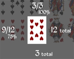
Wherever you are, Stevie D, thank you. In our case, we have 13 card ranks, and 12 of them will always be overflowing off the sides of the .card div. If we want to display a card of rank 10 (tenth one across in the sprite), 9 out of 12 card-widths will be in the left overflow. So, the x-position we want is (9/12) * 100% = 75%. The four y-positions for the suits will be 0, 33.333%, 66.667%, and 100%, since there are always three card-heights in the vertical overflow. It works! Even better, now that I get it, it’s at least as easy as pixel-counting!
What if we used ems? One card-width is 6.5em, so hey, we should be able to set the x-position of the .rank10 class at -9*6.5em = -58.5em. Now, when we scale up the font-size, our background positions scale proportionally with everything else. Change the resolution of the image, and nothing happens to the positions because our coordinate system is controlled entirely by the CSS. Want a mobile-friendly card deck with a smaller source image? Scale the source image down and then, in the CSS, change… absolutely nothing whatsoever. We can even add an entire new column onto the image — say, for a joker rank — and all we do is change the background-size to 1400%. None of our positions are affected by changing the width of the source image. Now that’s powerful.
The styling in the demo, linked at the top, does use the more powerful ems, but this approach was a little buggy when implemented in this post. So, the cards displayed here use percentages. Either approach has merit; the ems need a little more work.
Two CSS Sprite Caveats and a Further Idea
Do we really want to download a large image?
The single large sprite works well if we plan to display quite a few of the 52 possible cards. If we want to display only a handful at any given time, then it might make more sense to have small, discrete images, downloaded as needed. In general, though, the cost of downloading one large file once will be offset by the boon of having every possible card preloaded and ready to display.
Browser Support for Firefox
On another note, there’s one big problem with the background-position-x and background-position-y properties: they aren’t supported in Firefox. IE and Chrome accept the x and y position arguments separately, but Firefox has to take them both at once via background-position: x y;. This complicates our beautiful markup. Instead of having thirteen classes for the ranks and four for the suits, we have to get our hands dirty with 52 separate classes, one for each possible card:
.rankAC {color: #000; background-position: 0 0; }
.rankAD {color: #890000; background-position: 0 33.333%; }
.rankAS {color: #000; background-position: 0 66.667%; }
.rankAH {color: #890000; background-position: 0 100%; }

/* etc. */
If we’re using SCSS, we can make our lives a little easier by defining variables for each x- and y-position, like so: $clubs: 0; $diamonds: 33.333%; $spades: 66.667%; $hearts: 100%;, and so on. It’s still a bit of a bummer, but one can hope that FF will catch up with IE in the near future. Who ever thought we’d find ourselves saying that?
There must be something we can do with fonts!
Now, I discarded the idea of using a special font on the grounds that it would still require extra markup to position the central array of suits. However, what would be cool would be to take this set of sprites, convert them into a font where each card face is incorporated as a single glyph, and have truly scalable vector “images.” These would be included not in the background but as a glyph in the .card div. Sadly, this would not preserve the colors on the face cards… possibly an acceptable loss.
Conclusion
If you weren’t already a devotee of the em camp, I hope this article did a little to persuade you. If you were terrified of percentages because they just make no bloody sense, I hope the sage Stevie D. has soothed you, and that you will now have access to the incredible capacity for responsive design that they afford. And if you were just browsing around for a card-deck plugin, the full code is below; grab and go!
This is the best lunchtime read I have had in a long time. I wondered how sprites worked and never knew the advantages of em. Thanks for spelling out so clearly for me.