Article summary
Some of the most interesting and challenging projects involve data visualization. It can be very difficult to express data in a clear way and also make the product aesthetically pleasing. There are many different ways of presenting data to users, and choosing the “correct” visualization is not always a simple decision. Having numerous tools at your disposal, or at least greater awareness of what is out there, can help you make a better decision.
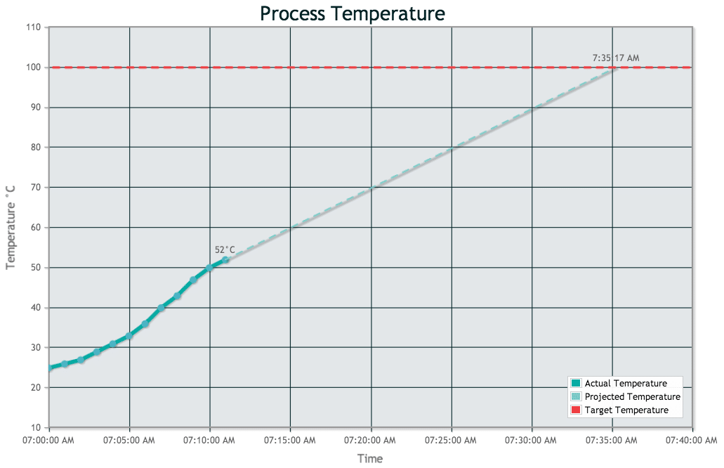
I was recently experimenting with a library called jqPlot, jqPlot is a jQuery plugin that supports drawing line, bar and pie charts with many customizable features. The project I was working on involved a device that monitors the temperature of the contents of a kettle during the process of brewing beer. My goal was to show the temperature as it changes over time and also to indicate a prediction of when the temperature would reach a desired target value. Here is what I ended up with:
To produce the chart above, very little html code was required.
1. Drawing a Chart
First, it was necessary to pull in jQuery, the jqPlot plugin (jqplot.min.js), and the jqPlot stylesheet (jqplot.min.css).
Then I had to add a div element for jqPlot to stuff the chart into.
The rest of the magic happens in JavaScript. To draw a chart, you just need to call the $.jqplot plugin and pass it a target and an array of lines to plot. The default settings produce a basic line chart with very little features. However, by passing additional options to the call and including extensions, you can customize the chart to suit your needs.
In the example above, there are two lines plotted initially: the actual temperature data and the projected temperature data. In the real application, a temperature sensor would be polled continually, and the chart would be updated in real-time with live data. For the purposes of this example, I created two helper functions that just return an example set of data.
var actual_temp_data = function() {
  return [ ["2014-04-05 07:00:00 -0400", 25, ""],
           ["2014-04-05 07:01:00 -0400", 26, ""],
           ...
           ["2014-04-05 07:10:00 -0400", 50, ""],
           ["2014-04-05 07:11:00 -0400", 52, "52°C"]];
}

var projected_temp_data = function() {
  return [ ["2014-04-05 07:11:00 -0400", 52, ""],
           ["2014-04-05 07:35:17 -0400", 100, "7:35:17 AM"]];
}
Creating the chart is then accomplished with the following call:
  var plot1 = $.jqplot('temperature_chart', [actual_temp_data(), projected_temp_data(), []], {
    // Options here...
  };
Customizing the Axes
Each data point includes a date/time, a temperature, and a label. By default, jqPlot does not know how to plot date/time points. In order to enable this functionality, you must include the ‘dateAxisRenderer’ extension. Also, printing labels next to data points requires the ‘pointLabels’ extension.
The following options were used to render the axes on the chart above. This tells jqPlot to use the DateAxisRenderer for the x-axis and to format the tick-labels with only the time of day. It also specifies that the x-axis will have 8 ticks.
    axes: {
      xaxis: {
        label: "Time",
        renderer: $.jqplot.DateAxisRenderer,
        tickOptions:{formatString:'%I:%M:%S %p'},
        numberTicks: 8,
      },
      yaxis: {
        label: "Temperature °C"
      },
Canvas Overlays
The red line on the chart is the target temperature. This line is not a normal plotted line but rather a canvas overlay. Using a canvas overlay is nice because it doesn’t affect the scaling or limits of the chart that is drawn. In this case, I only needed to specify that the horizontal line should be drawn at 100 degrees.
Overlays can be specified in the options when a chart is drawn but only after including the CanvasOverlay extension. I decided to make a small helper function to return the dashed horizontal line at the target temperature.
var target_temp_dashed_line = function(target_temp) {
  return { dashedHorizontalLine: {
             name: 'Boiling Pt',
             y: target_temp,
             lineWidth: 3,
             color: '#EF3E42',
             shadow: false
           }
         };
}
Then I just had to add the following to the chart options:
    canvasOverlay: {
      show: true,
      objects: [target_temp_dashed_line(100)],
    }
Theme Engine
jqPlot also includes a feature called the ‘Theme Engine’, which is useful for applying stylistic changes to your charts. The jqplot documentation gives several examples of changing the look of a chart on the fly. In my demo code, I created a theme called ‘coolTheme’ and applied it to my chart to give it the AO color scheme. I can see using the ‘Theme Engine’ in a few cases, but in general, using CSS to stylize your chart seems like a much better idea to me.
  var coolTheme = {
        legend: {
          location: 'se', // south-east corner
        },
        title: {
          textColor: '#002225',
          fontSize: '25',
        },
        series: [
            {color: '#00AAA1', lineWidth:5, markerOptions:{show: true}},
            {color: '#79ccc7', lineWidth:2, linePattern:'dashed'},
            {color: '#EF3E42'},
        ],
        grid: {
            backgroundColor: '#E3E7EA',
            gridLineColor: '#002225'
        },
    };
  coolTheme = plot1.themeEngine.newTheme('coolTheme', coolTheme);
  plot1.activateTheme('coolTheme');
Overall, I found jqPlot was a very nice tool to work with. It makes drawing basic charts light work. To add more sophisticated features require a bit more digging and playing around, but it seems like the capabilities are there. Check out the examples listed the jqplot website for more info and demos. Happy charting!
The complete source used for this demo can be found at my github page.