I love writing applications for the Android platform, partly because I find that there are a lot of very nice abstractions in the Android APIs. One of my favorite features is how easy it is to style the platform widgets.
If you haven’t worked with Android styling before, I’d like to introduce you to some of the key concepts by having a little fun and breaking as many design guidelines as possible in a one-page application. We’ll create rounded rectangles, borrow iOS patterns, and promise to apologize afterwards for being “evil”.
Our Application
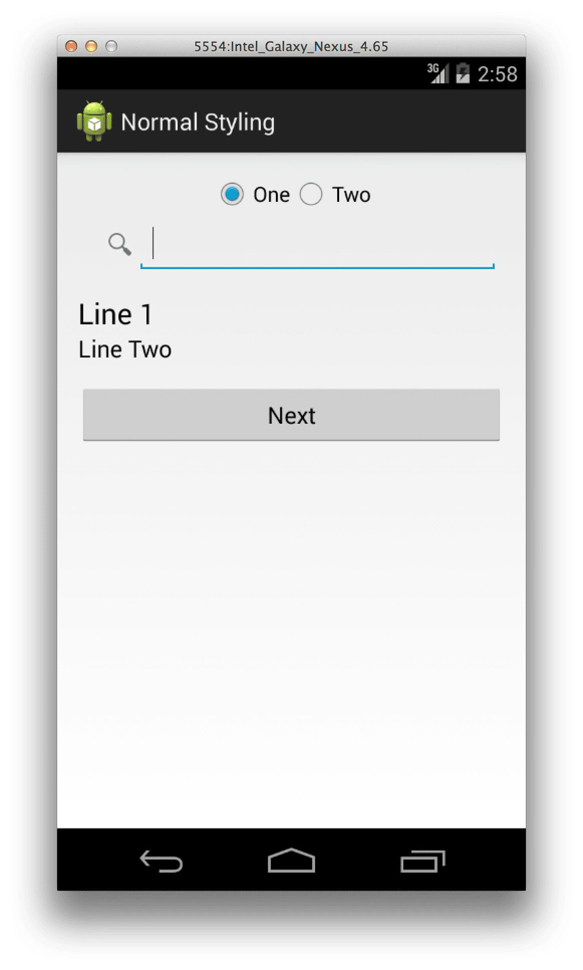
I’m going to use a very simple application with just two activities. The first one includes a few stock widgets, and the second activity includes the same widgets, with our non-Android styling. You can clone the application repository from Github if you’d like to play around with the code.
Core Concepts
Android defines a Drawable resource type, which can of course be a simple bitmap. However, we can also use Shape drawables to add basic fill and gradient backgrounds, LayerLists to compose a list of images and shapes, and StateList drawables to specify a set of drawables to be used based on what state a widget is in.
The platform widgets allow you to specify what drawables to use for the widget background, text, selection state, and optionally additional drawables to be used above, below, or beside the widget content. The platform renders a standard theme for the widgets when these drawables aren’t set, but allows us to easily modify the look.
A Toggle Control
Let’s start with the first widget on our page. We’ll restyle the standard radio button widget to look and feel somewhat iOS-like. Our layout for the radio button group looks like:
The key points here are the android:background properties as well as the android:button and android:textColor properties. These properties tell Android to use our custom drawables rather than the standard Android look.
Let’s start with the android:button property, as we are simply assigning it to a color — @android:color/transparent. This value instructs Android not to draw an indicator for our radio button. We could specify a more complex drawable in order to render something other than the normal radio button indicator, but in our case we don’t need one.
Next we have our button background for the left radio button:
-
-
-
The important thing to note here is that we are providing three different drawables, one for the “checked” state, one for the “pressed” state, and one for the default state. This allows us to control the visual feedback as the user interacts with the button. The rounded corners on the left side of the shape and the flat corners on the right give us the “toggle” feel. In a production application, we’d likely build this background dynamically based on the button’s position within the radio group, but I define two layouts here to keep things as simple as possible.
So there we are — we’ve dramatically changed the look of the radio buttons, provided different states to give feedback, and done it quite easily.
A Search Box
Next we’ll take a look at our search box.
Note that I am actually using an EditText widget here, rather than the standard SearchView. The SearchView is strangely unstyleable in the current releases. Our background for the bar holding the search box is again a simple color. The EditText background looks like:
-
-
-
A first note here is that because we can compose drawables, we don’t actually need to have the LinearLayout wrapping the EditText. We could do this with a single Drawable, but I wanted to show that you can use wrapping containers to lay down a base background that its children draw on top of. Next we use a layer list to first draw the rounded box for the edit text itself, then a bitmap drawable to render the search icon. The last item in the layer list is a bit “tricky”. It adds padding to the right of the box so that when the user types text, it won’t render on top of the search icon, but will wrap instead.
An “Arrow” List Item
Let’s violate Android design a bit more by creating an arrowed list item. Here’s the layout:
And the background:
-
-
android:shape="rectangle">
This time, we don’t need to modify the EditText styling at all. It’s all done on the containing LinearLayout. As before, we are using a bitmap with padding on the right to prevent text from rendering over the image. The trick this time is that we are using an InsetDrawable to modify the position at which our Shape background is drawn. We bump the left and right by a negative offset, so that they draw offscreen. This gives us a top and bottom border, but nothing on the left or right.
A Custom Button
And our final widget, a custom button:
The background:
-
-
The button text color:
And the button icon:
-
-
Note here that we can provide a text color based on button state, just like the background. We are also using the android:drawableLeft property to hook to a mount point that is left empty by the default platform style.
And there we are! I hope you appreciate how easily Android widgets can be modified, it’s a pretty nice system with a lot of flexibility. Now please, please, don’t be evil! And don’t use any of these styles in your Android apps!
dont need to repost my comment. Done already