Article summary
 We discuss scale, risk, and different options with our customers and team members continually throughout the lifetime of a project. Having a visual representation of the conversation points can be very useful.
A well-designed visual makes it easy to identify the highs and lows, draws conversation to the most important points, and helps everyone navigate the problem landscape. It’s hard to replace the way a good visual can connect with visual learners. And, as an added benefit for me, it removes the temptation to just read a slide during a presentation.
A few quick tips before we dig in:
- Double-check your numbers. It sucks to realize your visual is wrong in the middle of a presentation.
- It’s nice if the visual is easy to update to reflect new information. Simple shapes and a straight-forward scale help that a lot.
Below are a few examples we’ve used recently.
Simply Scale
Representing just scale is easy, but still valuable. Don’t discount creating a visual just because it seems simple.
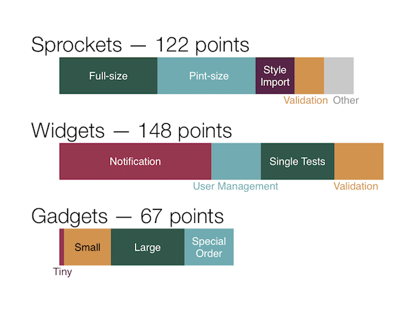
This example (created in OmniGraffle) was used to show the scale of work remaining across different subcomponents of a project.
Area and Arrangement
With a little more effort, colors and the arrangement of shapes can show groups within the data.
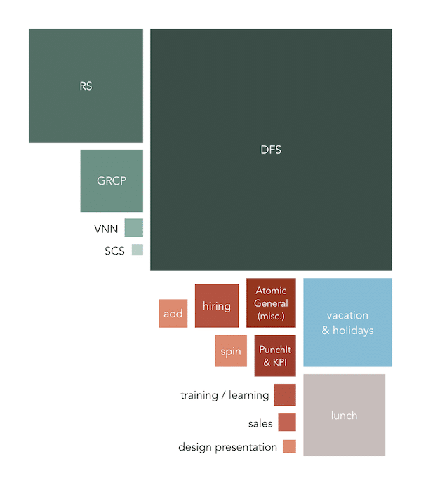
This example (created in OmniGraffle) shows what I’ve spent my time working on over the past 2 years. Green squares are customer projects, red are internal Atomic things, and the others are time away from work.
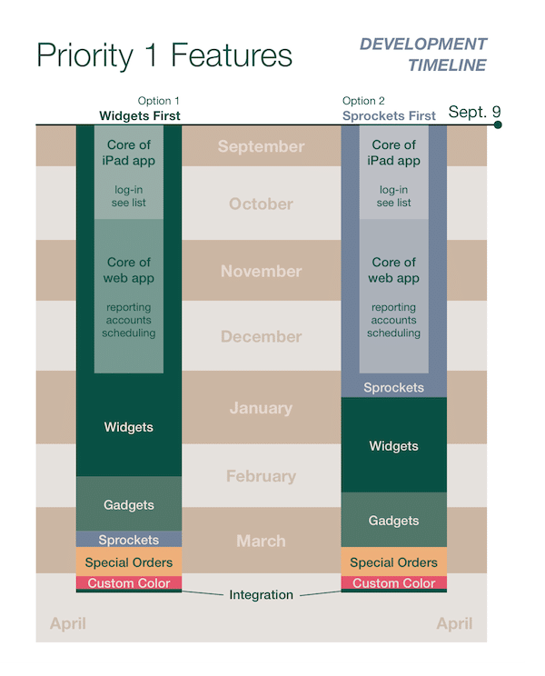
Scale, Different Options
Showing schedule impact of different decisions is a common theme in software projects. Calendars work well in a visual form, using either monthly or weekly blocks.
This example shows two options for scheduling work for specific business areas — building Sprockets support first gets the software operational earlier, with a small trade-off for the Widgets development completion date. This is basically the bar charts from before with a calendar for added context. (Created in OmniGraffle)
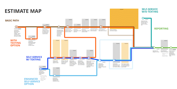
Scale, Risk, & Complex Options
When conversations are more complicated — with more options and areas to call attention to — so are the visualizations. The example below was used to walk through an estimate where there were a number of alternatives that needed to be considered. We found it very useful as a roadmap for the discussion.
Below is a zoomed-in example of the roadmap structure (or tube map, as we started calling it).
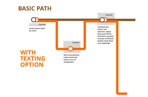
Brittany Hunter gets the credit for the detailed visual design, based on work we sketched out together on a whiteboard. We also had a detail page for each potential path to call out additional details (not shown). This diagram helped the estimate walk-through stay on-point and result in concrete decisions:
- Larger bars drew conversation, questions, and exploration of simpler alternatives.
- Summing estimates along selected paths let us put a final number together based on the discussion.
- Our customer had something to take away from the meeting that they could use in further internal discussions.
Conclusion
Visual representations of scale, risk, and optional paths can range from simple to complex, and we’ve found value from all areas of the spectrum. I hope these provide some inspiration for your next conversation or presentation.