Article summary
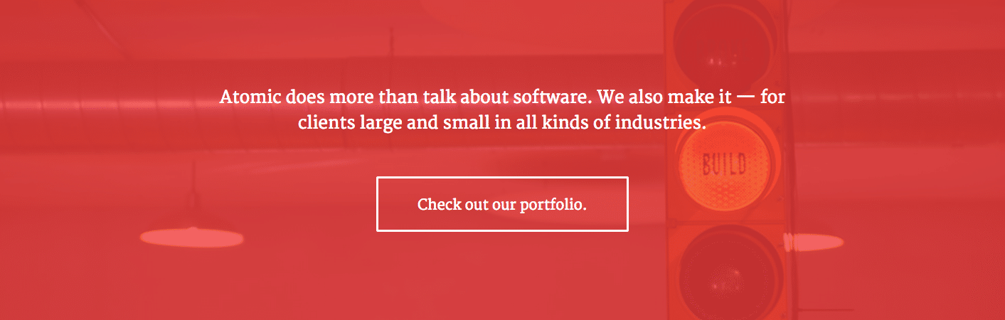
A common technique in web design is to use a large background image overlayed with a translucent color and text. Often used for splash screens and headers (“hero images”), the color overlay creates a better background for text, while being much more visually interesting than a solid background color.
Our blog and website use a variation of this technique in our footer (see the bottom of this page) to draw attention to our work portfolio.
The div Method
The most common implementation for these overlays is to introduce an extra div, stretched to cover the element with the background image. The new div has no content, but is given a background-color and set to a lower opacity, allowing the background image to partially show through.
Here’s what the HTML and CSS would look like:
...
#element-with-background-image {
   position: relative;
   background-image: url("//spin.atomicobject.com/wp-content/uploads/portfolio-tips-feature-image.jpg");
}

#color-overlay {
   position: absolute;
   top: 0;
   left: 0;
   width: 100%;
   height: 100%;
   background-color: black;
   opacity: 0.6;
}
This approach is not ideal for a couple of reasons: it introduces unnecessary complexity (requiring both HTML and CSS changes) and it violates the principle of keeping content separated from presentation.
CSS Multiple Backgrounds
Luckily, there is an alternative technique that takes advantage of CSS multiple backgrounds to layer our color overlay on top of our background image, all within the same element. This way, we can achieve the same visual effect without introducing any additional HTML.
One caveat of the multiple background technique is that a background-color cannot be layered on top of a background-image, but a gradient can. So instead of using the background-color and opacity properties, we define a gradient that uses the same color for both the starting and stopping point, and lower the alpha channel to reduce our opacity. This “faux-gradient” then gets layered on top of the original background image to create the overlay effect.
Here’s how the new technique would achieve the same effect as the example above:
...
#element-with-background-image {
    background-image:
        linear-gradient(rgba(0, 0, 0, 0.6), rgba(0, 0, 0, 0.6)),
        url('//spin.atomicobject.com/wp-content/uploads/portfolio-tips-feature-image.jpg');
}
It doesn’t work?
The ; is just missing after
height: 100%.It’ll work perfect after that.
Thanks for pointing that out Saskia – I updated the CSS.
Thanks for this tip! I’ve seen a bunch of examples of this but for some reason none of them were working for me, and yours did.
this page is good and its very helpful for me.
Thanks! must neede..learnt new thing
this is a great effect for improve image and website design, thanks
Awesome! Cheers.
anyway to incorporate this with a cover background image? so the image resizes?
This was so helpful. I have been looking around for hours to figure out how to overlay a color on a background image. Thank you!
Priceless! Thanks for this, saved me hour s of trawling the web/tearing hair out!
You are awesome!! My search ended here.. :-)
It works! Thanks! Just missing this to implement in my cover profile.
This is perfect, thanks a lot, you are a hero on the web
This worked great for me. Life saver!
Thanks so much for this! It helped me with a page I’ve been working on.