Article summary
Lately, I’ve been noticing radio buttons, checkboxes, and toggles being used almost interchangeably on a lot of apps and websites. Perhaps I’m just noticing the issue more since it’s one I’ve been extremely careful to avoid on my current project. It’s like when you buy a new car and suddenly everyone on your street is driving the same one. Regardless of the reason for my sudden realization, the bottom line is this: Radio buttons are not checkboxes. Checkboxes are not toggles. Toggles are not radio buttons. Each one of these elements serves a distinct purpose.
Radio Buttons
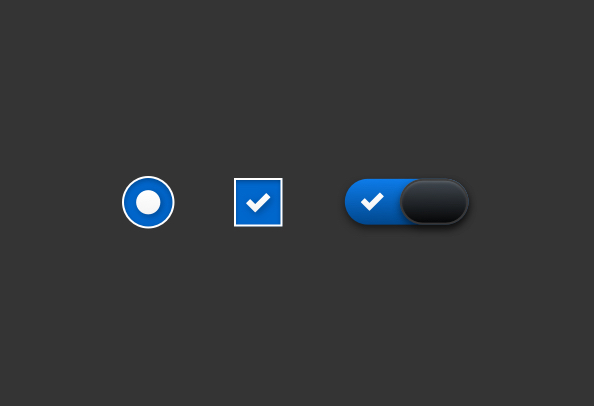
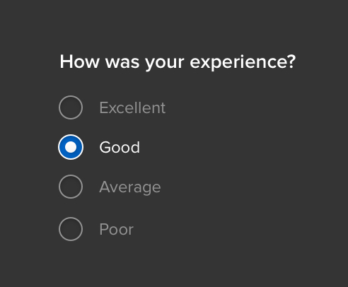
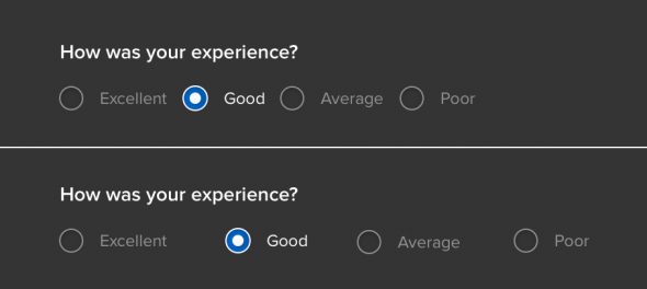
Radio buttons should be used when the user can select one, and only one, option from a list of items. The button should be circular and become filled in when it is selected. The shape of the radio button is crucial in differentiating it from a checkbox.
Checkboxes
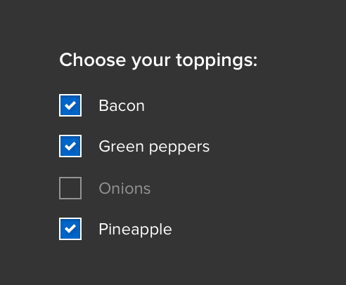
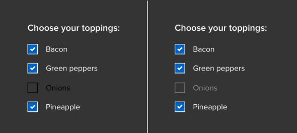
Checkboxes should be used when the user can select none, one, or multiple options from a list of items. The button should be square and have a checkmark or X in it when it is selected.
Toggles
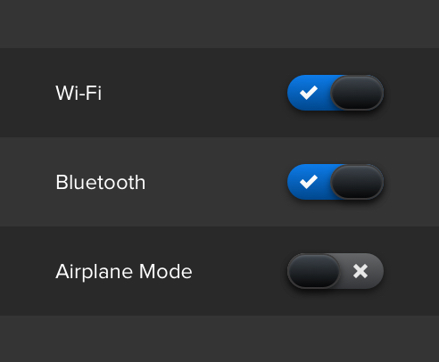
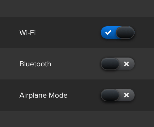
Toggles should be used to represent an action, like turning something on or off, or starting or stopping an activity. It should be clear which state is on and which state is off. This can be achieved with text labels, color, icons, or a combination of the aforementioned.
Extra Tips and Tricks
Always display a list of options vertically if possibly. Horizontally-aligned options can be hard to read and distinguish from one another. If you must display your list in a horizontal fashion, be sure to pay close attention to the proximity of an item to its corresponding checkbox, as well as the space between list items.
Be sure your unselected and selected states vary enough to make it obvious when an option is selected. However, you should also be careful to ensure unselected states do not look disabled.
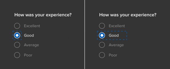
Make the entire list option, not just the checkbox or radio button, clickable. This will make it easier for a user to quickly select their desired option. Not everyone is as precise with a mouse as you are, designer!
Add some extra delight by using subtle animations when a toggle’s state is changed or a radio or checkbox is selected.
Why Does It Matter?
By adhering to standards that are already in use across the web, you’re creating a workflow with which your users are most likely already familiar and comfortable. This reduces any stress or confusion that they may have in performing the task at hand, making the process quick and painless. And of course, your goal should always be to make life as easy as possible for your users.