The world and its many, many systems are infinitely complicated and unquantifiable. Yet we hold out hope that if we can collect enough information, we can find the answers to big questions about science, medicine, life, and everything we can imagine.
Unfortunately, the more data we collect, the harder it is to interpret. Big data in particular tends to have enormous scale, unseen patterns, and far more than two interesting dimensions.
How did we harness our information? With visualizations. Where words and numbers fail, visualizations can make dense technical information decipherable.
Choosing our visualizations carefully can make the difference between groundbreaking discovery and fruitless data manipulation. We use graphs, images, diagrams, et cetera to understand our data, to explain our points to others, and to attempt to grasp the significance and implications of all of the masses of data that we generate.
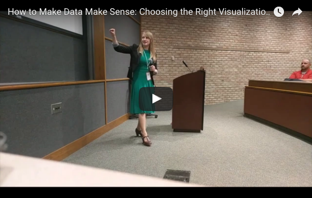
I recently gave a talk at this year’s Great Lakes Software Excellence Conference (GLSEC) on “Visualizations: Making Data Make Sense.” I shared some of what I’ve learned about how to build the right visualization for your data. You can find a video and my slides below.
The theme of GLSEC 2017 was “big data,” and that almost kept me from submitting a talk. Throughout my career I’ve been working with “big data” ideas, and going to “big data” events, and talking to “big data” people, but I’ve always felt like something of an impostor saying that I know big data.
But I spent all that time around big data people for a reason: I built tools that helped people interpret big data. At the University of Michigan 3D Lab, we worked with a number of scientists and specialists who needed to understand large quantities of information. Despite having collected as much data as they possibly could about complex systems, they couldn’t even begin to comprehend those systems using the data alone. Our job at the 3D Lab was to build tools to help them.
To learn more about how visualization can augment your understanding of your data, and how to identify and build the right visualization, check out the video and slides below. Learn how to make your data make sense!