My latest project has given me the opportunity to dip my toes into the world of React/Redux. React makes it easy to build user interfaces through modular, custom UI components. And now with Storybook, it’s easy to leverage those React components for UI testing.
So, what can you do with Storybook? I’ve found it helpful for several things, including:
The Ability to Test Rendering for Different Cases
Once you’ve made a React component, you will need to add styling and test how the component renders with different data sets. You can pass data into a component, and Storybook will render the component by itself.
This can be helpful for special cases like no data (where a “no results” message might be displayed), or longer content that might mess up the UI. Storybook tests allow you to test out these UI cases without having to fiddle with test data in your database, hardcoded into your component, and so on.
storiesOf("Component – Flight table", module)
 .add("No flights", () => (
   <FlightTable
     flightData={[]}
     notes={}
   />
 ))
 .add("One flight", () => (
   <FlightTable
     flightData={[
     {
       cities: "GRR-ORD",
       flightDepartureTime: "6:00",
       flightNumber: 2090,
     }
   ]}
   notes={}
   />
 ))
 .add("Flight with long notes section", () => (
   <FlightTable
     flightStatusData={[
       {
         cities: "GRR-DET",
         flightDepartureTime: "14:05",
         flightNumber: 2091,
       }
     ]}
     notes={"Really long note here to see if our table styling will hold..."}
   />
 ));
A Built-In Style Guide that Updates with Your Code
On previous projects, my team has tried to maintain a style guide for ramping new team members into the front-end styling, testing out new styles with our designer, and developing modular UI components for consistent styling across our apps. Inevitably, though, the style of the application evolved, and after a while, the style guide fell out of date.
Storybook can give you a built-in style guide that will change as your React components change. If you treat Storybook tests like other tests and maintain them, you'll get a well-organized and self-updating style guide for free.
Easy Cross-Browser Visual Checks
Cross-browser support testing is... fine. It's fine.

Storybook can't make IE any easier, but it can make it easier to spot how component-related changes will be rendered in different browsers. If you have Storybook tests showing a variety of content as discussed earlier, you can run Storybook and view the styles as rendered in each browser.
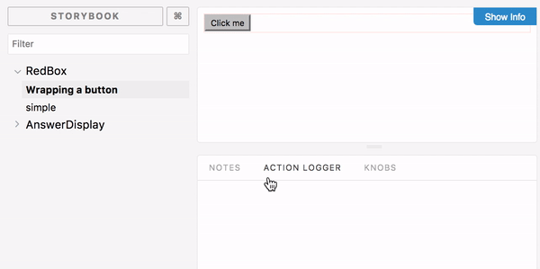
Interaction Testing
If your components trigger some type of action when the user interacts with them, you can use the Action Logger view to easily verify what action is being triggered.

Storyshots for Snapshot Testing
Once your component structure is set up the way you prefer, you can use snapshot testing to take HTML copies known as "snapshots." Later, if you make changes to the component structure or logic, you can easily diff the resulting changes in the outputted HTML against those snapshots. If there's a difference, you can update the snapshots, which is easy to do from the test runner. Or, if you want to undo your changes, it's easy to see exactly where the difference is.
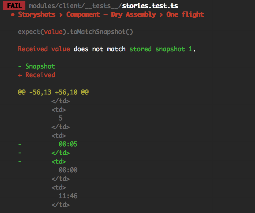
This functionality is called StoryShots, and it integrates with your Jest tests.
Get Started
React provides instructions for setting up Storybook testing with a new or existing React app.
Alternatively, if you'd like to try it out with an existing code base, you can try my coworker Drew Colthorp's starter kit, which comes with Storybook already configured, plus a few existing tests. You can find the source code here.
Once you have completed the setup (as described in the readme file), run yarn dev:storybook from the command line and navigate to localhost:9001 in your browser. Happy testing!