Article summary
In yesterday’s post, I shared the value of having a scorecard for your business. A scorecard follows the idea that you can improve what you measure. Conversely, if you don’t measure it, you can’t improve it. There’s clear value in having a scorecard tool to focus on your goals and ensure that you are solving the right problems. At Atomic, our current scorecard is the Atomic Radiator.
The Radiator was born out of a plan to measure the effectiveness of Atomic’s marketing efforts. I remember seeing an early version made out of yarn, tacks, corkboard, and paper. Creating a prototype out of physical elements allowed Atomic to learn what works.
Once the company had settled on a good, consistent version, we built custom software to automate the update and display. The current Radiator functions as a “digital dashboard,” emitting information like a heater emits heat–thus, the Radiator name. There are other digital dashboard products available that do the same thing as our Radiator, but they all require some data source and configuration to make them effective as a scorecard.
Breaking it Down
Atomic’s Radiator supports Atomic’s values, specifically Transparency and Share the Pain. It also supports our belief in Open-Book Management.
The Radiator functions across both our Grand Rapids and Ann Arbor offices, helping reinforce key behaviors that are important to our culture across multiple geographies. This includes taking personal responsibility for commitments and sharing fun moments that happen in the office.
Our Radiator displays information for each of Atomic’s Key Performance Indicators (KPIs). The power of KPIs is in their ability to focus your team on the decisions and actions that contribute to your company’s goals. As I highlight each area of the Radiator, I will describe the associated KPI.
The six key areas of our Radiator include:
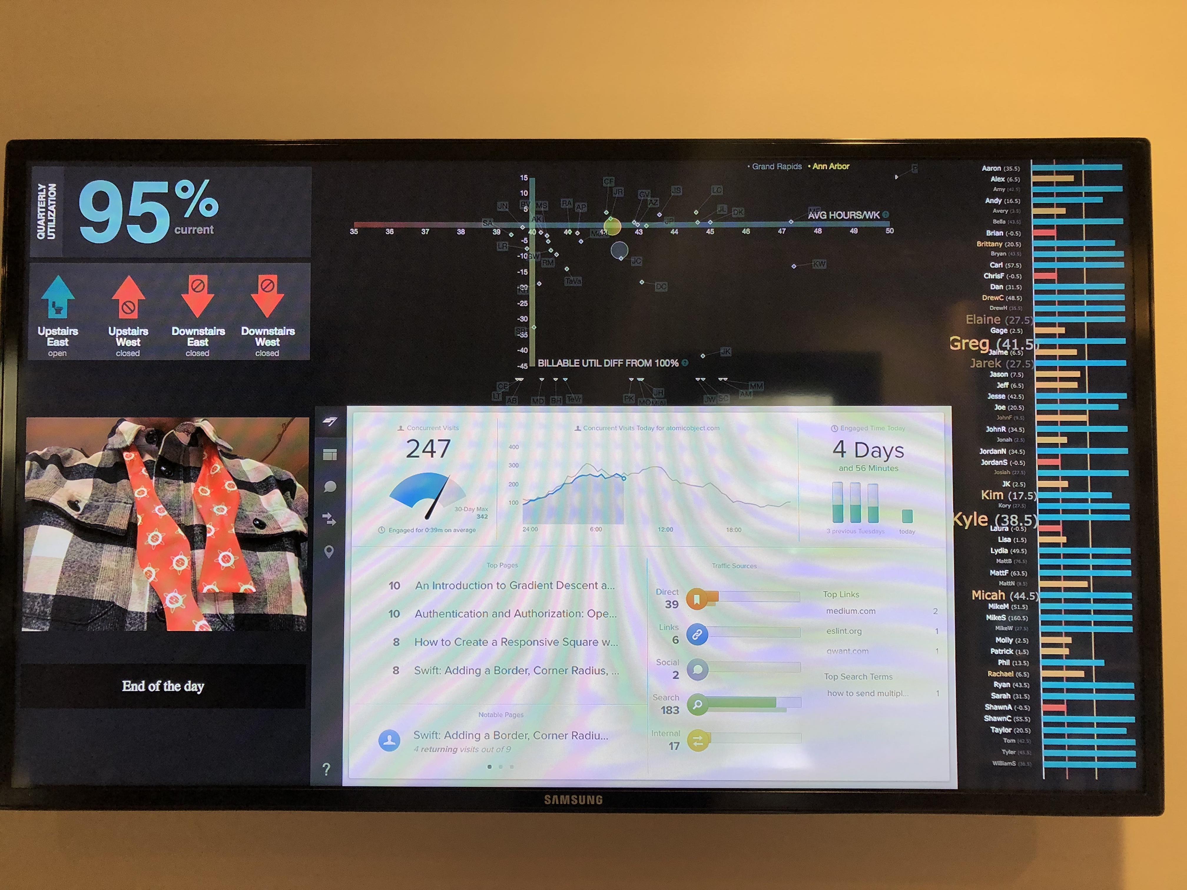
Utilization
The top left number shows the overall utilization for Atomic across both offices. Because we’re a billable company, this is our most important KPI. For a software consultancy, good utilization drives both revenue and profit. The higher the utilization, the more profit. Conversely, low utilization over a long period of time can drive a software consultancy out of business.
Our utilization is typically above 90%. (We use the PunchIt time tracking tool to provide our data, along with some math that eliminates data from non-billable team members and noise from vacation or personal time.) Each maker here has a direct impact on utilization, and since Atomic offers profit sharing for each team member, there is an incentive to keep this number high.
Bathroom Monitor
Below the utilization number, you’ll see a display of arrows. These arrows are part of the “PottyMon” that indicates which bathrooms are open for use. We use a green up arrow for an open bathroom, and a red down arrow for a bathroom in use. Each bathroom has a sensor in the door to know if it’s open or closed.
This widget updates in real time. In an office with multiple floors, this helps team members avoid making trips up and down stairs to find an open bathroom. This area is not tied to a KPI, but more of an effort to create a good quality-of-life experience in our offices.
Snap
Below the Bathroom Monitor is a photo widget called Snap. This custom application displays a rotating set of images from the Flickr photo service. Atoms can submit photos to the service through email. While not linked to a KPI, this widget is focused on creating cultural connections by sharing fun moments across both offices.
Chartbeat
To the right of Snap is a website traffic data widget called Chartbeat. It provides near real-time information about visitors to Spin and our website. Chartbeat displays a set of KPI numbers that indicate the effectiveness of our marketing efforts. This includes current visitors to our website as well as a tracker of which blog posts are getting the most views.
As a marketing-driven sales company, we know better marketing efforts drive more leads for our sales team. Understanding which posts are driving interest in our content helps us tune the stories we share with the world.
Participation Graph
Along the right side of the Radiator is long list of names and colorful lines. This custom side widget is the Participation Graph. For each office, it displays the names of everyone who records time in PunchIt. If a person’s name is not written in white text, it means they have not yet “punched” a full day’s worth of time. As more time progresses without entering time, the person’s name will continue to grow larger until it eventually breaks the widget.
In this way, the Participation Graph establishes a social norm to motivate team members to get their time “punched” on-time. This is similar to what hotels do to promote environmental conservation with towels.
The widget also displays a line graph that indicates how much time remains before an Atom must submit their blog post. There is also a number next to each Atom’s name that shows the exact number of days that remain. Once 10 days remain, the bar will change from green to yellow to remind an Atom that the post is due soon. When the line crosses into zero days remaining, the bar will turn red.
By looking at the overall graph, you can gain a sense for how well the team is meeting expectations for punching in time and contributing blog posts. Thus, the KPIs relate to the quality of the time captured and the participation in marketing/sales activities by an office.
KPI Graph
The last and most complex feature in the Radiator is the KPI Graph. This widget shows a scatterplot of the time entered by every Atom in an office across two axes. The X-axis measures the average hours per week, and the Y-axis shows the billable utilization difference from 100%. Note that the Y-axis crosses the X-axis at the 40-hour mark. Everyone who appears on the Y-axis or to the right has worked a full week. Whether you are above or below the X-axis depends on how much of that time was billable.
The KPI Graph allows all Atoms to see where they fall relative to each other and company targets. It allows a manager to look for patterns and determine any follow-up that is needed. For example, if someone is billing 50 hours a week (upper right of graph), its a good practice to check in and look for signs of burnout. There are also two centroid circles that indicate where the total of both offices appear relative to all other data points.
The KPI Graph is very effective at showing how well an Atom is doing relative to their peers and with the time they have available for billing.
Having Impact
The Radiator is physically located near common gathering points in the office. In Grand Rapids, it’s posted near the bathrooms and the kitchen area. This makes it accessible and visible to everyone in the office, further improving its impact on Atomic as a whole.
At Atomic, team members have a lot of freedom to make decisions that impact their clients and our business. Having a highly visible set of KPIs helps people make choices that best support our overall goals. When they receive feedback about the effectiveness of those choices, it further reinforces the behaviors that make everyone feel like they are winning.
As the marketplace and Atomic evolve, I’m positive the Radiator will also change. Having a custom version of a digital scorecard gives Atomic great flexibility in this respect, and that agility is a key strength to keep Atomic successful in an ever-changing world.