
Material Design was introduced by Google in 2014 as a visual language to create a universal design and style guide for applications. Along with Material Design, new widgets and controls were added to match the new styling.
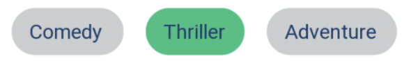
One of these elements is the chip. Chips function like buttons that can either be checked or toggled. They can be used as filters, choices, or entries and wired up to trigger actions.
If an app already uses the updated Material Design theme, chips will use the updated Material Design styling by default. If an app doesn’t use the Material Design theme, the style can be directly applied to the widget.
Adding Chips in XML
The easiest way to add chips to an Android app is to simply drop them into a linear layout in XML. By default, they are set up to trigger an action when clicked or tapped.
<android.support.design.chip.Chip
        android:id="@+id/adventure_chip"
        android:layout_width="wrap_content"
        android:layout_height="wrap_content"
        android:text="@string/adventure"/>
In the XML, chips can also be added to a chip group. Chip groups allow you to control multiple chips’ layouts and multiple-exclusion scope, similar to a radio group. This means that only one chip in a chip group can be selected at a time. If different functionality is required, such as being able to select multiple chips, chip groups will not work.
<android.support.design.chip.ChipGroup
    android:id="@+id/chip_group"
    android:layout_width="match_parent"
    android:layout_height="wrap_content"
    app:chipSpacing="10dp">

 <android.support.design.chip.Chip
    android:layout_width="wrap_content"
    android:layout_height="wrap_content"
    android:text="@string/comedy"/>

 <android.support.design.chip.Chip
    android:layout_width="wrap_content"
    android:layout_height="wrap_content"
    android:text="@string/thriller"/>

 <android.support.design.chip.Chip
    android:layout_width="wrap_content"
    android:layout_height="wrap_content"
    android:text="@string/adventure"/>

</android.support.design.chip.ChipGroup>
Adding Chips Programmatically
If dynamic functionality is needed, chips can be added to a view or layout programmatically. You can also create and add to chip groups in this way.
ChipGroup chipGroup = new ChipGroup(parentView.getContext());

String[] genres = {"Thriller", "Comedy", "Adventure"};
for(String genre : genres) {
 Chip chip = new Chip(parentView.getContext());
 chip.setText(genre);
 chipGroup.addView(chip);
}
Handling Clicks
There are three ways to register a callback on a chip.
The most basic handles what happens when a chip is clicked or tapped.
Chip chip = (Chip)findViewById(R.id.adventure_chip);
chip.setOnClickListener(new OnClickListener() {
 @Override
 public void onClick(View view) {
  // Handle the click.
 }
});
Chips can also handle being checked. This provides a Boolean of the checked state to the callback.
Chip chip = (Chip)findViewById(R.id.adventure_chip);
chip.setOnCheckedChangeListener(new OnCheckedChangeListener() {
 @Override
 public void onCheckedChanged(CompoundButton view, boolean isChecked) {
  // Handle the toggle.
 }
});
Chip groups can use the OnCheckedChangeListener to set one callback for all chips in a chip group. This provides the ID of the chip that was selected.
ChipGroup chipGroup = (ChipGroup)findViewById(R.id.chip_group);
chipGroup.setOnCheckedChangeListener(new OnCheckedChangeListener() {
 @Override
 public void onCheckedChanged(ChipGroup group, @IdRes int checkedId) {
  // Handle the chip group action.
 }
});
Finally, chips provide a close button that can have its own click listener.
Chip chip = (Chip)findViewById(R.id.adventure_chip);
chip.setOnCloseIconClickListener(new OnClickListener() {
 @Override
 public void onClick(View view) {
  // Handle the click on the close icon.
 }
});
Styling Chips
Material Design still allows developers to style chips to match their application. These styles can be declared in the styles.xml file. You can set background colors using a color state list with checked and unchecked states.
// styles.xml
<style name="ChipStyle" parent="Widget.MaterialComponents.Chip.Choice">
 <item name="chipBackgroundColor">@color/chip_background_color_state_list</item>
 <item name="android:textAppearance">@style/ChipTextAppearance</item>
 <item name="android:textColor">@color/secondary_dark_blue</item>
In XML, styling chips works the same as any other view in the layout. Simply add the style tag to the chip element.
<android.support.design.chip.Chip
        android:layout_width="wrap_content"
        android:layout_height="wrap_content"
        style="@style/ChipStyle"
        android:text="@string/comedy"/>
Adding styles to chips programmatically is a more involved process. It requires the addition of a resource attribute file that points at the desired style.
// attrs_chip_style.xml
<?xml version="1.0" encoding="utf-8"?>
<resources><attr name="CustomChipChoiceStyle" format="reference"/></resources>
This attribute will then be referenced from the app’s base theme in the styles folder to create a link between the resource attribute and the style.
// styles.xml
<style name="BaseTheme" parent="Theme.MaterialComponents.Light.NoActionBar.Bridge">
 <item name="CustomChipChoiceStyle">@style/ChipStyle</item>
</style>
When creating the chip, this attribute will be passed in as a parameter.
Chip chip = new Chip(parentView.getContext(), null, R.attr.CustomChipChoiceStyle);
Other Resources
More information on how to use and implement chips in an Android app can be found on the Material Design website.