Welcome to UX Wins & Sins, the blog series that reviews popular products and digital experiences to glean design lessons from what’s working (the wins!) and what’s not (the sins).
For this post, we’re kickin’ it nine to wine🍷 and reviewing Winc, a millennial-targeted wine club that aims to make palate education and wine delivery a cinch.
Design Lessons for This Episode
😇 The Wins – Packaging, Ease of Implementation
👿 The Sins – Lame Quizzes, Anticlimactic Moments, Broken Workflows
Regarding This Critique – Software is Hard
Having worked on software teams for some time, I know the trade-offs that must be made in order to bring a software product to market. Sometimes a magical, delightful user experience has been designed but must be pared-down in order to make time or unlock budget for other critical features. Therefore, hat tip to the Winc team. I’m sure the path to a working product was paved with many known wins and sins along the way.
About Winc
Formally known as ‘Club W,’ LA-based Winc is one of the first and most popular wine clubs to integrate technology into its business model. This digital experience utilizes an Instagram-able aesthetic and a short quiz to match customers with their perfect wines. After a customer takes the quiz, Winc ships four bottles of wine to them. This continues monthly until the Winc membership is canceled via live chat or phone call.
First Impressions
Upon first visit to the Winc site, I’m greeted with vibrant photography and a sparse-modern interface. Winc is heavy on marketing wines at low prices. Pair the cost-effectiveness of their wine with fancy branding vibes, and you’ve hooked a younger, penny-pinching, eager-to-be-boujee audience.
On to the Wins & Sins
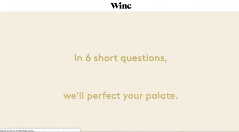
We start our journey to UX heaven and hell with a sin! To begin the trek to wine-dom, I first click “Get Started” from the homepage banner. Immediately, the screen clears. Instructions appear and disappear like the intro to a movie trailer. And thus we’ve come to our first sin. (Dun, dun, dunnnnnnnnn!)
👿Sin: Using disappearing messages
Don’t animate and remove messages that direct or inform a user about a part of the process—especially if there is no way to pause or restart the messaging. This is an accessibility nightmare.
Why? Because users can:
- Become distracted and miss the message altogether
- Misunderstand the message, want to re-read it, and be unable to do so
Here’s a clip of the disappearing message magic show:
Next is a win/sin combo!
👿Sin: Lame, impersonal quizzes that are 😇Win: Easy to implement
After the intro, a six-step quiz begins. The quiz asks basic questions about food and taste preferences. The questions are straightforward and written in a nonchalant tone of voice. This approach can feel very impersonal and overly simplistic (definite sin). From a software-build standpoint, though, it must have been extremely easy to implement (win). We’re talking basic buttons and a square image. HTML 101.
The trade-off here is that a quiz that cost peanuts to build has created a boring user experience. Considering that one of Winc’s brand promises is “learning your palate,” I would have encouraged them to place greater emphasis (and budget support) on building a more memorable and educational experience.
Here’s a glimpse at the first quiz question:
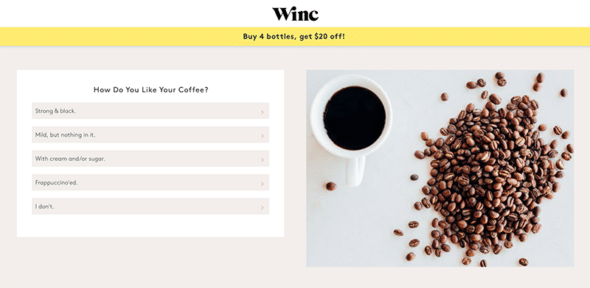
It’s very odd that there is no progress-measure or back button (aside from your browser-back button) on questions that would enable a user to change their answer or review what they’ve selected. I’m all for driving users along a path, but the process goes by so quickly that it becomes completely un-memorable.
👿Sin: Hidden steps
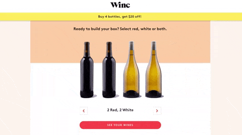
After finishing the “six-question” quiz, I’m greeted with a seventh (!) question that asks what types of wine (red or white) I’d like to appear in my box. But what if I don’t know? I thought Winc was supposed to tell me if I liked red or white based on my answers? And why is there a seventh question, when Winc told me there would only be six?
😇Win: Motion-enhanced buttons
There is a small, positive moment that happens on the quiz page: the motion of the “See Your Wines” button. It’s encouraging me to make a choice and move ahead, and that’s a good thing.
Now it should be time for the big pay-off! I should see which wines I’m paired with and really get to know where my wine adventures will take me. But no, instead I’m greeted with a big, fat UX Sin.
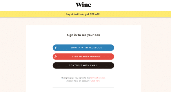
👿Sin: Gating information with account creation
During the previous step of the quiz, a big, pulsing red button encouraged me to click to “See *My* Wines.” So I expected that when I clicked that button, I would get to… see my wines.
Instead, I’m told I must create an account. Not cool. This could have been remedied with a simple text added to the “See Your Wines” button. If the button text had said, “Submit your email to see your wines,” I would have been prepared for the transaction.
I understand that Winc wants to capture my information to further market to me. I understand that I need to “pay” to see my wine pairings. This is a common gate in the digital world we live in. So why be sneaky? I understand that I need to give a little to get a little. At this point, my trust has begun to dwindle.
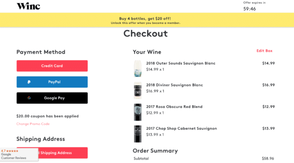
So—I think I have finally arrived at the point where I get to see the glorious wines on my list. I’ll get to understand what their flavor profiles are and how they match my preferences. SHOW ME THE VINO!
👿Sin: Anticlimatic pay-off moment
Instead of learning about my wine pairings, I’m ushered directly to a checkout screen. The wines Winc has chosen for me are lined up in a cart, and I’m shown sections for payment and shipping information.
I’m left to wonder—why did Winc choose these wines? What should I expect if/when I buy them? What does a Winc membership even mean? Where’s the celebration and build-up of anticipation to purchase and drink these wines? I’m no longer thirsty and now kinda bummed and bored.
👿👿👿Unpardonable Sin: Not accounting for edge cases
So, I input my payment and shipment information and click “purchase,” but to my surprise, ANOTHER disappearing message appears. This time, it lets me know that one of the bottles in my cart can’t be shipped to Michigan. At least, I think that’s what it said because it disappeared before I could finish reading it.
I’m then auto-magically taken to a shopping cart variant that looks completely different than the last checkout area where I was. This checkout has only three bottles of wine (instead of the four I should have).
I have no clue what to do next because Winc is supposed to be recommending wines for me. Also, why can’t they ship to Michigan? And where am I supposed to go next? All-around confusion and user experience chaos.
I start clicking around the site to find other wines. I try to find another red to replace the one Michigan hates (lol) and throw it in my cart. However, I don’t know if this new wine I selected will also be rejected by Michigan. In fact, I won’t know until I attempt to finalize my purchase again.
I keep clicking around the site because I want to experience the entire process and because I’m writing a review. However, if this had happened during my free time, I definitely would have abandoned the entire workflow.
Finally, the purchase was complete, although I’m not actually sure whether the new, random wine matches my flavor preferences. And the waiting game begins.
It’s important to note: upon receipt of the wine, someone at least 21 years old must sign for the package. This is listed as a side-note during the checkout process, but it seems like it could be a shipping nightmare if the recipient isn’t around to sign during typical 9-to-5 hours.
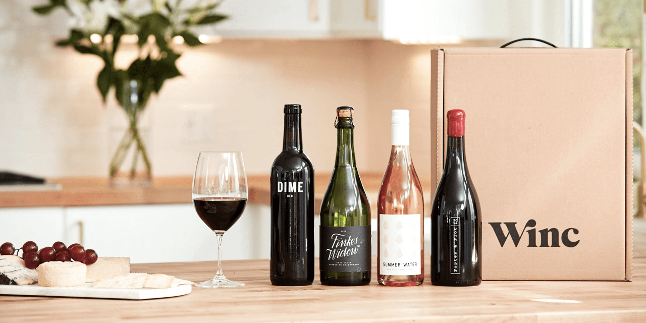
😇Win: A handle on the box of a heavy package!
The wine finally arrives because I’ve shipped it to the office where we conveniently have someone of legal drinking age to sign for it. (Otherwise, I probably wouldn’t have made the purchase, because I’m never home during the day.)
There are four bottles of wine in this box, and it’s heavy enough to be awkward if you don’t have a good grasp on the box. Winc thought about that and added a handy (ha!) handle to the top. It makes porting that big lug of a box easy-peasy. Yay, Winc! You did good!
And that about wraps up this wine adventure!
“But, Kim… how was the wine?” Oh, yea. No comment.
Until next time!