Article summary
I’ve been working with one of our clients for several years, which has given me a great opportunity to watch their mobile and web applications grow and respond to feedback from users.
This month, I was asked to update their existing iOS application to reflect changes that came from the latest iOS update, namely a move to skeuomorphic components and iOS dark mode.
Skeuomorphic Components
In the update to iOS 13, a few of the existing components changed from a flat design to a more tactile version.
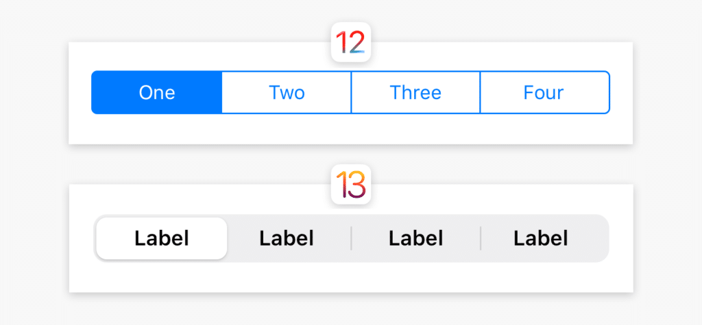
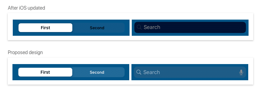
These controls include the iOS segmented control, search bar, and modal. Component changes aren’t typically a big problem when iOS updates, but in this case, the custom CSS we had in the flat controls didn’t carry over to in the iOS update (read more in this post by Rostyslav Dovhaliuk). This made the color contrast in our existing segmented control and search bar barely useable.
To fix this without a lot of custom CSS, we moved to a lighter background shade and a white font while in light mode.
Dark Mode
iOS 13 also allowed us to introduce dark mode functionality. This is important for users who work morning, evening, or night shifts while using this application. Our goals for this were to get a functional, WCAG AA contrast compliant skin that paralleled the current designs.
I first researched best practices around dark mode design. The most useful articles I read were by Briandito Priambodo and Nick Babich. I’d highly recommend reading both of these before doing any dark mode design work.
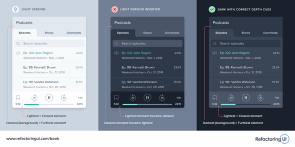
The most important thing I learned was that the dark mode design shouldn’t be an “invert” of the existing design. Instead, it should maintain our natural depth perception — closer things are lighter and farther away things are darker. However, this should be done with the user’s interface needs in mind; keep important actions and links high contrast.
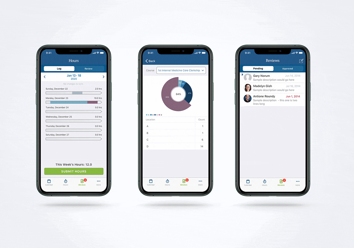
The final design kept these lessons in mind. Where possible, I tried to use colors from the existing color palette. Where this wasn’t possible, I relied on contrast-compliant tints of the original client color palette.
Have you done dark mode theming or skins for your product? If so, I’d love to hear more!