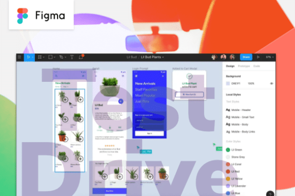
Having been a staunch Sketch fan for some time now, I gave Figma a try when it was first released. During a recent project, a client wanted the team to use Figma. Below, I’ll identify the key positives and negatives I discovered during my recent experience with Figma.
Collaboration in Figma
The ability to collaborate in Figma is terrific. Multiple designers can work on the same UI at the same time without stepping on each other’s toes. This has been a great experience in remote paired designing. When I pair with another designer, we often have a Zoom call going as we talk through the problem. It sounds like Figma will be introducing an audio call feature directly in Figma soon.
Each file in Figma has avatar indicators on the page that show who is viewing the file. It is weird to have people pop in on you while working. To compound that odd feeling, the user’s mouse indicators show up on the screen, which can be a source of distraction.
Figma has a nice inline comment feature. It can be helpful to use as a to-do list on the work-in-progress designs. It can be painful, however, when the comments are not anchored to an element. This causes problems when you copy and paste elements elsewhere in the file. The comment doesn’t come along for the ride and becomes stranded on the file, not associated with any of the designs the comments are referring to.
The other pain with comments is not having a global place to view comments in a team. On the most recent project, we had quite a few files in our team. We had to resort to remembering to cycle through the files to address all the outstanding comments.
Another neat feature is being able to link to specific pages in the application from our user stories in the backlog. This allows the whole team to work within one application. The implementation team can inspect the designs as a “reviewer” user type in Figma, allowing them to see the HTML and CSS of the designs.
File Organization in Figma
I’ve enjoyed having all our Figma files in one location within Figma. These files are hosted in the cloud, making access to the files a breeze, whether from the desktop app or web application. It really makes storage seamless. Because everyone is working off the same file, there is no need for version tracking or worrying about the source of truth.
On the downside, the index page for project files is somewhat clunky, and it can be hard to find the right file quickly. Figma groups files within projects and those projects under a team. The file names in the team are hidden until hovering over the file’s card. You can create custom card thumbnails to customize the look of the team’s index page. This can add a nice touch, but it’s another thing to manage.
Auto Layout in Figma
Auto Layout an amazingly interesting feature. It’s similar to Sketch’s smart layout. I currently have a love-hate relationship with it. It’s really great at adding simple spacing and managing multiple components within a group such as a navbar or dropdown, but you have to get creative to go much beyond that. But it’s easy and exciting to imagine where this is going from here.
You can use Auto Layout within and on components. For example, say we were to create a simple navbar with four horizontal links. We can create a component for the link items with Auto Layout to hold the padding of those elements. The link items can be placed within a navbar container to retain the correct spacing and layout based on the width of the navbar container. This makes it a lot easier to change around content but retain the layout’s look and feel.
Another place I’ve found a lot of value in Auto Layout is the overall page container and the way it sets consistent spacing for page titles, page content, etc. Driving this consistency throughout the visual design process creates less confusion during implementation.
Things get dicier when trying to create more complex responsive components. We constantly wanted components to dynamically wrap but were forced to solve the problem with a desktop and mobile component. Ideally, it would be nice to have the components in Figma match those being implemented. Currently, we would have two components in Figma for most components implemented in the project.
One can imagine where this feature is heading, allowing designers to create robust responsive layouts for desktop to mobile. Designers could then give the implementation team a link to the designs where they can copy and paste the code to implement those components.
Variants in Figma
Variants are similarly related versions of components. You could use variants to create a single button component that allowed the designer to change a couple of variables to alter the visual layout of the component. For example, say you wanted to have a button that could be a primary or secondary button and the ability to choose between rounded and not rounded. You could create a variant component for each of these options.
The designer can then create a custom variable that can be manipulated on the component when used within Figma to get the desired look. These variables can be booleans (true/false) or strings like resting, active, hover, etc.
Future of Design Tools
Both Sketch and Figma have a compelling set of similar features. The symmetry of the structuring of the UI and implemented components is on such a collision course. Solving the design-to-implementation hand-off problem will be a killer feature. It’s been so interesting to watch the evolution of these tools, but I’m excited to see where things will be going soon