I’ve spent a bit more time interacting with doctors lately than I would usually prefer, and they always tell me I have high blood pressure. I thought it was white coat syndrome. So, I decided to take my blood pressure every day for a week, record the information, and plot my results (to prove I’m right). Here’s a quick guide on how I used matplotlib to create a heart rate tracker.

Some quick information about blood pressure: when reading blood pressure, the higher number is the systolic reading and the lower number is the diastolic reading. More information on both can be found here. Both readings are measured in millimeters per mercury (mmHg), and how we fit a planet into our blood is beyond me…

Getting Set Up
I used Python with NumPy and Matplotlib to parse and plot my data. Numpy is widely used in the scientific community as an open-source library for array manipulation and numerical computing. Matplotlib is a community-developed plotting library for Python that takes advantage of NumPy. I captured my data using a standard blood pressure reader.
First, I imported NumPy and Matplotlib into my program using these two lines:
import matplotlib.pyplot as plt
import numpy as np
I recorded my data in an external file and formatted it as json. I then imported it into my program and parsed the data. You may record your data in similar ways or simply hardcode the data into the program. My data looks something like this:
{
"date" : "1-10-2022",
"systolic" : 121,
"diastolic" : 76,
"pulse" : 59
}
I then iterated over my data and populated the NumPy arrays. Matplotlib requires NumPy arrays to plot data. In this case, I am pulling the dates and the heart information out of my data.
def parse_data_dates_sys_dia_pulse(json_data):
    dates =[]
    systolic_data = []
    diastolic_data = []
    pulse_data = []
    for data in json_data['heart_info']:
        dates = np.append(dates, data['date'])
        systolic_data = np.append(systolic_data, data['systolic'])
        diastolic_data = np.append(diastolic_data, data['diastolic'])
        pulse_data = np.append(pulse_data, data['pulse'])
    return dates,systolic_data, diastolic_data,pulse_data
Time to Start Plotting
I can now start plotting! I’ll be using my “dates” array as my x-axis. If I wanted to do a very basic plot, I could simply plot my dates and my systolic reading on those days. I do that by running the following code:
plt.plot(dates, systolic_data)
plt.show()
And I get this plot:
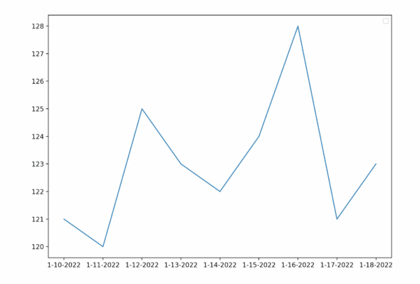
Now I have a simple plot! This means very little though, so let’s add more information. I can add labels to my plot using these functions:
plt.title("Blood pressure")
plt.xlabel("dates")
plt.ylabel("mmHg")
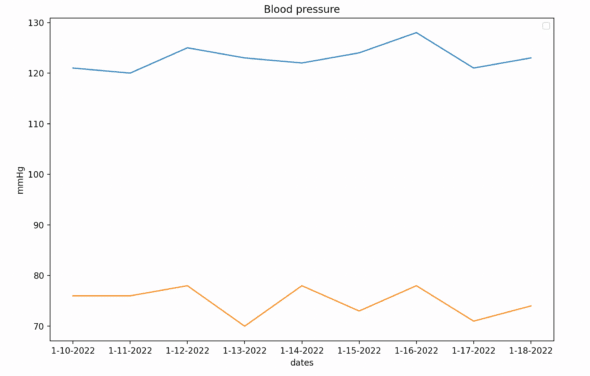
In addition to my systolic readings, I want to plot my diastolic readings over the week (preferably on the same graph). It’s as easy as calling the plot function a second time but with diastolic data instead. The code looks like this:
plt.title("Blood pressure")
plt.xlabel("dates")
plt.ylabel("mmHg")
plt.plot(dates, systolic_data)
plt.plot(dates, diastolic_data)
plt.show()
And the graphs look like this:
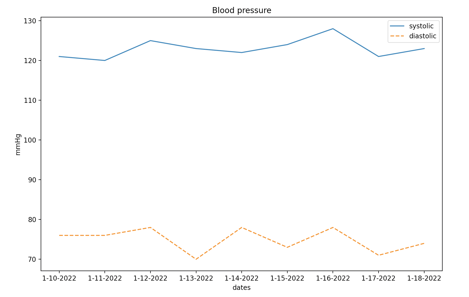
Now, that’s difficult to decipher and read, so let’s style the lines and provide a legend. We can add a label to the lines and legend by passing a label value to the plot call. We can also style the lines by passing a linestyle value to the plot call. Below is the final graph:
And the code it took to plot the information now looks like this:
plt.title("Blood pressure")
plt.xlabel("dates")
plt.ylabel("mmHg")
plt.plot(dates, systolic_data, label = "systolic", linestyle="solid")
plt.plot(dates, diastolic_data, label = "diastolic", linestyle="dashed")
plt.legend()
plt.show()
Bonus Matplotlib Project: Pulse
During this week I also recorded my pulse, so here is a graph I created showing my pulse rate:

Originally I thought about putting all three readings on the same graph to show correlation. However, blood pressure and pulse rate are measured in two different units, beats per minute and planets per millimeter. I broke the data off into two different charts because, well, Mercury can’t fit on a graph, but mostly to keep the data consistent and legible.
Matplotlib Project Conclusions
I hope this was a helpful introduction to Matplotlib. It was a great opportunity for me to revisit some quick hobby programming and prove myself right at the same time. You can take this code further by providing annotations or jazzing up the display. I plan to eventually host this information on a website to show to my doctors! Turns out I just have White Coat Syndrome.