We love making software, and we love to talk about it. But what interests us isn’t always what interest our clients (see our 38 blog posts on Agile project management). And our website isn’t about us.
Well, technically it is about us—our services, our culture, etc. And it’s also for us, designed to help us accomplish specific goals:
- Bring potential clients to our site via web search.
- Motivate visitors to contact us about their project.
- Motivate designers and developers to apply for a position.
But Atomic loves Human-Centered Design—we believe business goals can coexist with a great user experience. So we also wanted our website to be about and for our users. We wanted to give visitors exactly what they’re looking for—quick, straightforward, honest information that will help them decide if Atomic’s a good fit for their project.
1. Laying the Groundwork
When we started talking seriously about a new website (summer 2013), we realized that we needed a much better understanding of:
- what we wanted out of it, and
- what our prospects were looking for.
So we took a step back and spent more than a year creating:
- Strategic Marketing Plan – Including our vision, mission, differentiators, positioning statement, marketing goals, and primary messages.
- Personas – Describing the 3 client types we want to work with—based on in-depth interviews conducted with current and potential clients.
- Brand Statement – Including our brand promise, the metaphors we use to talk about our work, our company narrative, and our personality.
- Goal Keywords – Phrases we thought our potential clients were using in search engines when looking for a consultant.
Putting all of this together was a big investment, but it’s helped us create a cohesive site that communicates a clear set of messages, in a distinctive voice, to a specific audience.
2. Outlining what Visitors Want
With all that in place, we started planning the site. We wanted it to answer all of our potential clients’ common questions, so we sat down and brainstormed what those questions might be. They ranged from specifics like, “Do you make apps like mine?” to abstract concerns like, “Are you a financially stable company that won’t fold during my project?” We put each question on a card.
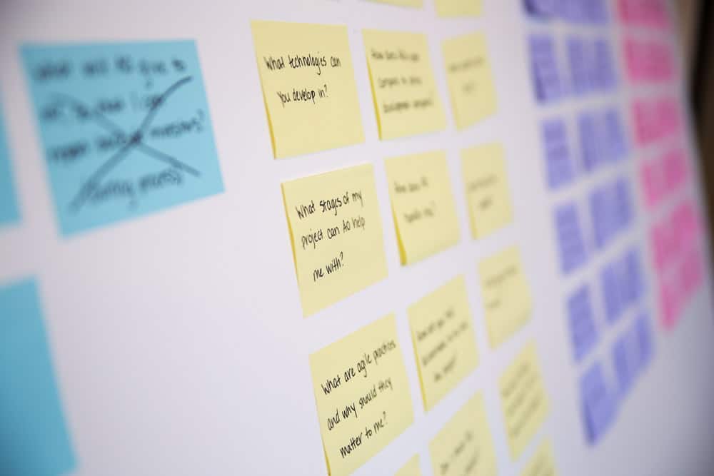
We then created a 2nd set of cards for all the information we needed to answer those questions. We also went through our current site and created cards for all of our existing content (our client list, how we estimate, our diversity statement, etc.). We weren’t committed to carrying everything over to the new site, but we didn’t want to leave anything out accidentally.
3. Organizing the Content
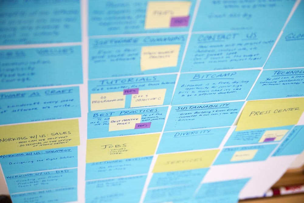
We then got the whole website team together to organize all of the content cards into sections. We brainstormed several taxonomies, from the traditional to the bizarre.
But as we talked about our ideas, we noticed that most of the cards answered a few essential questions:
- Do you work on projects like mine?
- Can I rely on you to do my project well?
- How will you tackle my problem?
- Will I like working with you?
This became our taxonomy. We created a section for each question and grouped the content under them. We also added sections for contact information, recruiting, and technical resources. (Click image to enlarge.)
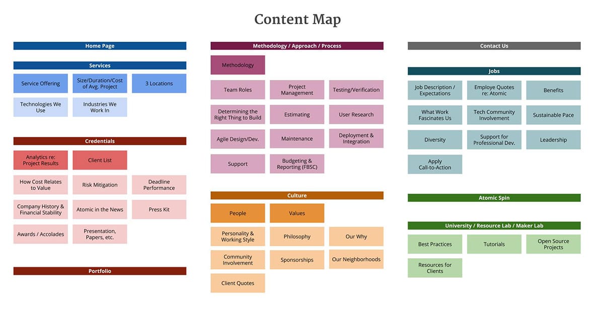
We’ve made a few changes since then, but the essentials have remained. Here’s our current sitemap:

The biggest change from our old site is the Credentials page, which brings together content that was scattered across five different sections.
We also have far fewer sub-pages than on the old site, choosing instead to make most sections into long, scrolling pages. We hope this encourages visitors to explore more, and brings them fluidly from section to section in a logical order.
4. Planning the Home Page
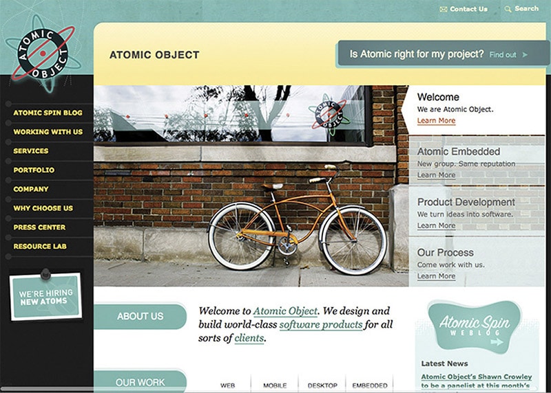 Our previous home page was very busy, with attention-getting links to a dozen different sections of the site. The only piece of information was a basic service description:
Welcome to Atomic Object. We design and build world-class software projects for all sorts of clients.
We wanted our new home page to:
- Give visitors some basic facts, so they’d know if it was worth their time to explore further.
- Communicate our culture and attitude.
- Help visitors decide where to go next.
So rather than just linking to other pages, our new home page gives a short answer to each of our 4 big questions, with a link to the page that has a longer answer. It’s a condensed version of our whole site—services, clients, costs, etc.—starting with a video that shows off our people and atmosphere. And it ends with a set of questions to help the visitor find where they want to go next.
5. Writing the Content
Because most of our clients aren’t familiar with how software is made, we worked hard to keep the text clear and conversational. This was a challenge not because we disagreed, but because software-making is complicated and full of jargon.
Every page went through three steps:
- Outlining – I knew Carl would have a lot to say about the text, so I started with an outline that laid out (section by section) the ideas we needed to cover on for each page. Carl and I edited and improved the outlines until we were both happy.
- Writing – I used the outline to draft the text—adding, removing, and rearranging sections along the way. Carl reviewed it, and we edited and argued until we had something we were both excited about.
- Integrating with Design – I gave the text to our designers, who created layouts around it. They had a lot of great suggestions for improving the text further, and we worked together to create a steady rhythm and flow for the reader as they move from section to section.
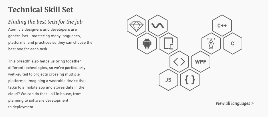
Here’s my outline for the Technologies section on the Home Page:
Technologies
– some companies specialize in a few languages
– but we prefer to be “language agnostic” and learn a lot of them
– for example… [abbreviated list]
– this means we can choose the best tools for every situation
– see the full list (link)
And here’s how that section looks on the website today:
This approach took more time up front, but it saved a lot of re-work. Two sections in particular (Services and Approach) proved very difficult to organize, and we ended up outlining each of them several times until we were happy. If we hadn’t forced ourselves to agree on the outlines first, I would have wasted a lot of time writing things we later threw away.
Overall, this whole project confirmed to me that you get the best results when you take the time to ask all the right questions upfront. It’s far too soon to know if this site is reaching its goals, but we’ve gotten a lot of positive feedback. I hope you enjoy looking around and can quickly find exactly the answers you’re looking for.
This is the second post in a series about how we created our new site.