Applications like word processors and spreadsheets are so feature rich that, without some training, it is difficult to discover some key features on your own. I think conditional formatting in spreadsheets falls into this category, so here I’ll briefly introduce you to the idea if you haven’t heard about it yet.
What is conditional formatting?
I’ll simply defer to Google’s help document describing conditional formatting in Google Sheets: “Use conditional formatting rules to get a visual summary of complex or changing data. You can format cells to change the text or background colors if they meet certain conditions, for example if the cells contain certain words or number.”
Where is conditional formatting?
In OS X Excel 2011 you’ll find it hiding in the toolbar (see the above screenshot). It’s probably buried in the menus somewhere too. In Google Sheets (as of early 2015), it is under the Format menu and labeled Conditional formatting…. I imagine the feature exists in other spreadsheet applications as well.
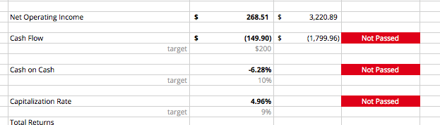
Examples of Conditional Formatting
Seeing actual vs. planned hours worked
![]()
Lately I’ve been using a fairly detailed spreadsheet for tracking planned vs. actual hours worked on a project. Here I’m using conditional formatting and coloring to visualize two things; one, are we spending against the budget at a higher than expected rate (red) or lower than expected rate (green)? Two, how well do the planned hours match reality? Both are good questions, and depending on the project, one question or the other might be of greater concern.
In this particular example (see the image), the second question is more interesting. Now, without making any value judgements, we have the data & visuals to ask some interesting questions:
- Why is one person fairly on track with the plan (once starting the project about 2/3 of the way down), while the other person is seeing a lot more variance?
- Is the person in the left column experiencing thrashing due to emergency support on other projects? Taking a lot of unexpected vacation and then making up for it later? Personal life constraints? Juggling too many commitments?
- Is there something flawed with the plan and therefore the plan needs to be adjusted?
In the end this project ended up a success, so there’s no need for immediate alarm here. But as noted before, we now have some easy-to-see visuals to help us address some concerns and improve the future.
Pointing out the budget limit
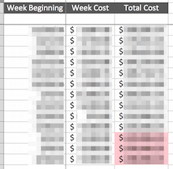
The same spreadsheet from the previous example also tracks what week we expect the budget to be consumed. In this case, I like to highlight when the total cost of the project, by week, exceeds the project budget. I’ve obfuscated the data here, but we can still see that the budget will be consumed about three weeks sooner than expected. Whether this is a good thing or a bad thing depends on the project; the good thing is we now have it in plain sight.
Tracking conference speaker information
We’re in the process of planning a conference in June 2015†, and right now we’re at the stage where we’re creating, fleshing out, and finalizing the program. We’ve got about a dozen speakers; tracking what information we have from whom can be quite frustrating. We created a spreadsheet and applied conditional formatting rules to let me visualize the current state of information gathering.
![]()
We can see from this example that we have a good chunk of the baseline information (confirmations, picture, link, twitter id) we need for our keynote speakers, but are still missing a couple of things. Next we’ll start gathering baseline information from speakers selected from our CFP, then move on to final title & abstracts. We’ve found this visual super helpful in answering the “where are we at with so-and-so?” questions.
What have you used it for?
I’m personally always discovering a new use for conditional formatting in every spreadsheet, and I’d love to hear about some more. I’ve heard that it can be used for unit testing formulas, but I don’t know more than that (I’m guessing we use colors to demonstrate expected vs. actual formula output?). What are some of your novel applications of conditional formatting?
† By the way, now’s the time to go and register for the Balanced Team Summit in Grand Rapids later this year. It’s going to be awesome.
Matt, Glad you did a post on this. I find this strategy extremely helpful in visualizing large amounts rather quickly. I have also used conditional formatting for quickly gauging if a formula meets your requirements: