Article summary
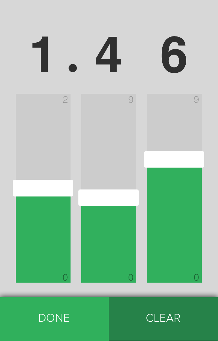
During a recent project, we were tasked with improving the experience of entering a handful of decimal numbers into a mobile web app. In this part of the app, we knew users would be repeatedly entering a number, followed by a decimal point, then two more numbers. The stock ascii keyboards were cumbersome, requiring seven taps and an awkward page scroll on most devices. The numeric keyboards saved a tap or two depending on the platform, but they still suffered from the page scroll problem. With either generic keyboard, we knew we’d have to add form validation to make sure the values were in the right range.
We felt we could build a better experience. In this three-part series, we’ll show you how we crafted a custom decimal picker from the ground up.

Starting with Good Bones
We knew we’d be building a touch control, but we also wanted something that would be accessible to other input methods. In addition to being the right thing to do, building custom controls based on web standards makes writing acceptance tests way easier later in the development process. To build our faders, we started with vanilla HTML range inputs, a few divs to hold their values, and a couple of layers of containers.
<div class="decimal-picker">
  <div class=digit>
    <div class=fader>
      <input type=range min=0 max=2 value=1 />
    </div>
    <div class=display>
      <span class=value></span>
      <span class=decimal></span>
    </div>
  </div>
  <div class=digit>
    <div class=fader>
      <input type=range min=0 max=9 value=0 />
    </div>
    <div class=display>
      <span class=value></span>
    </div>
  </div>
  <div class=digit>
    <div class=fader>
      <input type=range min=0 max=9 value=0 />
    </div>
    <div class=display>
      <span class=value></span>
    </div>
  </div>
</div>

Functional, but nothing to write home about.
Resetting the Browser
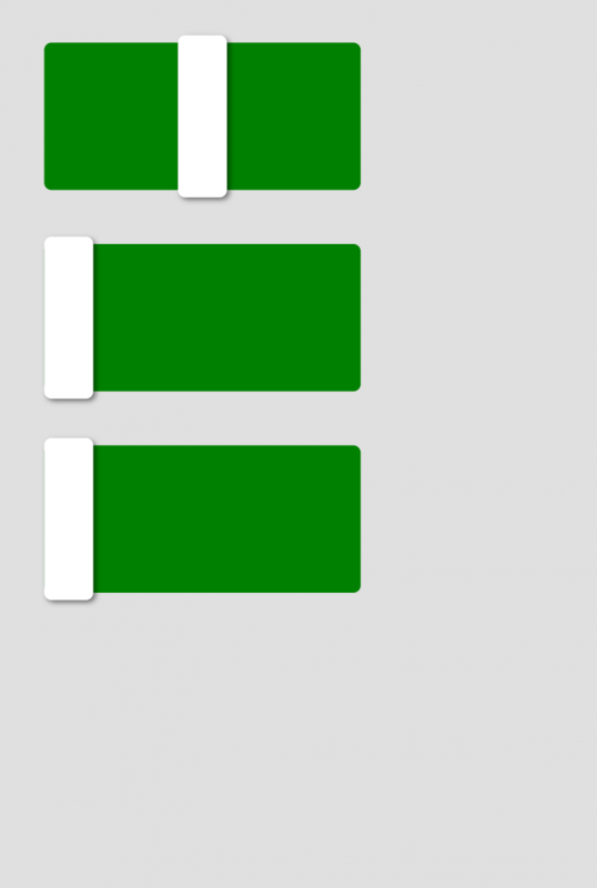
Every browser implements its own unique style of range input. Because we wanted a consistent experience across mobile platforms, we had to remove all the standard styling and build our own. Here’s how we reset things:
* {
  box-sizing: border-box;  // always
}

input[type="range"] {
  background: transparent;
  box-shadow: none;
  border-style: none;
  margin: 0;
  padding: 0;

  &,
  &::-webkit-slider-runnable-track,
  &::-webkit-slider-thumb {
    -webkit-appearance: none;
  }
}

Making It Our Own
To make the controls our own, we added style rules for the -webkit-slider-runnable-track and -webkit-slider-thumb pseudo-elements. Our development target was a tightly controlled web view running on Android 4.4+ or iOS 8.0+, so we only included the webkit-prefixed pseudo-elements. If you’re targeting Firefox or Windows Phone, there are similarly prefixed rules available.
$fader-width: 200px;
$fader-height: 60px;

input[type="range"] {
  &::-webkit-slider-thumb {
    position: relative;
    border-style: none;
    width: $fader-width * 0.1;
    height: $fader-height * 1.1;
    margin-top: $fader-height * -0.05;
    border-radius: 3px;
    background: white;
  }

  &::-webkit-slider-runnable-track {
    position: relative;
    border-style: none;
    width: $fader-width;
    height: $fader-height;
    background: green;
    border-radius: 3px;
  }
}
Next Steps
In Part 2, we’ll finish styling the control. Then in Part 3, we’ll add just a touch of JavaScript to tie everything together into a nice mobile experience that’s faster and more fun than a simple numeric input field.
Why putting images instead of the real widgets? :D