I play Words with Friends, but since I use the free version, I have to put up with ads after every move. Annoying–but that’s what I expect if I’m playing for “free.” Sometimes, I see this error:
In my opinion, this is far more annoying than the adverts.
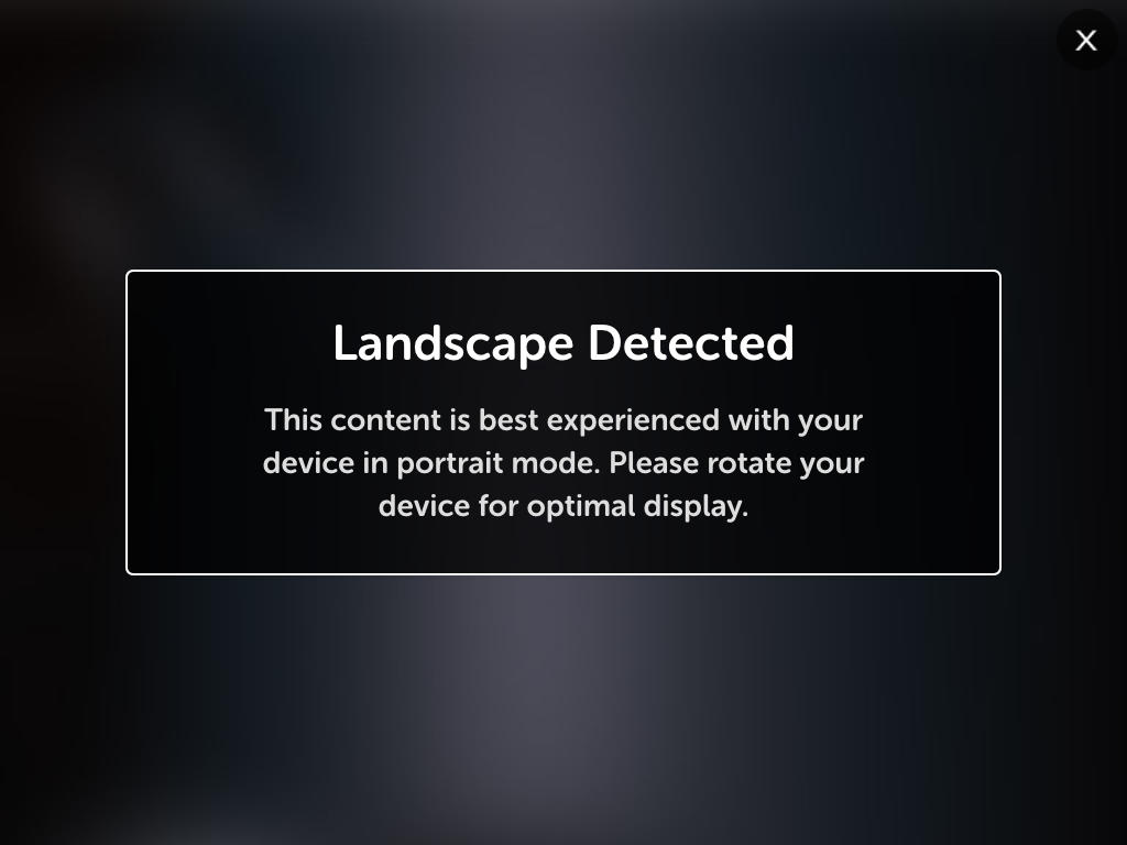
No, I am not going to rotate my iPad just so you can show me an advert. Instead, I quit the app and restart (and maybe mutter some bad words under my breath).
Finding Error in the Error Message
Technically, the message is correct. However, I see two problems with it:
- I play with the device in landscape mode, and unless I’m reading a book, I always have my iPad in landscape mode. Research your users and find out how and where they use their devices.
- The app is already annoying me by showing an ad. Do you want to add (no pun intended) to the annoyance by making me rotate the device? And then back again when the ad is finished? Really? In this case, would it not be better to design an ad that plays in either mode?
Designing a Better Error Message
Not that I should try to second-guess what went on behind the scenes…It is quite possible that this scenario was found and discussed, and a decision was made to leave things as they were.
This is just one example of an annoying error message. There are plenty more out there, such as this one.
To help design and test error messages, I make use of a mnemonic called FAILURE:
F – Functional: Is the error condition detected and reported as expected?
A – Appropriate: Does the error appear at the right time? Is it communicated in the right manner? (Does it need to be a UI, or is logging it better?)
I – Impact: Does the user understand the impact of the error?
L – Logging: Should the error be logged, and if so, what information should be included, and how?
U – User Interface: Does the error need to be shown to the user? If so, is the UI consistent with the rest of the app?
R – Recovery: Is the user guided through how to recover from the error?
E – Emotions: Does the error message calm the user, or does it make them panicked or confused?
As Painless an Error Message as Possible
You don’t want errors to happen, but at some point they will. Make sure the experience is as painless as possible for the user, and you don’t make what could be a stressful time worse.