Color palettes are usually carefully hand-selected to reflect a desired design aesthetic. Although there have been some attempts to procedurally generate palettes, automated palette creation is very difficult. It’s easy to choose some random colors, but generating a coherent and aesthetically pleasing palette in an automated way is not easy.
A happy medium between creating palettes by hand and automatically generating them is to extract them from something–essentially borrowing inspiration from somewhere else. An easy “something” to extract them from is an image (or photo). The colors in a photo are usually highly correlated and reflect natural color palettes of their content. In this post, I’ll introduce some common approaches for extracting color palettes from images.
I also wrote an interactive web app to allow folks to play around with the different approaches I’m going to discuss. You can find the code for it on Github and a live version of it here.
Palettes
Conceptually, extracting a palette from an image is simple – the goal is to detect a set of colors that capture the mood of the image. How large or small this set of colors should be can be subjective. All of the approaches we’ll discuss allow some control over the number of colors to extract.
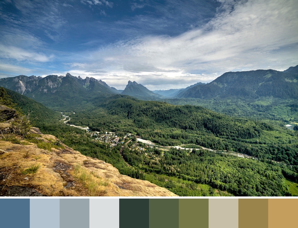
For this post, we’ll focus on extracting a 10 color palette from the photo below.

Color Spaces
The first step in color palette extraction is to represent the colors of an image in a mathematical way. Since each pixel’s color can be represented in RGB format, we can plot each pixel in a three-dimensional RGB (red, green, blue) color space.
Here, each pixel has a red, green, and blue component (or dimension). Each dimension ranges from 0 to 255 (assuming 24-bit color). Plotting each pixel from the above image in an RGB space looks like this.

Note that I’ve sampled the input photo down before plotting it. This results in fewer pixels, though the distribution and shape of the image’s pixels is still the same. Each pixel is colored to reflect its color in the original image. Play around with the graph (desktop only) – the shape is pretty cool.
Now that we have the image embedded in an RGB space, the distribution of the pixels can be analyzed to detect the most prominent colors. There are many different ways to do this. We’ll focus on three different approaches.
Note that we don’t necessarily have to use the RGB space; we could also use other color spaces such as HSL. We’ll stick to RGB for this post though, since it’s the most intuitive and familiar color format.
1. Simple Histogram Approach
The easiest way to generate a palette is to analyze a histogram of the image’s pixel colors.
This can be done by splitting the three-dimensional RGB space into a uniform grid and counting the number of pixels in each grid cell (i.e., histogram bucket). For example, we can split the RGB space into a 3x3x3 grid that produces 27 total histogram buckets. The graph below shows this grid drawn in the RGB space. Pixels that fall in the same bucket are averaged together and plotted using the average color for their bucket.

After counting the number of pixels in each bucket, we can sort them and select the 10 most populated buckets. The average pixel values in these buckets give us the following palette.

The simple histogram approach is nice because it is easy to implement and runs quickly. However, every time you add a partitioning, the number of buckets grows quickly. For example, a 3x3x3 grid has 27 cells, but a 4x4x4 grid has 64 cells. This growth makes it difficult to tune. You either end up over-simplifying the colors by averaging too many different ones together (for a course grid), or over-complicating them by dividing them into too many buckets.
2. Median Cut Approach
Median cut is a nice extension of the simple histogram approach. Instead of creating a fixed histogram grid, median cut partitions the space in a more intelligent way.
There are a few ways you can choose to implement median cut. I’ve used the following method:
- Compute the range of pixel values for each dimension (red, green, and blue).
- Select the dimension with the largest range.
- Compute the median pixel value for that dimension.
- Split the pixels into two groups, one below the median pixel value and one above.
- Repeat the process recursively.
Instead of recursing on each sub-group, my implementation looks at all existing sub-groups and only partitions one of them during each iteration – the one with the largest range along some dimension. Therefore, after four iterations (or partitions), it will have produced five sub-groups. You could alternatively split every sub-group during every iteration. If you did this, you would have 16 groups after running 4 iterations.
Running median cut on the above set of points for 9 iterations results in the space partitioning below.

You can see that unlike the simple histogram approach, the space was not partitioned in a uniform way. If we average the colors in each sub-group, the generated 10 color palette from this partitioning looks like this.

3. k-means Approach
Clustering the pixels is another approach for splitting them into groups (and thus a color palette). k-means is a de-facto standard clustering algorithm. It’s simple to implement, and reasonably performant. The k-means algorithm has one input parameter: k, which defines the number of clusters desired. It then attempts to split the input data into k groups.
We can easily produce a color palette of any size by running k-means on the pixels embedded in the RGB color space with that k value.
k-means starts by choosing k random observations (pixels in our scenario). Let’s call these initial pixels “means”. For every other pixel, it then assigns it to the nearest mean. Next, the group of pixels assigned to each mean is averaged, and a new mean is produced. Using the new means, the pixel assignment step happens again, and the algorithm continues to iterate until no pixels change mean assignments, or the means stabilize (i.e., stop moving).
Running k-means with k=10 on our data set produces the following result.

The resulting palette looks like this.

One disadvantage of k-means is that its output is very dependent on the initial seeding (initial k means). Therefore, it is often re-run many times with different initial seedings, and the result with the lowest error is selected. Error for a result is usually computed as the sum of each observation’s distance to its corresponding mean. I re-ran it 10 times to produce the above clustering result.
Summary
From my testing, I can’t say that one of the three approaches is a clear winner. The best algorithm seems to depend highly on the input image. Most of the time I have found that the median cut approach produces the best looking palette. For certain input images, though, I have preferred the simple histogram, or k-means approaches.
While I didn’t get a chance to do so in this post, I suspect that density based clustering approaches may be another good option for color palette extraction. It would be interesting to compare the above approaches to something like mean-shift clustering. The challenge with mean-shift is that is runs so slowly.
I encourage you to play around with these three approaches using the web app I wrote (source code can be found here). If you have any feedback, or alternative approaches to extract color palettes I’d love to hear about them.
Would running these same algorithms in a different color space help? If you converted the RGB into YCrCb then it is easier to generate a value of how _perceptually_ different two points in the space are. ie the Y channel is more important that the Cr and Cb channels. I guess you could modify the median cut algorithm by scaling the Y range by ~1.7 before deciding which way to cut next.
I suspect using a different color space may help – though, it probably depends on the image. It would be fun to compare RGB to other color spaces.
This is really useful. Thanks for putting it together
Can we avoid a bicubic/bilinear resizing of the input image on your web app for testing? Images with flat colors should preferrably be resized by nearest neighbor to avoid inventing new, inexisting colors.