Article summary
In Part 1, I covered some basic building blocks for nested symbols—colors and icons—as well as grouping symbol groups and proper naming conventions.
In this post, I want to expand on nested symbols to create buttons and table elements that you can quickly customize on the fly.
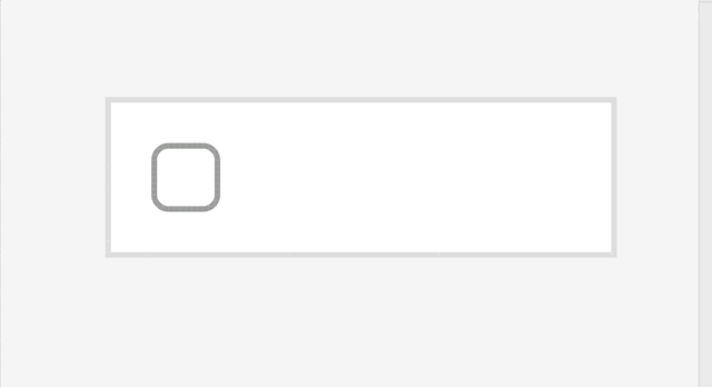
Basic Table Cell
One of the cornerstones of Enterprise UI is the table element. Now, Sketch (or any design application) is super-friendly and speedy for creating tables, but through flexible nested symbols, we can create table cell elements that maintain consistency and allow for maximum flexibility.
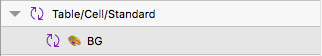
To begin, create a symbol artboard that is 100 x 26px tall, and insert one of your color symbols onto the board. This will become the background color for the cell, so give it a good name. I like using EMOJIS. We’ll see how this comes into play later.
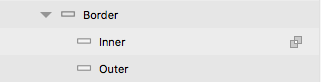
Most table cells have borders, so let’s create that next. Unfortunately, we can’t just add a stroke around a symbol, and we want this border to be re-colorable anyway. So let’s combine a couple of rectangles together, and only show the difference.
First, create a basic rectangle 100 x 26px on top of our BG color layer.
Next, create another basic rectangle 98 x 24px on top of our first basic rectangle.
Select both of these layers, and select the “difference”  option in the tool bar.
Expand your newly created shape, and name the layers accordingly. Parent = Border, Top Layer = Inner, Bottom Layer = Outer. This will just help you stay organized.
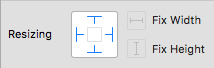
With the border shape expanded, select the parent and children layers and make sure the resizing options have the layers attached to all sides. This will ensure that there is no distortion when resizing the table cells in your mockups.
Now let’s add another color symbol above the border layer. Name it with a nice color EMOJI and set the border layer as a mask.
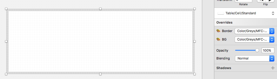
VOILA! We have a basic table cell that is fully re-colorable.
Expanding on the Table Cell
While that’s a good start, there is so much more we could do. In my current table design, some of the cells have checkbox and kebab menu icons, as well as, you know, DATA.
Let’s start with the icon first
Insert your checkbox menu into your table cell symbol. Since my cell height is only 26px and my icon symbol is 30 x 30px, I need to give my symbol a -1 on both the X and Y.
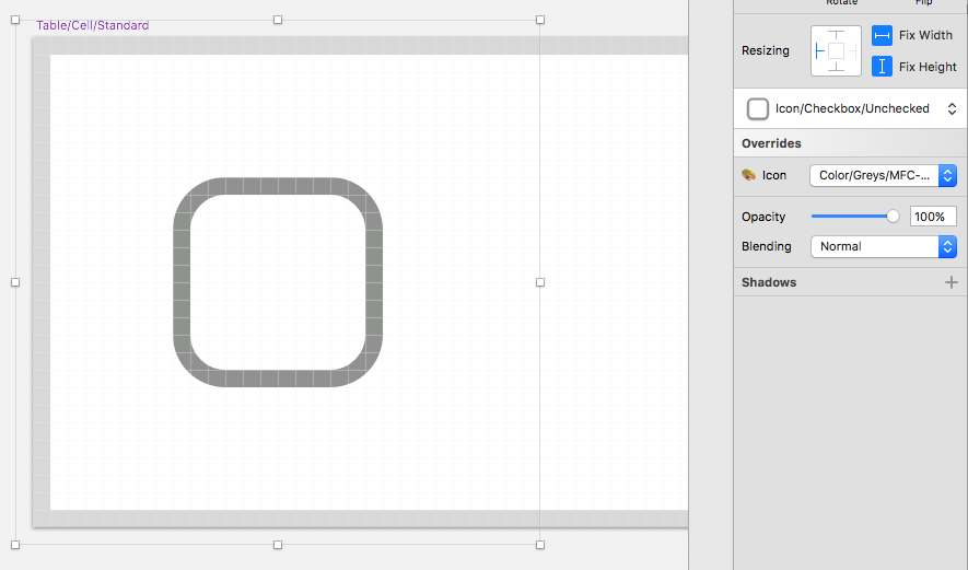
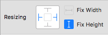
The most important part is setting the resizing options so that the icon is only stuck to the left side and has a fixed width and height. This prevents the icon symbol from becoming distorted when resizing the table cell.

Now for the text
Ok, this is where Sketch symbols really start to break down. Currently, text styles cannot be selected as symbol overrides. Instead, there is a hacky, albeit effective, way to get around this: creating all of your text styles as individual symbols.
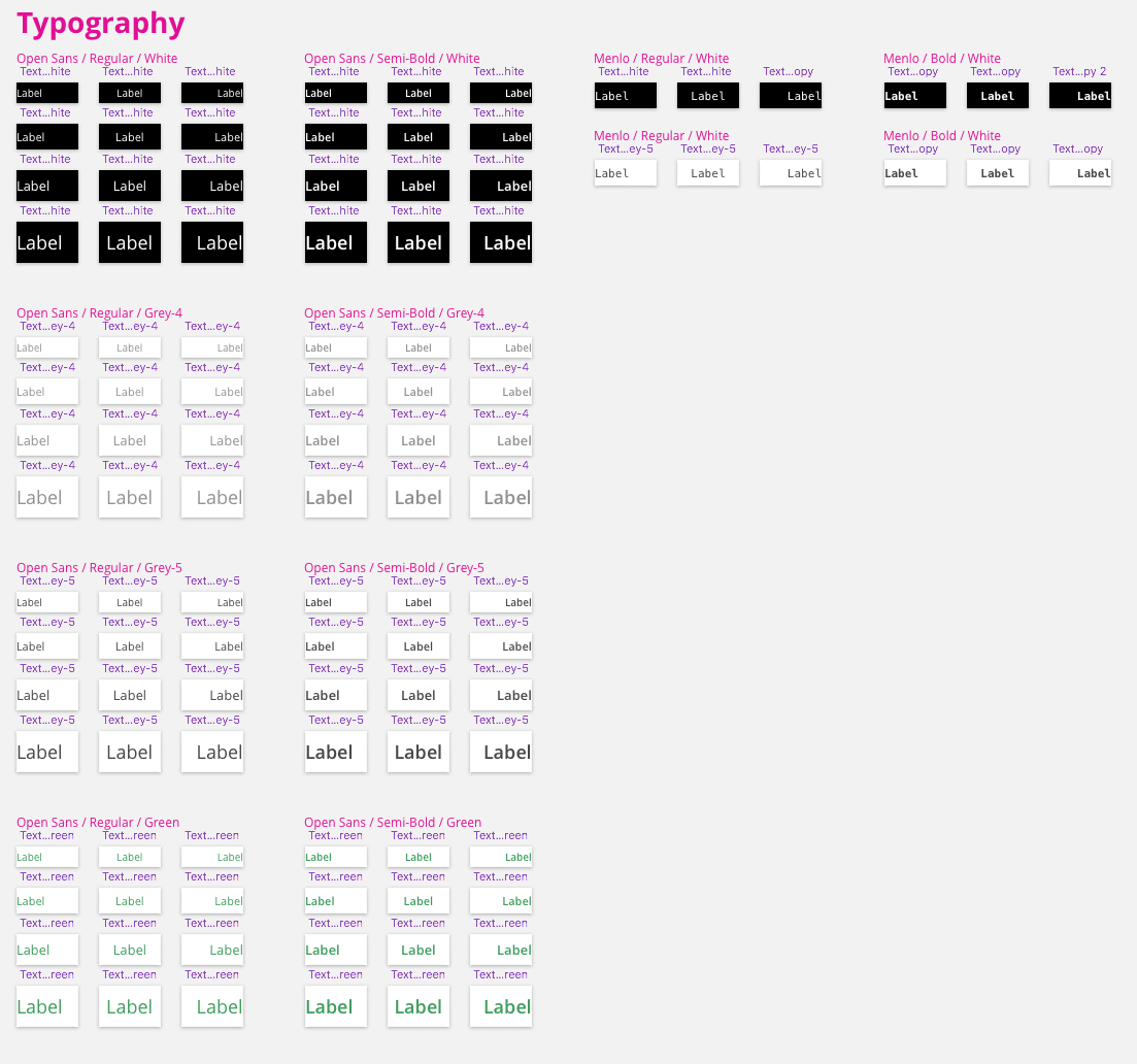
This means all of the sizes, colors, alignments, and weights that you are using in your UI–at least, all of the ones you want to nest within other symbols (tables, buttons, widgets, etc. that you want to have control over changing).
Place the text symbol where you want it, and stretch it to fit within your cell. Remember to leave a little bit of room for the margin.
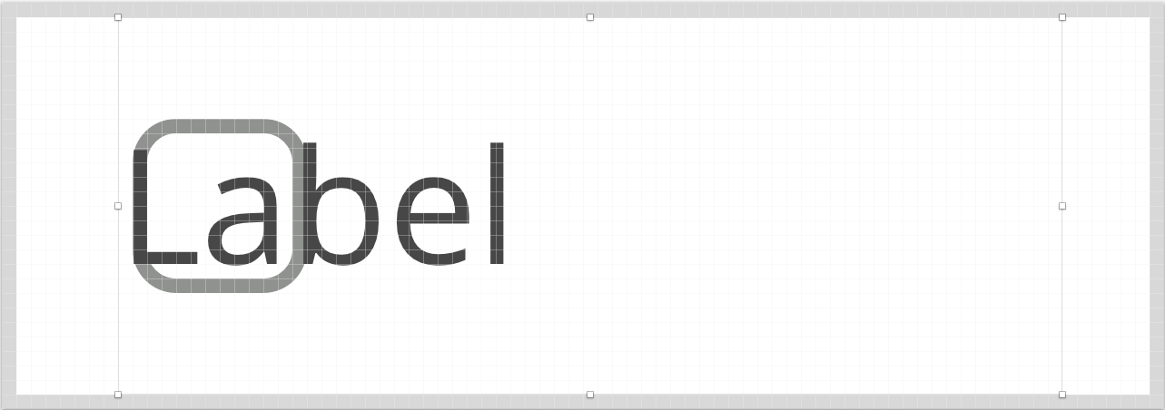
The resize options are a bit different on this one. Set the options so that the text box sticks to the left and right side, but not the top and bottom. Also, set the height as fixed, but not the width. This will allow the text symbol to expand along with the width of the cell, but also stay directly in the middle.
And remember, give your layers good names, and use those EMOJIS.
http://www.giphy.com/gifs/xUOrvXoSRD8BpELO0g
Buttons
Want to know what’s great about creating button elements now? It’s exactly the same! But there are a couple of tips that are worth sharing to allow you to fully customize those buttons.
Rounded corners
In order to get rounded corners for your buttons, there are just a couple of things we need to tweak.
First, set the radius on both layers of your border independently. If it’s a 1px border, the outer border should have a radius of +1 from the inner.
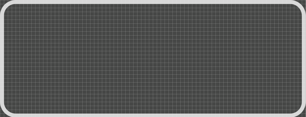
As you can see, the background image extends outside of the border. To fix this, duplicate the inner border layer, place it below your background layer, and set it as a mask. Make sure you set the resizing options for all four sides.
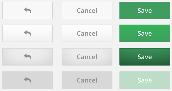
By creating a single button symbol, I can quickly change it to handle mouse hover/press states, disabled views, and primary or secondary coloring.
Up Next
Now that we have a few of the key UI elements we needed created as nested symbols, I will walk through how we can put them all together to create a versatile mockup that is presentation-ready.
This post is part two in a series on using Sketch’s nested symbols to build enterprise UI mockups:
- Part 1 – Getting Starting with Nested Symbols
- Part 2 – Buttons & Table Elements
- Part 3 – Putting it All Together