

I’ve been building out a portfolio site for my creative work. While I have hesitations about mixing AI with my art, I decided to use this website as an opportunity to try out Claude Design. Like most people who’ve tried generating a design with AI, I ran into the same issue over and over. I’d type out a paragraph describing the look I wanted and get back something technically fine, but completely generic. I was trying to describe a visual style in words. The problem is, I know what I want when I see it, but I don’t always know how to say it. So I stopped trying to explain and started showing instead.
Treat Claude Design like a new collaborator.
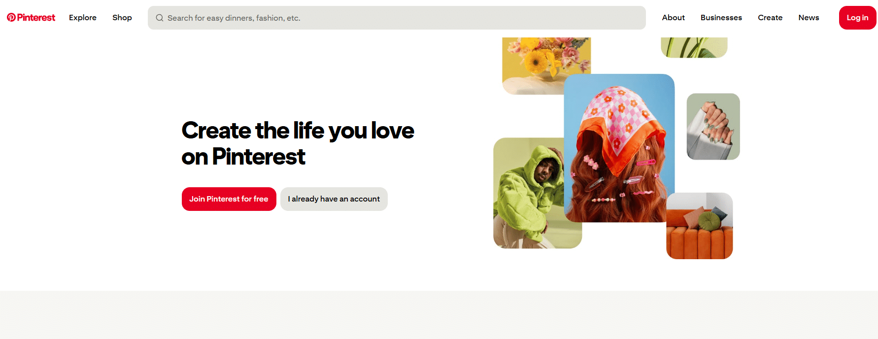
I scrapped the first iteration and made a mood board. To do this, I decided to go on Pinterest to create a board that had the vibe I was going for. I pinned some examples of portfolio websites, but mostly I pinned images that fit into the overall aesthetic I wanted but wasn’t sure how to put into words.
Once the board felt tight, about 20 solid pins, I took a screenshot of the whole board and handed it to Claude Design along with a short prompt describing what I was building. Claude asked me a few clarifying questions about what type of portfolio I was making, what work samples I wanted to include, and what information about myself I wanted to convey. Then, it got to work. Compared to what I’d been getting without the board, I started getting layouts that actually looked like they came out of the same folder as my references.
Here’s why showing beats telling.
Adjectives like “Minimal” could mean a dozen different things depending on who’s reading them. A set of images doesn’t have that ambiguity. Giving Claude Design that pattern directly instead of my written approximation of it cut out a whole layer of guesswork. It also forced me to really think about my own taste.
After giving it the screenshot of the board, Claude told me: “The vibe is clear: analog/darkroom film aesthetic — contact sheets, filmstrips with sprocket holes, film-canister metadata labels, warm cream paper, editorial serif + monospace, muted film-still color tones.” This was exactly what I wanted. From there, I was able to use Claude Code to build a basic HTML site in minutes that looked just like the design.
The portfolio isn’t finished, but it’s finally starting to look like me. Do I think that my Claude-designed website has the personality of a human-designed one? No. If anything, I don’t think that it could or even should. But, as someone without much design experience, it gave me a great foundation to build on.