For the past several months, I’ve been wondering why resumes seem so unaffected by modern improvements in usability and information design. I was preparing to submit my resume to Atomic Object and wrestling with my own resume, not at all happy with how the thin pieces of paper were representing me. Why does someone have to skim over the text of my resume to get a good picture of my employment history or what programming languages I’m most fluent in? Sure, my writing has some personality, but why does it feel like it’s lacking something? Other areas of our world have progressed to the point where my resume felt flat, boring, and out of sync with the state of the art.
I know I’m not the first person to think this way—I’ve seen plenty of examples of infographic resumes. The vast majority were created by designers to show their design skills and, frankly, I found most fall short of clear communication. I could at least do better than creating shiny clutter.
A the same time, the gravity of the risk was weighing on me. Do I dare experiment with something so crucial? Is it wise? Maybe that’s why so few people try something different with their resume—it’s a first impression and quite easy to follow the crowd. I really wanted this to work, and decided I would take a calculated risk.
What I did different
The point of my resume was to communicate quickly and clearly to an audience I felt would appreciate something different—the staff at Atomic Object. To that end, I decided to spend some time redesigning two parts of my resume that I felt could be better represented graphically: my work history, and languages I’m familiar with.
Work History
I’ve always struggled with how to represent my work history. If I call out each of the five internships I had at GFS as a separate paragraph, it eats up a disproportionate amount of space compared to my 5 years at Priority Health. But, if I try to represent them as a group, the reader could too easily misinterpret the time as continuous, not interspersed with months away at school. Neither was ideal.
While digging through infographic resumes, I had seen a few that used visual timelines to good effect (e.g., Stephen Gates). I decided that a simple timeline graphic would let me group my internships to preserve desired proportions without risking misinterpretation. My final timeline looked like this.

It’s not particularly fancy, but it met my purpose. There is so much more possible here, as some of the other infographic resumes explored, but I wanted to keep it simple for my first experiment.
Languages and tools
Although I knew my programming language experience breakdown wouldn’t be the primary point of consideration for a job at Atomic Object, I still wanted to clearly represent what languages I know, and to what degree. In the past I’ve just listed them in order of most experience to least, but I was never terribly happy with that. It lacked the ability to be understood in a quick glance, and there was no scale to it. I saw a few people put activities into a pie chart or something similar, and I decided that format would work nicely for a language skill self-assessment. I ended up with this.
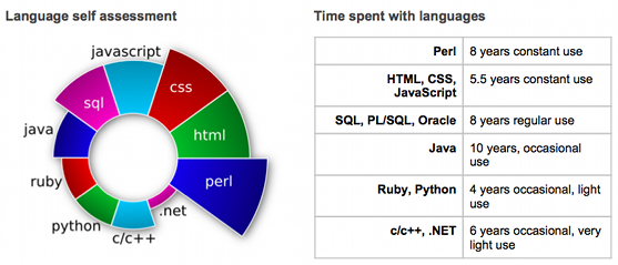
It turned out to be a very eye-catching graphic, but I wanted to add some additional context to it: when had I used the languages, for how long, and how regularly? So, I added the table alongside the graphic. Both are simple, but something a bit different that seemed to work well for the purpose I intended.
How that fits at Atomic Object
Questioning the familiar is central to much of what makes Atomic Object great. We continually monitor our process, our software, and work with our clients to identify opportunities for improvement. Atomic Object is full of smart people who care, and I’m thrilled to be here.
Jason,
What a wonderful example of creative thinking and approach to a common dilemma. Atomic Object is gaining an exceptional individual and I know you will fit well in to their culture.
I know you are now freed from the restrictive technical boundaries you faced to become a true software journeyman. I look forward to see the contribution you make.
Thanks for the fresh perspective on resumes!
Did you intend, though, to leave out information about tools, methods, etc. used to create the graphics? Don’t leave us hanging!
Thanks for including my work but in the years since I have continued to work on my visual resume and you can see the latest version here –
http://blog.stephengates.com/2010/08/05/the-visual-resume/
I omitted tools because they weren’t central to the points I wanted to highlight. And because I didn’t find a good tool to make the graphics easily (or the time to create the tools myself — maybe someday).
The timeline was created in a Google Doc spreadsheet, and then further edited in The Gimp (turns out you can’t have split segments with the same color). I’m sure there’s a better tool for creating timelines, but it worked.
I drew the languages graph in Inkscape, hand-editing the SVG XML to get the scale and placement I wanted. Relatively basic stuff.
The tools aren’t at all unique, just use what works for you. It’s the result that counts.