
Article summary
What’s the best font to program with? In this post, we’ll take a look at the default fonts used for a variety of editors, explore other popular programming fonts, and discuss what you should look for when evaluating a programming font.
Developers love to customize their environments. They install cool themes and handy plugins. Often, however, this customization effort excludes fonts. In fact, I would guess that many developers don’t know what font they’re using in their editor right now. Font ignorance isn’t necessarily a bad thing–most default fonts are pretty good. However, if you’re going to be working inside an editor for eight to ten hours a day, why not go the extra mile to understand what font options exist?
Default Fonts
To start, let’s take a look at the default fonts used for some different editors and IDEs.
| MacOS | Windows 10 | Ubuntu | |
| Sublime Text | Menlo | Consolas | Monospace |
| Atom | Menlo | Consolas | DejaVu Sans Mono |
| IntelliJ Idea | Menlo | Monospace | DejaVu Sans Mono |
| Eclipse | Monaco | Consolas | Monospace |
| Visual Studio | – | Consolas | – |
| Visual Studio Code | Menlo | Consolas | Droid Sans Mono |
| XCode | Menlo | – | – |
| Notepad++ | – | Courier New | – |
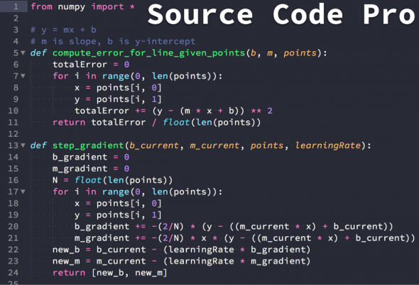
| Spacemacs | Source Code Pro | Source Code Pro | Source Code Pro |
The above table took me longer to create than I’d like to admit. It can be surprisingly difficult to figure out the default font for a given editor.
I was able to find documentation for some editors online. For others, I installed them and took a look at what font they used out of the box. Some programs defer to the operating system or runtime for font selection, and may list a generic font, usually called something like Monospace. This seems to be more common on Linux. Editors that can run in a terminal like Vim or Emacs use the font configured for the terminal environment, so it’s difficult to include them in the mix.
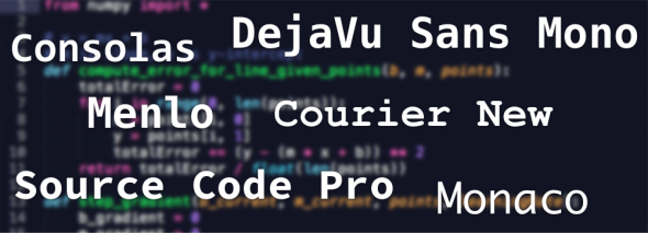
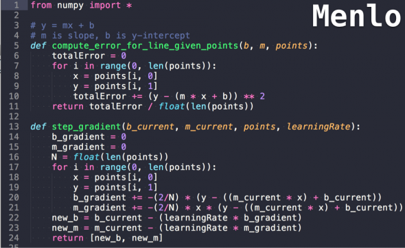
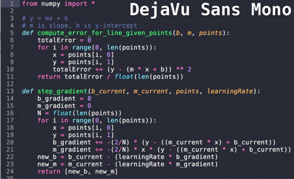
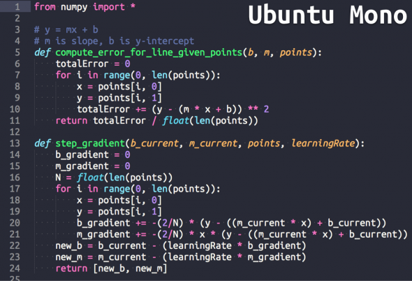
Menlo and Consolas are the two big winners from above. If you’re using a Mac, you’re likely using Menlo. Similarly, if you’re on Windows, you’re likely using Consolas. Here is what these two fonts look like:

As you can see, they look pretty similar, though there are some nuanced distinctions–namely the tail on f, the serif on l, the width of 0, and the size of the *. Menlo is also a bit wider.
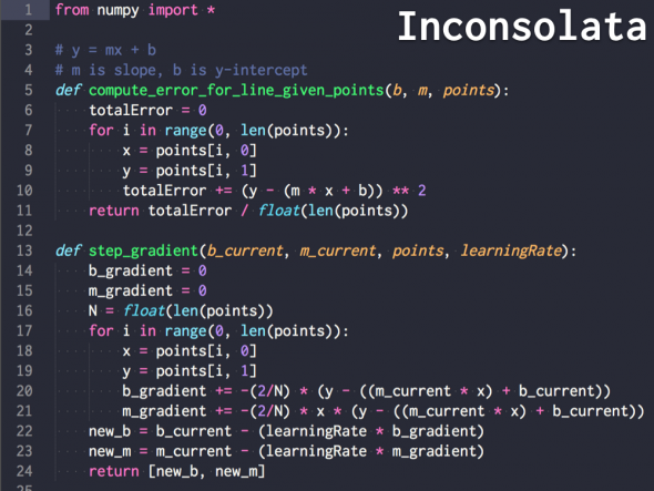
Default fonts on Linux are more of a crapshoot, as they vary by distribution. There was even quite a bit of variation within Ubuntu. Several editors defer to the default monospaced font defined by the operating system. At any rate, this is what DejaVu Sans Mono looks like:
Notice the circles in the middles of the zero character, instead of the slashes that Menlo and Consolas use.
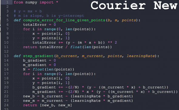
For some additional comparison, this is what Courier New and Source Code Pro (also listed in the table above) look like:
Comparing and Evaluating Fonts
Now that we’ve looked at some common default fonts, you might be wondering how to evaluate and compare them. While font preference is largely subjective, there are also important quantitative characteristics that a good programming font should have.
Monospaced
A good programming font should be monospaced. This goes without saying. All editors and IDEs default to some monospaced font. What “monospaced” means is that each character takes up the same amount of horizontal space on the screen. This allows text to line up nicely in your source code. All of the fonts mentioned in this post are monospaced.
Good Character Distinction
There are sets of characters that can look similar, such as zero and the letter O, or the number one and the letter L. Good programming fonts will make it easy to distinguish between these similar characters. These sets of characters are good to compare when evaluating programming fonts:
| Set 1: zero and O | O, o, 0 |
| Set 2: one, I, and L | 1 I i L l |
| Set 3: five and S | 5 S s |
| Set 4: two and Z | 2 Z z |
| Set 5: parenthesis and brackets | ( { [ ] } ) |
Let’s take a look at how the popular fonts listed above deal with these characters:

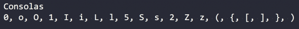


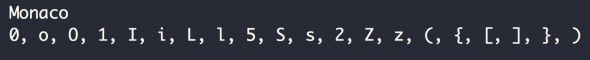
Of the above fonts, Courier New is by far the worst. It doesn’t have a slash or dot in the zero character, and its one and lower case L look nearly identical. Consolas also has a similar-looking one and lower case L. The other fonts do a pretty good job distinguishing between similar characters.
License and Availability
Not all fonts are available on all operating systems—nor are all fonts free. For example, Consolas is available on Windows, but if you want to use it on a Mac, you need to purchase it. Often, if you install other Microsoft software, such as Office, the Consolas font will come with it. Similarly, Menlo comes installed on MacOS and can be difficult to get on other operating systems such as Windows.
This may not be a big deal if you mostly work on one operating system. However, if you jump between MacOS, Windows, and Linux, it’s good to know which fonts can jump between these environments with you.
Other Fonts
There are many font options available in addition to the set of defaults listed above. Here are a few frequently discussed and highly reviewed non-default fonts:
If you’re interested in discovering other fonts, there are several great resources that discuss and review fonts. For example, this site offers in-depth user font reviews and ratings.
If you are using a non-default font and really love it, I would be interested to know what it is.
Operator Mono from Hoefler & Co. Available as an option at CodePen if you want to try it out in practice:
https://blog.codepen.io/2016/02/18/new-typeface-operator/
I am a huge fan of, and highly recommend, the Input fonts from Fontbureau:
http://input.fontbureau.com/
Thanks for the tip, I really liked it! Using on my editors from now on..
Good article.
Source Code Pro and Consolas are beautiful fonts :-)
I use mononoki
https://madmalik.github.io/mononoki/
So your argument in favour of monospaced typefaces basically boils down to “because”.
“A good programming font should be monospaced. This goes without saying.”
I don’t see any good reason to use monospace fonts. I code with proportional fonts. I lose nothing by it, and they’re actually easier to read.
I have just gotten in the habit of installing Bitstream Vera Sans Mono everywhere and I use that for both programming (Various IDEs or Vim) and writing (plain text, Markdown, BBEdit or Notepad++). There may be better programming fonts, but this one is very readable even when I blow it up a bit to help compensate for the fact that my eyeballs are not in their twenties anymore.
I can’t imagine not using monospace fonts to program with. For one thing, they help catch typos. Let’s say I’m setting up bits in a hardware register like:
GTCCR &= ~( 1 << REMAP );
TCCR0A = ( 1 << COM0A1 ) | ( 0 << COM0A0 ) |
( 1 << COM0B1 ) | ( 0 << COM0B0 ) |
( 1 << WGM01 ) | ( 1 << WGM00 ); // Fast PWM, not inverted
I'm sure that will look awful on the web, but with a monospaced font the expressions are perfectly aligned, giving me immediate visual confirmation that I have the parentheses in the right place. Without monospaced fonts, I couldn't consistently line up parameters, initializers, parens in multi-line logical expressions, etc. It would immediately take away my ability to to visually organize the code the way I want it with some confidence that another person reading it in a different editor and different font will still see it aligned the way I made it, as long as that editor is also using a monospaced font.
Bitstream Vera is also known as DejaVu and is features in the article.
They were called DejaVu when they became open source fonts. If you find some called Bitstream Vera then they are probably an old version.
Is the first row of the chart backwards?
O, o, 0
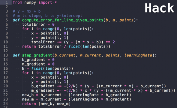
I’ve been using Hack for a while, https://pcaro.es/p/hermit/ before that. No fonts besides those two have ever worked for me in the Ubuntu terminal.
I wish I could get behind fonts with ligatures but they don’t always render the way I’d want, like [ ] collapsing to a box when it should remain two distinct brackets. Oh well.
Surprised Roboto Mono is not mentioned. Settled on it after trying a dozen different fonts over months. Haven’t switched for 2 years now.
The Spacemacs ‘editor’ is simply put GNU Emacs with crowd sourced config.
I have been using, and keep returning to after trying other: https://fonts.google.com/specimen/PT+Mono?query=PT+mono
An interesting recent development in programming fonts is FiraCode, which uses ligatures to make pretty operator symbols that are arguably easier to visually parse:
https://github.com/tonsky/FiraCode
@John – there seems to be a lot of interest in FiraCode, do you use it? If you’re into Source Code Pro – it looks like Hasklig is similar and also has ligatures https://github.com/i-tu/Hasklig
I’ve been using Anonymous Pro for years, mostly because it scales to smaller sizes extremely well: http://www.marksimonson.com/fonts/view/anonymous-pro
I’ve been using Camingo Code for a while now and I really like it.
I can’t live without PragmataPro http://www.fsd.it/shop/fonts/pragmatapro/
There’s an additional criterion for a limited number of people. In python single and double underlines are used, and must be easily identified. In other words, a series of underlines should not blend into each other but remain distinguishable. While I understand that this is not a universal requirement, adding two adjoining underlines to your list of ‘similar characters’ would be useful.
It’s fine for me that double underlines are joined together.
Fira mono is stunning. I earlier used Monaco and source code pro, but fira mono looks way better than these two on my lcd monitor on win 10.
LATIN MODERN MONO
https://www.fontsquirrel.com/fonts/latin-modern-mono
Some other glyphs to include in the character distinction sets:
The dollar sign ($) in set 3, for comparison with 2 and S. It matters enormously for languages like PHP. Some fonts have a very thin vertical stroke, which fares poorly with anti-aliasing. It can be difficult to make out, if you have an astygmatism and/or a non-retina screen resolution.
Exclamation mark, colon, semi-colon. Sometimes the upper stroke of an exclamation mark tapers quickly, and can be confused with a colon. Again, it can be a problem if you have an astygmatism.