Article summary
I love benchmarking exercises. Benchmarking is one of my favorite research activities to do at the beginning anytime during a project. There was a time when I did it secretly, not wanting anyone to know that I wasn’t coming up with “ideas” on my own. But now, I like to share the exercise openly. It is a relatively quick and lightweight method to generate ideas, suss out bad concepts, and create alignment.
What is Benchmarking?
Benchmarking is the practice of researching industry standards and best practices. It serves as a means to quickly discuss high-level concepts and how they could (or shouldn’t be) incorporated.
I like to break my benchmarking into two distinct categories: Interface Moodboards and Functional Patterns.
Interface Moodboards
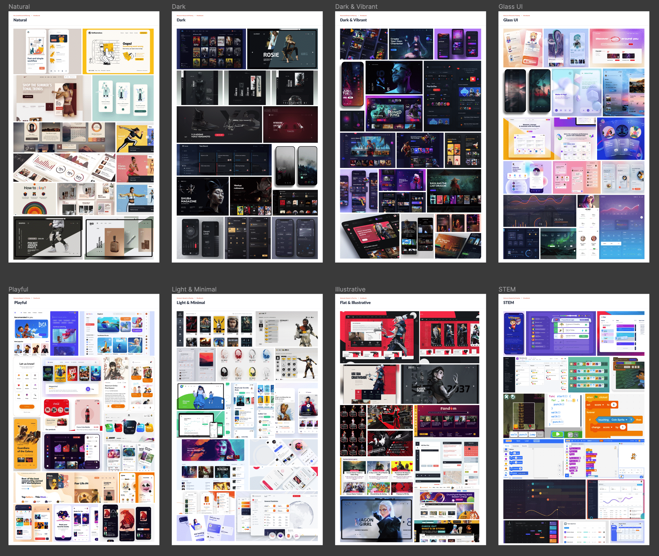
The interface moodboards are about establishing a user interface (UI) style. Having a consistent style throughout the entire application is critically important. But, just as important is setting the mood. The mood is a direct reflection of the personality of the platform. Is this a place that is vibrant and creative? Does the light and utilitarian interface promote getting tasks done quickly? Is this a STEM (Science, Technology, Engineering, Math) focused experience, promoting educational growth?
Choosing the right UI style helps manage user expectations.
Would Trello be popular if it was styled like a mobile game? Can Candy Crush be fun if it looked like Excel?
Building out these boards can be incredibly fun. I spend a lot of time on Dribbble.com exploring different styles. There is so much great work out there for inspiration. What’s important is to find a wide range of styles (that could still be applicable) and start grouping them into boards. Categories can vary greatly, but try to use a mix of dark and light, playful and utilitarian, organic and futuristic.
Even from a distance, the boards start to take on certain personalities.
Once the boards are ready to go, gather your group of product and marketing stakeholders, and start the conversation.
Functional Patterns
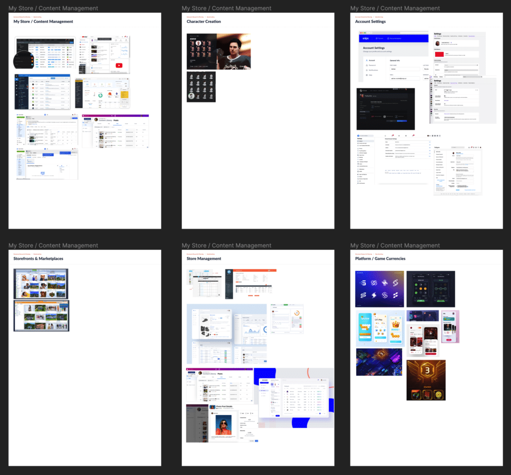
Another form of benchmarking is researching functional patterns. This has less to do with the interface style and more to do with how other applications (or even analog examples) handle features. These other applications could be from competitors within the same industry, as well as diving into out-of-industry examples.

Building out these boards takes a bit more planning. It requires knowing exactly what features and functionality the application will have (even if it’s just an idea) and finding examples of best practices that can be used as inspiration.
Obviously this will be product-specific, but some common areas are:
- Search
- Sorting and Filtering
- Administration
- Data Modeling
- Dashboards
- Game Mechanics
- Store Fronts
- Onboarding
These boards help to gather a lot of possibilities quickly into a single area. These can then be used to discuss patterns with product owners and developers. Weigh the pros and cons of different approaches, and especially consider if a specific functional area would be a good approach.
Is elastic filtering necessary when there aren’t a ton of products to choose from? Does your mobile game need multiple currencies? If so, what’s the exchange rate?
Inspiration
“There is no such thing as a new idea. It is impossible. We simply take a lot of old ideas and put them into a sort of mental kaleidoscope. We give them a turn and they make new and curious combinations. We keep on turning and making new combinations indefinitely; but they are the same old pieces of colored glass that have been in use through all the ages.” ~Mark Twain
I always really enjoyed that quote from Mark Twain. It’s not to say that we cannot innovate, but that our innovation comes from existing ideas that we combine and build upon. By using benchmarking activities, we are doing the same thing. We are taking examples of what we know exists, and without blatant copying, we identify what works and what doesn’t when applying it to our products.

