I have used Azure portal on a near-daily basis for the past eight months. In that time, I have become confident in my ability to find exactly the information I need.
Despite this, I still tend to end up frustrated and confused whenever I use it. With the disclaimer that I am not a designer and I do not have much experience with alternatives to the Azure platform, I’d like to take a closer look at how certain design elements of Azure portal contribute to this seemingly conflicting experience.
The Challenge
Like most platforms for managing applications and cloud resources, Azure portal can be difficult to use effectively. This is mostly because these types of tools have a ton of content and functionality. There are interfaces for managing users and subscriptions, for monitoring application performance and logging, and for configuring countless unfamiliar settings.
Being able to find and navigate among all of those different screens is time consuming, especially when the portal doesn’t behave as you might expect.
The Good: Discoverability of Information
Azure portal has several tools to narrow the search for what you’re trying to find. This has been a big help in making me more comfortable and confident using the portal.
Search Bar
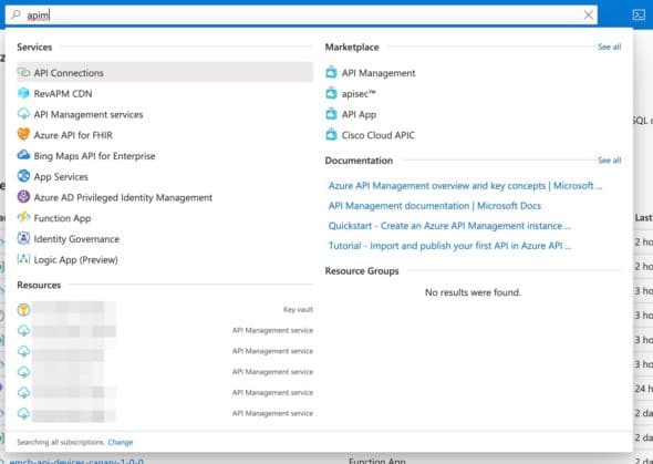
Azure portal’s main search bar pulls up possible results as you type:

This can be a big time saver, and I have found the immediate displaying and categorization of search results to be pretty helpful in situations where I didn’t know where to start looking. I also think that including links to relevant documentation is a nice way to encourage longer-term learning around how to use the portal.
Sample Inputs for Complicated Forms
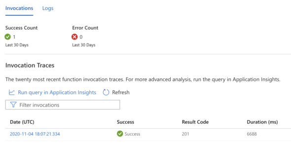
The link to Application Insights (which also creates a pre-populated query to use as the next page’s input) is another good example of how the Azure portal helps boost discoverability. Here we can see a selection of a page displaying requests made to an API:


In addition to helping you get somewhere faster, this pre-filled query provides a good starting point for learning how to use App Insights’ complicated query language.
The Bad: Not Meeting User Expectations
My frustrations with Azure portal stem from the ways it doesn’t meet my expectations of how a modern web app should behave.
Modals and Saving
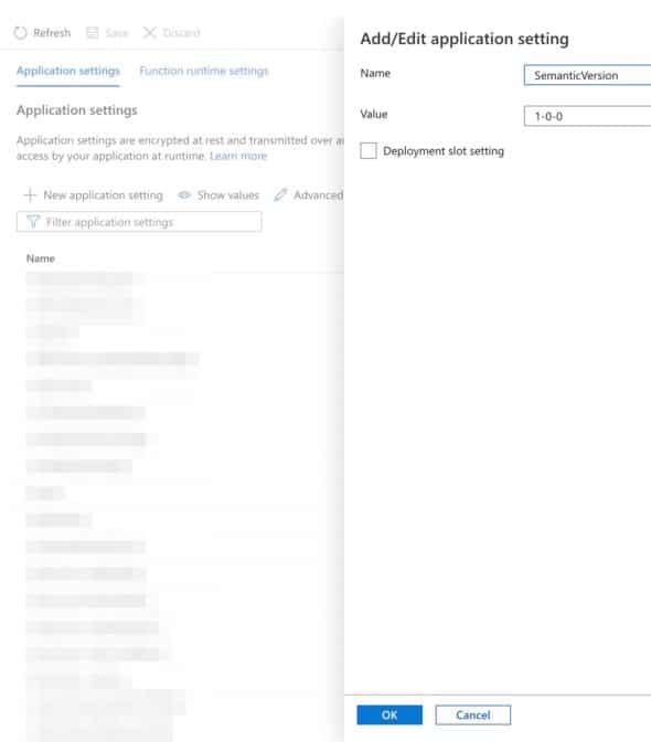
Here’s a screenshot from the page for viewing and editing app settings:

Clicking on an individual setting opens a modal to the right for editing the value, with its own “OK” button for exiting out of the modal. With interfaces like this, I expect that the “OK” button will also save my changes. But in Azure portal, you also have to click the “Save” button outside of the modal itself. I can’t count the number of times developers have had to remind one another to save.
Navigation and Scrolling
Another source of frustration is the portal’s use of a horizontal side scroll for transitioning between different views. In some ways, this is a nice touch, but it also means losing context for where in the portal you actually are. If you refresh the page, instead of seeing the same view, you may actually be taken back to the display you had several screens ago.
Azure portal contains a wealth of different information and functionality, and it caters to technical users (like me) with strong opinions about how user interfaces should behave. I appreciate how easy Azure makes search; it has helped me learn to use more of the tool’s functionality over time. But I wish they’d put more thought into how to app’s behavior violates user expectations.

