Article summary
Burn charts have been a staple of Atomic-run projects for quite a while. They’ve also been the subject of much discussion both internally at Atomic and at-large in the Agile development community. The basic concepts are simple, and we’ve found them useful — especially when they are allowed to evolve as we learn how to better engage our customers and teams. I’m going to tell a story of one such evolution.
First, if you’re unfamiliar with a basic burn chart, check out Mike Marsiglia’s previous post about Atomic burn charts. Got that down? Great!
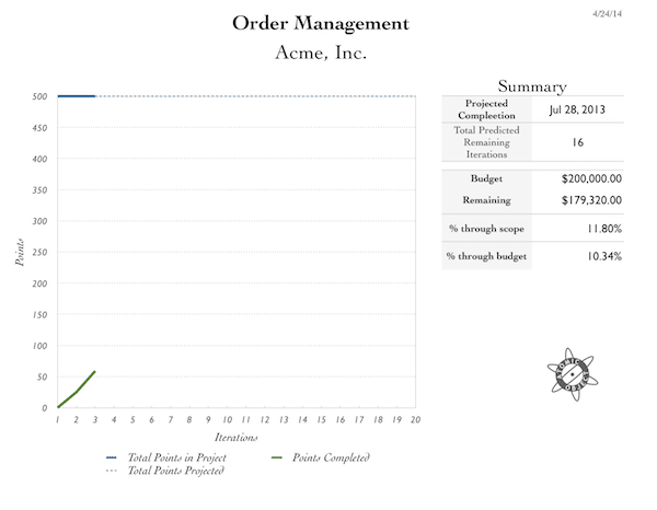
I’m going to follow the story of a ficticious company, Acme, Inc., working on a custom order management system. Our burn chart experience started simply, as Mike’s example illustrates: one big scope bucket (represented by the blue line), and a team of three working to realize the features represented in our backlog (represented by the green line).

Adding Intermediate Milestones
But things rarely stay so simple, and we soon found our burn chart needed some attention to better tell the story of our project.
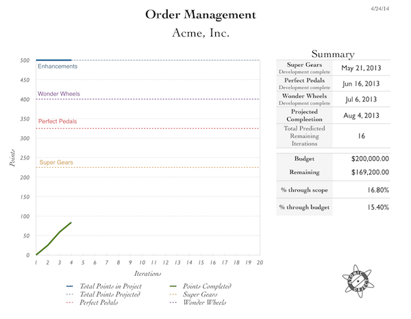
We had been discussing the project’s completion as a single date, but realized not long into the work that a few incremental releases would be valuable. The team, working closely with Acme, determined that individual product lines could be supported and released incrementally. The product line support would be rolled out in the following order:
- Super Gears
- Perfect Pedals
- Wonder Wheels
- Additional Enhancements (Customization, etc.)
We added intermediate milestones to the burn chart to represent the scope that needed to be completed for each, and included date projections to keep our eyes on those release points.

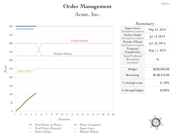
That worked well for a while, but it wasn’t long before it became clear that it would be best to launch the Wonder Wheels support before Perfect Pedals. Plus there were a few stories in the Perfect Pedals bucket that needed to be pulled forward to support Super Gears better. No problem — we expect priority and scope changes in a project. Our process is designed to accomodate that.

This, too worked fine for a while. The Super Gears launch went extremely well, but as we approached the completion of the Wonder Wheels features, we found another challenge with the burn chart. As we neared completion of the Wonder Wheels bucket, there were a few blocked tasks, and the team (now 5 developers, to help expedite launch) spent some time working on features to support Perfect Pedals. The team completed 14 points of Perfect Pedals work and 15 points of Wonder Wheels work in that iteration. Drat. That’s not going to be obvious on the burn chart.
We worked around the issue temporarily by bumping the scope line for Wonder Wheels by 14 points — the amount of work completed that was not related to completing that bucket. It required a detailed explanation in that week’s iteration update. Not ideal.

At the same time we, started thinking more critically about the level at which our customer was best able to engage in discussions. Acme isn’t a development company, and we were reporting project progress primarily to the company president. She couldn’t be involved in every detailed discussion about feature design and implementation — the managers of the individual product lines worked with us for that purpose. The stories in our backlog were written for us (developers) and the product-line managers and were a bit too low-level to be useful as bullet points in a higher-level converstation.
The Stacked-Bar Burn Chart
What we needed was a better way to show what we were doing, what we had done, and what was still on the horizon — something that would:
- Keep visibility on smaller intermediate milestones, without getting lost in details.
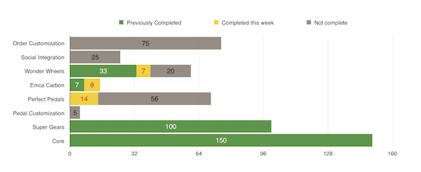
- Answer questions like “Where are we on integration with Emca Carbon Fiber, who needs data about Wonder Wheels orders?” and “We haven’t talked about pedal customization in a while. Has that work started? How much is left?”
- Show what we accomplished in the last iteration.
- Help visualize the scale of our weekly progress against meaningful buckets of features, intermediate milestones, and the full scope of the project.
We ended up creating a second chart more tailored to those purposes.

The previously-shown burn chart still has its purposes. It shows the story of re-prioritization over time and our rate of progress. But I suspect the most important part of that chart for our customer is the right-hand column of dates and dollars.
We’ve used different forms of that stacked bar chart over the past several months to illustrate where complexity lies, at a high level, within our project. It has been well received, communicates clearly, and polishes up nicely for presentations. Alongside other information, such as the stories we’re planning to tackle next, a list of the top project risks, and our plans for mitigating those risks, the chart has been particularly useful in framing our weekly iteration updates.
For my current project, especially in communication with leadership at the company, it has been very useful for:
- Communicating what we just completed
- Framing discussions of risks
- Maintaining a higher-level, business-value-focused awareness of feature status
- Picturing the scale of newly-requested features alongside the scale of the backlog
We still use our backlog and more detailed communication with individuals and groups who are engaged in our design and development process at a more detailed level.
This is just another example of a tool, the burn chart, taking a few evolutionary steps before making a more significant shift to better match it’s purpose, and a good reminder to not be constrained by your tools.
For more on project mangement at Atomic, I recommend the following posts on Atomic Spin:
- Atomic Burn Charts by Mike Marsiglia
- Moving Beyond Story Points, Iterations, and Burn Charts by Shawn Crowley
- Pitfalls of Integrated Design and Development Burn Charts by Shawn Crowley
- Managing Agile, Poly-skilled Teams with Intermediate Milestones by Shawn Crowley
