I recently wrote about the similarities between the practice of gesture drawing in fine art and rapid paper prototyping in software design. As a former student of art now working in software, drawing comparisons between the two is something I’m wont to do.
Indeed, such comparing and contrasting is the central building block of art historical writing. Because art history is often a study of evolving styles, talking about a work in light of another is a productive means of learning about each. In class I initially experienced two side-by-side slide projectors (yes, humming, antiquated projectors!), which were succeeded in my last year by a wide aspect keynote presentation. The result was the same: two images up at a time.
An effective compare and contrast begins by identifying similarities. Comparing apples to oranges (or paintings of each) is worthwhile because both are still lifes of fruit. You need to start by determining what gives you grounds for making the comparison. In other words, what gives the comparison meaning?
Given that both painting and software design are creative enterprises, it’s not surprising that overlaps exist. Both are subject to stylistic influence and creative inspiration, and both require empathy, careful planning, study, and skill.
But a more interesting and perhaps less obvious overlap between large masterful paintings and large masterful applications is their common commercial relationship. While the open market began emerging in the sixteenth century (particularly for small pictures), grand paintings were, well into the nineteenth century, typically commissioned by patrons, and therein lies the meaningful hinge: both grand paintings and software applications (at Atomic and other innovation services firms, anyway) are built for clients.
Building on this, we can further say that both applications and paintings are expensive; they take time and that time is costly. And painters like software designers need to cope with their client’s high but hard to communicate expectations.
The benefit of compare and contrast is that it allows both objects of study to be made more clear by the comparison. Given what we know of the similar contexts of both makers, what can software makers learn from the age old masters?
Prudent makers in each will strive to understand their clients’ goals from the outset, have a general understanding to start from, and receive sign-off on increasingly faithful representations before producing the final, pixel perfect creation — working in increasing levels of fidelity, as we say.
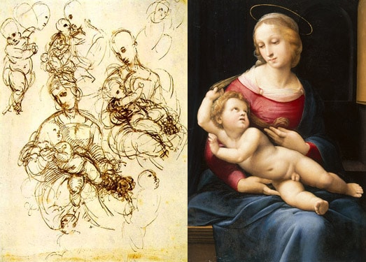
Painters did studies to mitigate risk and set their clients’ expectations about the work to be completed. Subject matter, figure placement, mood and style were generally agreed upon before. By validating their work at different points, they could avoid expensive rework of large, costly deltas. Below is a sample study and the final product of Raphael’s Bridgewater Madonna. See how Raphael, a prolific sketcher, experimented with different compositions of mother and child before settling on the final version.

In the same way, makers at Atomic work in different levels of fidelity as appropriate, starting with verbal and written understanding, moving to high-level feature descriptions using story maps and lo-fidelity sketches, and only then to visual design and production code.
Smaller changes, however, were easier for painters to fix. A disquieting facial expression was easily enough painted over. In the same way, small usability tweaks to an application are made possible by the flexibility of the medium.
This very flexibility, however, is one of things that distinguishes digital design from other forms. Designing on and for machines is ultimately more flexible (especially when using CSS extensions like Sass). This is no doubt why many designers start in higher levels of fidelity (PSDs or HTML). It’s just so easy to make and change. If you had given Raphael a magic canvas in which he could move and undo brush strokes, would he not — at times — have started in higher fidelity? An interesting thought experiment, but what can we learn from it?
Given the sophistication of our tools, we don’t need to work backwards (by being dogmatic about starting with sketches for each element) or reinvent the wheel by ignoring the wisdom of the masters (or by thinking lo-fi design is the invention of sticky note-wielding UXDs). The takeaway is to learn to work in levels of fidelity appropriate to the risk level. Creating a simple fruit study? Perhaps you can start in the final medium. But new, unknown, complex or otherwise risky subject matter? You’d better pick up a pencil.
1. As a blanket cover-all for references, my art historical knowledge and insight I owe almost entirely to my college advisor and friend Dr. Craig Hanson. Let this “1” be a giant footnote to his teachings.
