
Article summary
I recently discovered a very simple Flexbox-based solution to a problem that has given web designers and developers issues for years.
Consider the following situation:
- You’re working with a grid framework that uses floats to create columns. Think Bootstrap, Foundation, Skeleton, Susy, or any number of others.
- You have two columns of dynamic content adjacent to each other, and you don’t know the size of the column content or which column will be taller.
- You need to vertically middle-align the two columns.
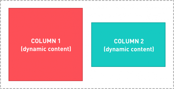
Our desired layout would look like this:
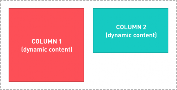
But by default, the two columns will top-align themselves within the container like this:
So, how can we get our columns to middle-align without breaking our float-based layout? Up until recently, this seemingly simple problem has been surprisingly difficult to solve.
Can’t I just use ‘vertical-align: middle’?
Unfortunately, no, for a couple of different reasons.
First, as the CSS docs state, “The vertical-align CSS property specifies the vertical alignment of an inline or table-cell box.” Our elements are not inline, inline-block, or table-cells, so this rule won’t work without altering our display styles.
Second, our grid framework uses ‘float: right’ to position our two column elements. The CSS rules state, “A floating box must be placed as high as possible.” This means that a floated element will always be top-aligned.
While the first issue can be solved by changing the ‘display’ rule to make the columns ‘inline-block’ or ‘table-cell’, there is no CSS technique that solves the second issue. We would need to remove the float rules, which would interfere with the underlying grid framework.
Flexbox to the Rescue
As usual, Flexbox has a simple fix for our problem. Here it is in two easy steps:
- Add ‘
display: flex’ to our container element. - Add ‘
align-items: center’ to our container element.
That’s it! Here’s what the HTML and CSS might look like for our simplified example:
 [Dynamic content]
 [Dynamic content]
.container {
display: flex;
align-items: center;
}
.column-1,
.column-2 {
float: left;
width: 50%;
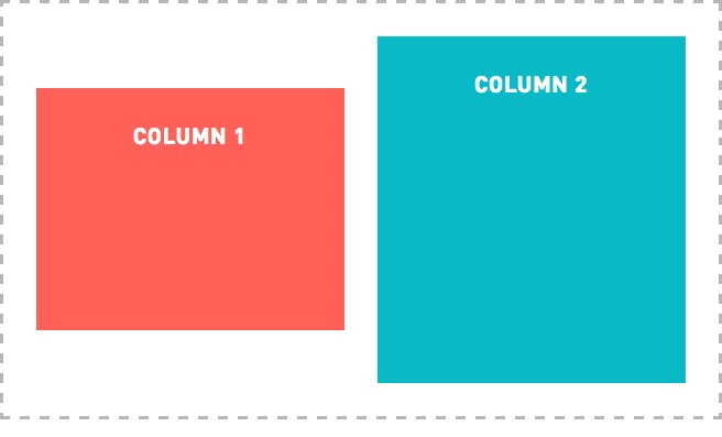
}As you can see in the animation below, the columns remain middle-aligned regardless of the size of their content:
What makes this solution especially nice is that adding these two rules to our container element solves the alignment problem without altering the styling of the columns in any way. Modern browsers can take advantage of the Flexbox styling, while older browsers just ignore it, leaving the two columns top-aligned.