
The goal of building a clear and consistent user interface (UI) creates a need for a set of components that can be reused across an application. A button on one page of the application should appear the same as a button in any other part of the application. This reduces the mental load for the user navigating the application. Plus it just looks nice. Creating a library of general, abstract components makes consistency across the application much more manageable. Storybook can help you do just that.
According to their website, “Storybook provides a workshop to build UIs in isolation. It helps you develop hard-to-reach states and edge cases without needing to run the whole app.” It is free, open-source software that eases the pain of building frontend components by providing an environment where you can play around with component settings and styling. Interactive “stories” allow developers to view and edit components independently from the application. Storybook also provides a space for developers working on a team to find which components are already built. This helps avoid duplication of effort and code.
Get the most out of your Storybook stories.
Now that you know some of the benefits of Storybook, it’s time to get started! First, you’ll need to install Storybook. Then, you can start writing stories. But what does a Storybook story entail? To get the most out of your stories, it’s best to include a visual test case for every possible state of the component plus a “playground” state.
Consider a button component. Your application may use several variations of button sizes and colors, each of which can be represented by its own story. The playground story adds controls to the basic component, so then you can play around with various combinations and see how they would be represented in the UI.
To set up a playground story, define a set of Args for your component. These will create controls in your Storybook, so you can experiment with your component. Next, add a template for your component and some initial arguments. For example:
export default {
  title: 'Button',
  component: CustomButton,
  argTypes: {
    color: {
      options: buttonColors,
      control: { type: 'radio' },
    },
    size: {
      options: buttonSizes,
      control: { type: 'radio' },
    },
    label: {
      control: 'text',
    },
    disabled: {
      control: 'boolean',
    },
  },
};

const Template: ComponentStory = (args: ButtonProps) => {
    return (
       console.log(‘I’ve been clicked!')}
        disabled={args.disabled}
      />
    );
  };

export const Playground = Template.bind({});
 Playground.args = {
    color: 'red',
    size: 'large',
    disabled: false,
  };
Add value with interaction tests.
The example above will create a basic story for a button component with controls to show the result of providing different arguments to the component. But what about states that are difficult to represent using basic controls? For example, I recently worked on a search input component with various states (e.g. inactive, focused, hover, searched) that are not controlled by component arguments but by user interaction.
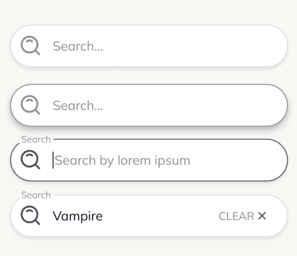
To ensure the component displays the correct state, we can add interaction tests using a play function. Storybook’s interaction testing mimics Testing Library’s user events API and Jest’s expectation framework. Using this API, we can simulate common interactions like hover, click, type, and clear. Then we can inspect the result to ensure the resulting component appears as we intend.
For example, to test that a ‘Search’ label appears when the search input component is focused, we could use a test that looks like this:
SearchInputs.play = async ({ canvasElement }) => {
  const canvas = within(canvasElement);

  // label appears when component is focused
  await expect(canvas.getByTestId('search-input-label')).not.toBeVisible();
  await userEvent.click(canvas.getByTestId('search-input'));
  await expect(canvas.getByTestId('search-input-label')).toBeVisible();

  // simulate search
  await userEvent.type(canvas.getByTestId('search-input'), 'Vampire');
  await userEvent.click(canvas.getByTestId('search-icon'));
  await userEvent.click(canvas.getByTestId('search-input-clear-button'));

  // label is no longer visible after search is cleared
  await expect(canvas.getByTestId('search-input-label')).not.toBeVisible();
};
These tests can be run from your Storybook or in a CI environment.
Get the most out of Storbyook.
Overall, Storybook has many benefits to teams working on frontend components. To make the most of these benefits, be intentional about what you include in your stories, and consider adding interaction tests for components with interactive states.