
Here, we’ll learn how to build a search bar in Figma that accepts keystrokes and mimics the experience of a user typing in real time!
The ability to build interactive and responsive interfaces is a critical skill for any UI/UX designer. Learn how to create a search bar in Figma that responds to user input by animating as if the user of your Figma prototype is typing in real time.
(TL;DR – Get started in Figma)
Just want to use the component? Grab the Figma community file here:
https://www.figma.com/community/file/1227271557159482902
In this tutorial, we will cover the steps to create a basic search bar, including setting up the necessary components, designing the input field, and creating the animation to mimic the typing experience.
Whether you are a beginner or an experienced designer, by the end of this tutorial, you should better understand how to create responsive and interactive UI elements in Figma, allowing you to create more engaging interactions for presenting and testing your prototype.
So let’s dive in and get started!
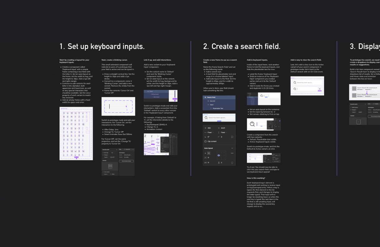
1. Set up keyboard inputs.
Start by creating a layout for your keyboard inputs.
- Create a component called ‘Keyboard-Input’ with a simple frame containing a text field with the letter A. Set an auto layout on the frame, set the width to hug, and the height to 18px. Add a 1px left and right margin.
- Continue to add variants for each letter in the alphabet, both uppercase and lowercase, as well as any special characters that should be available. Set the value property of each variant to match the character.
- Add an empty frame with a fixed width for space and enter.
Next, create a blinking cursor.
This small animated component will indicate to prototype users that your field is active and can be typed in.
- Draw a straight vertical line. Set the height to 18px and add a 1px stroke.
- Convert to a component, name it “Blinking-Cursor” and add a new variant. Remove the stroke from the variant.
- Name the variants “Cursor On” and “Cursor Off.”
Switch to prototype mode and add your interactions. For “Cursor On,” set the interaction to the following:
- After Delay: 1ms
- Change To: ‘Cursor Off’
- Smart Animate: Ease Out 500ms
For ‘Cursor Off’, set the same properties, and set the ‘Change To’ property to ‘Cursor On.’
Link it up, and add interactions.
Add a new variant to your ‘Keyboard-Input’ component.
- Set the variant name to ‘Default’ and nest the ‘Blinking-Cursor’ component inside.
- Set an auto layout on the variant, set the width to hug, the background to white, and the height to 18px. Add a 1px left and 4px right margin.
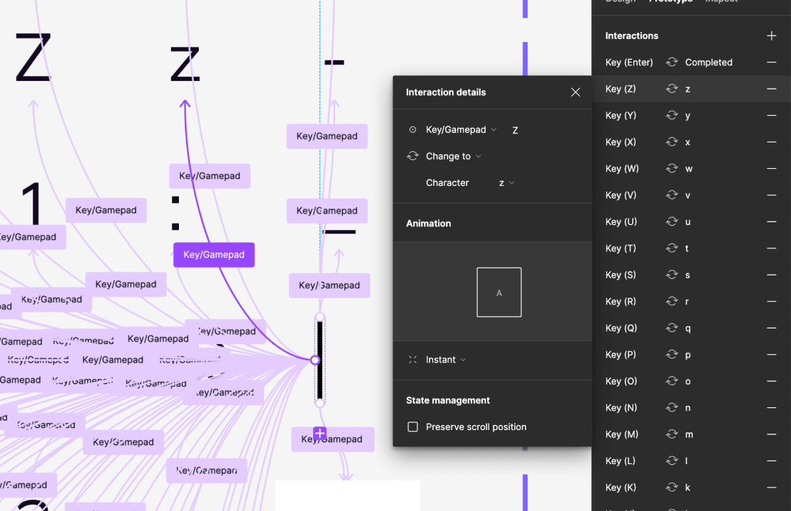
Switch to prototype mode and add your interactions. Add a connection from the ‘Default’ variant to every other variant in the ‘Keyboard-Input’ component. For example, if linking from ‘Default’ to ‘A’, set the interaction details to the following:
- Key/Gamepad: [Shift]+A
- Change To: A
- Animation: Instant
2. Create a search field.
Create a new frame to use as a search field.
Name the frame Search-Field and set up the following inside:
- Add a search icon.
- A text field for placeholder text and wrap it in a frame labeled “Input.”
- Add auto layout to the field. Set the height to 45px, and the width to approximately 300px.
Add in keyboard inputs.
Inside the input frame, nest another frame to hold the keyboard inputs and hide the placeholder text for now.
- Label the frame ‘Keyboard Input.’
- Grab an instance of the ‘Keyboard-Input’ component you created earlier and set it to the ‘Default’ variant.
- Add it inside the frame you created and duplicate it 15-20 times.
- Set an auto layout on the container.
- Set the spacing between to -2
- Set canvas-stacking to First on top.
Create a component from the search with two variants:
- Default: Placeholder text visible.
- Active: Keyboard Inputs visible.
Switch to prototype mode, and link the Default to Active variant on click.
Try it out.
You should now be able to click into your search field and type to see keyboard input appear!
Add a way to clear the search field.
Last, let’s add a close icon to the Active variant of your search component. In prototype mode, link it back to the Default variant with an On Click event.
How the heck does this work?
Sometimes Figma interactions feel like sorcery and make your head hurt, but the reason this prototype works is pretty simple.
Each keyboard input element is prototyped and waiting to receive input on Key/Gamepad entry. This means that all the elements are listening for a keystroke at the same time. But, when a key is typed, the first element in the list receives the keystroke first, and therefore responds first, changing to display the letter typed.
That input then changes to a variant of the component associated with the letter typed. Since letter variants are not set to do something on Key/Gamepad entry, when the letter key is typed, the next item awaiting input will change to display the second key, and so on…
3. Display the results.
To prototype live search, we need to create a dropdown to display search results or suggestions.
Build a list-item component named ‘Search-Result-Item’ to display in the dropdown list of results. Set a Default and Hover state and transition between the two on hover.
Create an instance of the List Item
Duplicate the ‘Search-Result-Item’ about ten times, and apply a frame to hold them. Add an auto-layout and set the following:
- Margin: 8px
- Spacing: 2px
- Fill: #FFFFFF
- Drop Shadow
Add the search results to the Search-Field component.
- Interaction: Mouse Enter
- After Delay: 2000ms
- Action: Open Overlay: Search-Results
- Overlay Position: Manual
Position the overlay so it will appear just below your search field.
Now your search results component will appear a few seconds after your search component is clicked on, giving enough time for typing to begin. Adjust the delay timing to fit your needs.
4. Start Using Your Component!
This component is ready to use in your prototype. You can rebuild it to fit your needs and even add more functionality, like displaying live search results or triggering an event when a specific key is entered.
- Use it to present search functionality to stakeholders and demonstrate its impact on the user experience.
- Simulate real-time search updates with an interactive search bar to showcase dynamic search results.
- During user testing, capture valuable feedback to improve subsequent iterations of your design!
Figma Search Bar: Credit Where Credit is Due!
I’m not sure who originally created this solution, but when I saw some examples of input fields in the Figma Community, I knew I had to pull them apart and figure out how they worked. If you know who came up with this idea, let me know, and I will credit them here!
Hello, how do you nest components in Figma?