Typography is one of the most important aspects of designing a website. Good typography can improve reading comprehension and usability, while poor typography can make even the best site difficult to use.
Fortunately, there is a lot of low-hanging fruit when it comes to this area. By following just a few key rules, you can greatly improve even the worst web typography.
These simple improvements can have a big impact:
1) Choose an Optimal Column Width
The width of text columns has a large effect on the readability of the text. Long lines of text can make it difficult for readers to keep their place when moving from line to line, while overly narrow columns can slow reading speed and create layout issues.
While there is no strict rule for what constitutes an optimal column width, a line length of between 50 and 75 characters (including spaces) is a happy medium that allows readers to maintain their place without breaking rhythm too often when traveling from line to line.
Takeaway: Set text column widths to between 50 and 75 characters per line to improve readability.


2) Establish a Typographic Hierarchy Using Font Size and Weight
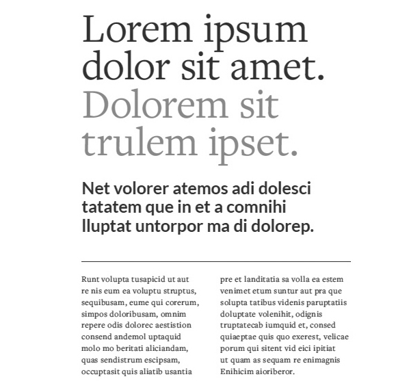
Typographic hierarchy is the presentation of text in a way that indicates to the reader its importance by its size, weight and placement relative to the text around it.
Readers on the web often scan content quickly. A clear visual hierarchy helps them determine how important each piece of content is before reading a single word. This improves people’s ability to find the information they want more efficiently.
Font size and weight are two of the most important visual cues in establishing a typographic hierarchy. In general, the larger and bolder a piece of text is, the more important it is. Start with the largest, boldest type for your headlines, and work your way down. Headlines should be larger and heavier than subheadlines, which should be larger and heavier than body text, which should be larger and heavier than captions and footnotes.
Takeaway: Use font size and weight to indicate the importance of the content represented. Start with large, bold headlines, and work your way down to small, normal weight text.

3) Use Colored Text to Indicate Interactivity
Users should be able to spot interactive elements on a web page at a glance. Using color in your text can be an effective way to signal this interactivity to the reader.
In my designs, I represent all static text in either black or shades of grey. I reserve use of colored text for interactive elements such as links and buttons. By consistently sticking to this pattern, you can help users quickly and intuitively determine which elements are interactive and which are not.
Takeaway: Use black and grey scale for static text. Reserve color for links and buttons.
4) Avoid Floating Text
Floating text is a headline or caption that sits evenly between two pieces of content, making it difficult to determine to what content it applies. Readers interpret visually close content as being related. When these visual groupings are confusing or unclear, usability can suffer.
Use white space to clearly differentiate which pieces of content go together. Headlines should be closer to the content below than the content above. Captions should be closer to the images they label than the content that follows.
Takeaway: Content should be visually grouped with related content. Use white space to ensure that these visual groupings are obvious.

Conclusion
There are endless more tips out there for improving web typography, but following these simple rules should help you get you moving down the right road. What tips have you found to be effective?

