There are as many wireframing methods as there are designers out there. We all have our preferred set of tools and techniques as well as our own visual languages. Some designers use wireframing or prototyping tools, some create them by hand, and some use a combined approach.
As a designer, I find (regardless what method I use) it’s easy to let aesthetics override strategy. So I created an approach which aims to counteract that. The approach I describe below helps me maintain a strategic focus throughout my design process. It uses the site’s content strategy as a foundation, and helps me keep that strategy in mind as the page evolves into a final visual design.
This method is also useful for deconstructing designs. If you want to improve or redesign an existing site, try creating a basic wireframe (#1 or #2 below) to kickoff your design process. This can help you identify your strategy, uncover hidden assumptions, and find weaknesses in hierarchy, organization, or messaging of your site.
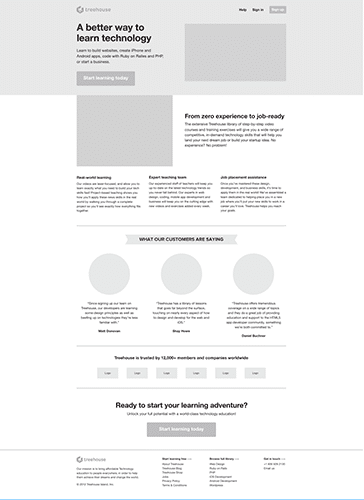
For this example, I’ve chosen to deconstruct the Treehouse homepage. While creating these wireframes, I focused on three elements of user experience, as defined in Garett’s Diagram:
- Content Requirements
- Information Design
- Visual Design
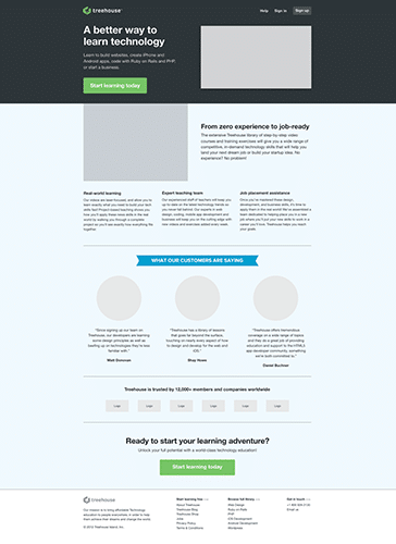
1. Define your real estate.
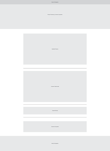 Designate large sections of your page to obvious content blocks. Label them with your key user goals and broader page content strategy in mind. This could easily be a sketch or whiteboard artifact, but for consistency and personal preference I start here digitally.
Tip: Conduct a whiteboard session with your key stakeholders. I find this exercise a great way to gain consensus on the high-level content strategy of individual layouts, before adding more detail.
2. Identify your content requirements.
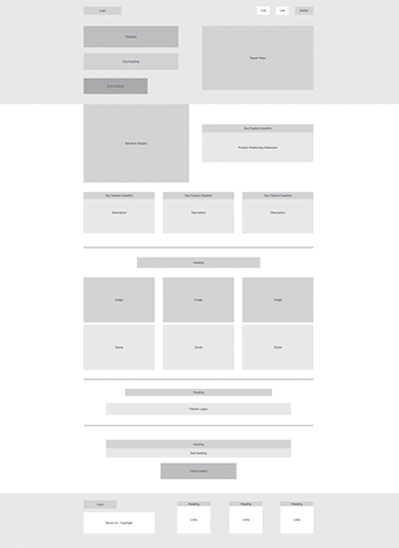 Garett describes this as the content elements required for the site in order to meet the users needs. Defining a grid at this point will help organize groups of content and balance flow between elements as you move down the page.
Tip: Create a duplicate slide and remove all text. I find this draws a more emotional response to what’s being presented on the page. Don’t be afraid of page length; focus on browser page views when determining character count.
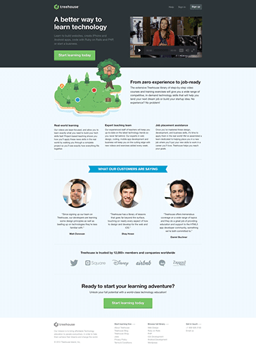
3. Give it character.
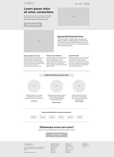 Garett defines Information Design as the presentation of information to facilitate understanding. Use placeholder text and format with final implementation in mind. With enough context, functionality should be implied at this stage.
Tip: Keep messaging clear and concise, and avoid redundancies. You only have a few seconds to make an impression. Using design elements such as shape, line height and white space, you can separate your content into small consumable chunks.
4. Let it speak.
 This is a defining moment. If the copy doesn’t meet the design, it will fail to meet your objectives and users’ needs. Try to avoid altering the information design at this point; stick to your previous decisions (and test your assumptions later). Review with the team, iterate, and understand why pivotal decisions were made.
Tip: Defining obvious large content blocks allows you to easily flip sections as the design evolves. The end of one section should provide a clear segway to the next and continue the story as you move down the page.
5. Make it real.
 Garett defines Visual Design as the visual treatment of text, graphic page elements and navigational components. You have already prioritized the importance of your messaging using scale, weight and position. Now it’s time to add color, style and other effects to reinforce the functional purpose of each element.
Tip: Use color to convey your brand strategy, and keep it simple. It’s also important to keep information hierarchy in mind. Introduce color slowly and notice how each addition draws an emotional response.
6. The final touchdown.
 At this stage, it’s great to look back at the first wireframe example and see how closely you followed your original content strategy. It’s common to shift throughout the process, especially if you have an opportunity to build an interactive prototype. I find it very beneficial to start building the CSS and HTML prior to introducing color. Getting the page in the context of the browser early helps facilitate content creation. It also allows your clients to participate and feel they’ve co-created this design with you, having set yourself up perfectly to iterate on the fly.
Tip: Vary your media. Everyone has different methods of learning and interacting with your service.
Footnote: Special thanks to Treehouse for creating a beautiful website that was built perfectly in line with the nature of this exercise.