Driving decisions about aesthetics and visual design direction with project stakeholders is a delicate process that can be fraught with frustration on all sides. You can increase the likelihood of success and happiness by using targeted artifacts in your decision-making process, but the real secret for success lies in good communication and guidance.
Style Tiles – Between a Mood Board & a Wireframe
Atomic Object has been using style tiles to help guide the visual design direction of software products. If you’re not familiar with style tiles and how they work, here’s a brief overview.
Early, high-fidelity visual design direction has historically been critiqued by reviewing two types of artifacts:
- Mood Boards – A mood board is collage that generally consists of images, text, and objects that reflect an aesthetic direction.
- Wireframes – A wireframe shows a fully-defined user interface.
However, both mood boards and wireframes can be dangerous to use when critiquing visual design. Mood boards can be too abstract for many people, since they have a hard time projecting how a mood board would manifest as tangible visual design elements like color palette, font, or button style. Wireframes, on the other hand, can be too concrete and can focus attention on the wrong considerations. When presenting high-fidelity wireframes, people can easily get sidetracked critiquing information architecture or interaction design.
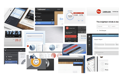
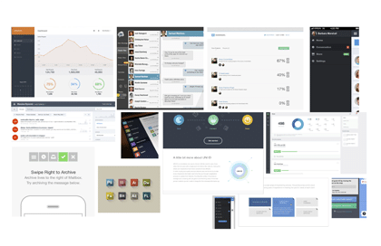
Below are two mood boards that help set a direction but don’t concretely show how interface elements will appear.
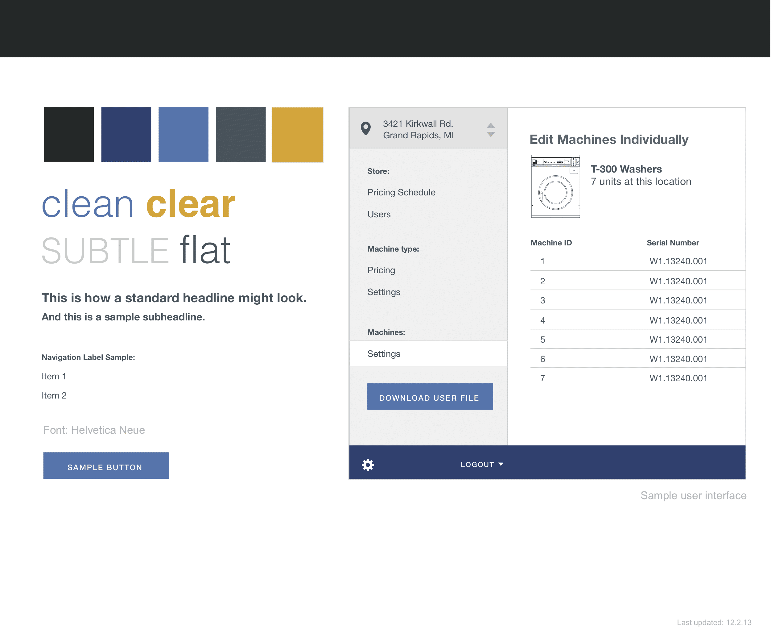
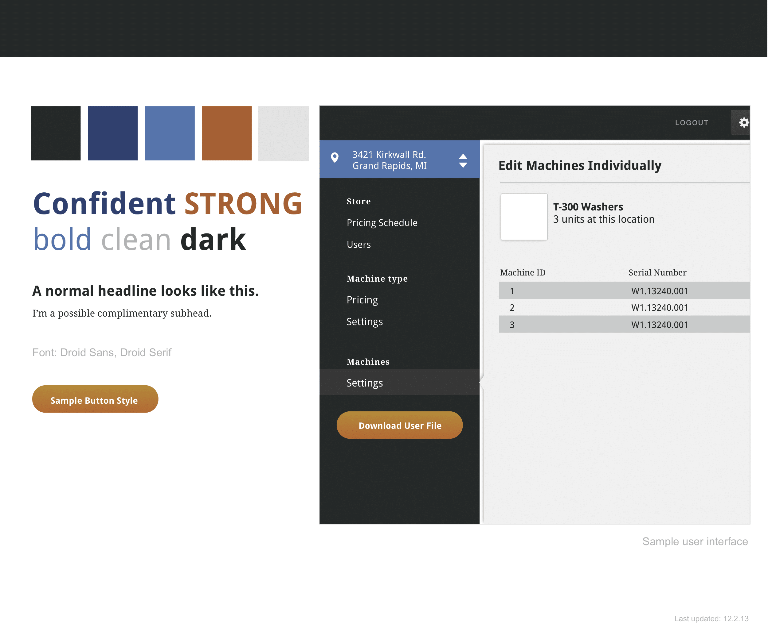
Style tiles are collages of tangible, visual design elements, which help to communicate a concrete visual language. They put the focus on critiquing visual design elements and provide a balance between the abstract nature of a mood board and the completeness of a wireframe.
The tiles below show two different approaches for the same application. There is a bit of sample wireframe work included to help visualize how individual elements come together, but the sample wireframe is not intended to show a final information architecture or interaction design.
Context & Communication Are Essential
Style tiles are great tools, but they’re not self-explanatory. In my experience, most non-designers have a difficult time providing feedback on a single style tile or even comparing and contrasting different tiles. Simply asking for open feedback is a poor way to facilitate meaningful conversation. And sending style tiles through email and asking for written feedback is an invitation of disaster.
I believe stakeholders have difficulty providing style tile feedback for two reasons:
- Stakeholders may feel implicit pressure that they should be able to articulate why a specific style tile feels right, but they lack the vocabulary to map their emotions to concrete visual design terminology related to typeface, color theory, composition, etc.
- Stakeholders actually want to see the fully designed wireframe so they can picture the end result. Stakeholders will embark on the impossible task of trying to envision each stile tile as a fully realized wireframe and mentally comparing the finalized mental visions. This can’t be done. I’ve observed people trying to perform this futile exercise, and it’s easy to see them get frustrated and give up.
Getting the most out of style tiles requires two things: in-person communication and attention to emotions.
In-Person Communication
In-person feedback is essential for providing guidance, assurance, and clarifications. Don’t seek early design feedback through email. Ever. If in-person is impossible, use a video conference.
Use Emotion, not Logic
Before creating style tiles, you should have collaboratively defined adjectives describing the software product’s or brand’s personality attributes. You may have identified attributes like “progressive”, “orderly”, and “concise” to describe the product.
When asking stakeholders to choose a style tile out of a set of alternatives, ask them to compare two tiles against each other and make a gut decision based on the predefined attributes. Keep decisions quick, and don’t get into details. Compare additional alternatives against previously ranked style tiles to create a fully prioritized set.
Next, ask stakeholders to zoom in and focus on the details of their top choice. Ask stakeholders to focus on each design element of their top choice, and ask if the element reflects the product’s personality attributes better than the same element on other tiles. This detailed comparison will allow some elements to be swapped in from other tiles and a final tile to be created from the elements of several alternatives. Don’t use jargon when helping stakeholders compare element alternatives, and try to keep everyone from zooming out to envision a wireframe.
Please leave a comment below if you have any similar observations, tips or tricks to share.
I really like the idea of style tiles. In our graphic design program at Ferris State our workflow consists consists of the site map phase, wireframe phase, moodboard phase, then visual directions phase. I have observed moodboards that do a good job of capturing the feel of the project but also have seen moodboards too abstract or distracting to bring much benefit to the end visuals. I think style tiles bring in a good transition to the process rather than trying to hammer out multiple final visual directions based on a moodboard. Very well written post.