One of the pleasant surprises I encountered while using WPF was how easy it is to change the look of a button. It is very easy to draw buttons using simple shapes, rounded corners, and so on. Sometimes, though, your application’s needs will require more complicated work.
For example, say you need to make an image similar to a wifi logo, like so:

How might you go about this in WPF?
PathGeometry? Inflexible
The image above is fairly easy to create with XAML’s equivalent to SVG: PathGeometry. But let’s add another layer of (not quite) arbitrary complexity. Say that in some cases we want to draw the same image, but with a narrower angle, like so:

Just stretching a PathGeometry won’t quite give us the look we are going for; we’ll need to actually specify that shape programmatically.
Constructive Geometry? Wasteful
One possibility would be to use constructive geometry. Each arc in the symbol can be represented by two circles and a triangle:
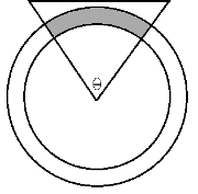
Arc = Triangle ∩ OuterCircle - InnerCircle
I explored this approach, and even had it working, but I was unsatisfied with it. For one thing, it can be wasteful. If the implementation of constructive geometry draws culled areas as transparent, there may be “overdraw” issues. So I wracked my brain to come up with alternatives.
ArcSegments? Much Better
In the end, I went with an approach I initially dismissed as overly complicated. I made a widget that draws Arc shapes using PathSegments. The reason I hesitated initially is because the way that WPF’s built-in ArcSegment works is not really that useful for my purposes. To draw an ArcSegment you need to specify the start and end points. Instead of thinking about start points and end points, I want to describe my arc in terms of angle and inner and outer radius. Fortunately I found a fairly straightforward formula to translate from these values to points:
PointOnCircle = (c.X + r*cos(θ), c.Y + r*sin(θ)
where c is the point at the center of the circle, r is the radius of the circle, and θ is the angle. This formula will determine the point to provide to ArcSegment.
WheelArc UI Widget
Since I wanted my code to be DRY, I decided to encapsulate this logic in its own widget. The widget, which I called WheelArc, binds to an angle, an inner radius, and an outer radius. It also supports a Stroke and Fill brush. This makes it easy to bind to the color if something changes, such as if the signal gets weaker:

Additionally, because I center the WheelArc to the center of the arc:
it is very easy to translate and rotate multiple arcs and keep them in the right proportion to each other:

A few other gotchas I discovered in this process:
- Make sure your UI widget correctly binds dependency properties and raises the right events on changes. If you do this right, you should be able to see the changes in design view as well as at runtime.
- WPF will allow you to bind numerical values to the translation and rotation render transforms; for example, you can bind the Angle of a RenderTransform directly to a double. Unfortunately, while this works at runtime, it also generates an error before the first successful binding. Pile up enough of those errors, and it will slow down your app. Instead you will have to use IValueConverters, which can take the bound values as inputs and return the appropriate transform.
What are some complicated UI widgets you’ve had to create?