
Article summary

The seventh item in my Swift Tool Belt is an extension for UIBarButtonItem. This extension will add a couple of inspectable properties to help you set accessibility properties from Xcode’s interface builder. They also add the ability to hide a bar button item.
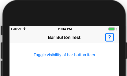
A UIBarButtonItem is a button that you can add to a navigation bar. These buttons can be placed to the left or right of the navigation title. In the image below, I added a bar button item with an icon of a question mark in a box.
Toggle Visibility
Normally, you can’t toggle the visibility of a bar button item because there is no isHidden property. One way of getting around this is to remove the bar button item from the nav bar and add it back again once you need it to be visible.
I find this method tedious. I have to create a strong reference to the bar button item and assign/un-assign it to the navigation bar. The strong reference is required so that your bar button item is not deallocated once it has been removed from the navigation bar.
@IBOutlet var rightBarButtonItem: UIBarButtonItem! // strong reference
---------
navigationItem.rightBarButtonItem = nil // hide
navigationItem.rightBarButtonItem = rightBarButtonItem // show
My solution is to create an extension that will disable the bar button item and set its tint color to transparent, effectively hiding the bar button item. Luckily, the isEnabled property exists on a bar button item, so we can prevent it from functioning when it is hidden.
I will share the full code for the extension later in this post. For now, you can take a look at the isHidden property in my extension.
var isHidden: Bool {
    get {
        return tintColor == UIColor.clear
    }
    set(hide) {
        if hide {
            isEnabled = false
            tintColor = UIColor.clear
        } else {
            isEnabled = true
            tintColor = nil // This sets the tinColor back to the default. If you have a custom color, use that instead
        }
    }
}
Now all it takes to hide a bar button item is to set the isHidden property.
rightBarButtonItem.isHidden = true
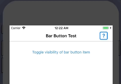
I set up an example view controller with a button that toggles the visibility of the bar button item. You can see it in action.
Add Accessibility
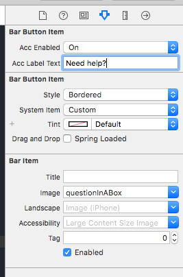
The UIBarButtonItem does have accessibility properties, but you can only set them in code and not through Xcode’s interface builder. Most other controls have accessibility properties that you can set in Xcode’s interface builder, so it is annoying that you have deal with this control in a different way. Setting an accessibility label on a bar button item that only has an image is pretty important to let people who need it know what the bar button does.
I got around this problem by adding two inspectable properties in my extension to equip interface builder with this ability. I had to shorten the word accessibility in my properties because Xcode cuts off words if they are too long.
@IBInspectable var accEnabled: Bool {
    get {
        return isAccessibilityElement
    }
    set {
        isAccessibilityElement = newValue
    }
}

@IBInspectable var accLabelText: String? {
    get {
        return accessibilityLabel
    }
    set {
        accessibilityLabel = newValue
    }
}
Now, my Xcode settings for my bar button item will look like the following. Notice the two new properties for enabling accessibility and adding the label.
Here is the complete extension for UIBarButtonItem. I hope you find it as useful as I have.
public extension UIBarButtonItem {
    @IBInspectable var accEnabled: Bool {
        get {
            return isAccessibilityElement
        }
        set {
            isAccessibilityElement = newValue
        }
    }

    @IBInspectable var accLabelText: String? {
        get {
            return accessibilityLabel
        }
        set {
            accessibilityLabel = newValue
        }
    }

    var isHidden: Bool {
        get {
            return tintColor == UIColor.clear
        }
        set(hide) {
            if hide {
                isEnabled = false
                tintColor = UIColor.clear
            } else {
                isEnabled = true
                tintColor = nil // This sets the tinColor back to the default. If you have a custom color, use that instead
            }
        }
    }
}