Article summary
During my iOS work, I’ve assembled a set of code that I bring with me on every iOS project. I’m not talking about large frameworks or CocoaPods here. These are smaller Swift extensions or control overrides that are applicable to many projects. I think of them as my tool belt.
In this post, I’ll show you an extension that will add a border, a corner radius, and a shadow to any UIView, UIButton, or UILabel and allow you to preview what it will look like in Interface Builder.
 Back in 2014, I wrote a blog post on Expanding User-Defined Runtime Attributes in Xcode where I added a border, corner radius, and shadow to a UIView using Interface Builder’s user-defined runtime attributes. This solution had no type checking—you had to type the property you wanted to modify by hand and often had to look up what it was called. You also had to run your project in order to see the effect of the runtime attribute. Starting with Xcode 6, there is a new mechanism that solves a lot of these problems.
IBInspectable
Adding an @IBInspectable attribute to a property in your class will expose that property to the Attributes Inspector tab of Xcode. Now you have a convenient way of modifying that property without having to type it manually in the user-defined runtime attributes section. This solves the problem of having to remember the name and type of the property that you want to modify.
Let’s see what that looks like for setting a cornerRadius of a UIView.
extension UIView {
    @IBInspectable
    var cornerRadius: CGFloat {
        get {
            return layer.cornerRadius
        }
        set {
            layer.cornerRadius = newValue
        }
    }
}
When you select a UIView, or any control derived from UIView, a new cornerRadius property will show up in Interface Builder.

This inspectable attribute can be applied to other properties of UIView that are missing from Interface Builder.
Let’s add a borderColor property. Since the @IBInspectable attribute builds upon the mechanism for user-defined runtime attributes, we are still limited to the types that can be set by Xcode’s Interface Builder. We have to perform some trickery if the types do not line up exactly with the property we want to set.
For instance, a view’s borderColor is of type CGColor, but Xcode can only set a color using the type UIColor. A simple conversion on the getter and setter will solve the problem.
@IBInspectable
var borderColor: UIColor? {
    get {
        if let color = layer.borderColor {
            return UIColor(cgColor: color)
        }
        return nil
    }
    set {
        if let color = newValue {
            layer.borderColor = color.cgColor
        } else {
            layer.borderColor = nil
        }
    }
}
Let’s take a look at the complete extension to UIView that will set a border, cornerRadius, and shadow.
extension UIView {

    @IBInspectable
    var cornerRadius: CGFloat {
        get {
            return layer.cornerRadius
        }
        set {
            layer.cornerRadius = newValue
        }
    }

    @IBInspectable
    var borderWidth: CGFloat {
        get {
            return layer.borderWidth
        }
        set {
            layer.borderWidth = newValue
        }
    }

    @IBInspectable
    var borderColor: UIColor? {
        get {
            if let color = layer.borderColor {
                return UIColor(cgColor: color)
            }
            return nil
        }
        set {
            if let color = newValue {
                layer.borderColor = color.cgColor
            } else {
                layer.borderColor = nil
            }
        }
    }

    @IBInspectable
    var shadowRadius: CGFloat {
        get {
            return layer.shadowRadius
        }
        set {
            layer.shadowRadius = newValue
        }
    }

    @IBInspectable
    var shadowOpacity: Float {
        get {
            return layer.shadowOpacity
        }
        set {
            layer.shadowOpacity = newValue
        }
    }

    @IBInspectable
    var shadowOffset: CGSize {
        get {
            return layer.shadowOffset
        }
        set {
            layer.shadowOffset = newValue
        }
    }

    @IBInspectable
    var shadowColor: UIColor? {
        get {
            if let color = layer.shadowColor {
                return UIColor(cgColor: color)
            }
            return nil
        }
        set {
            if let color = newValue {
                layer.shadowColor = color.cgColor
            } else {
                layer.shadowColor = nil
            }
        }
    }
}
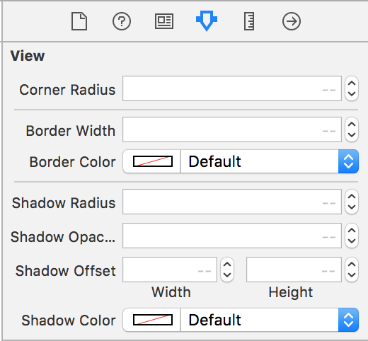
This will add the following controls to Interface Builder whenever a UIView (or any class inherited from UIView) is selected. Since UIButton, UILabel, and many other controls are inherited from UIView, they all get these new properties.

IBDesignable
If you try to modify your @IBInspectable properties, you will notice that Interface Builder will not show any of your changes in real time. When you build and run your project, then your border or shadow will show up on your control. We can fix this by using another attribute called @IBDesignable. This attribute tells Xcode that it can render the control directly in Interface Builder.
The @IBDesignable attribute has to be placed on a class, not a property. Just adding it to our UIView extension will not work.
That means we have to override UIView, UIButton, and UILabel and add this attribute in order to see changes in real time. Luckily, because of inheritance, we don’t have to repeat all of the @IBInspectable properties on each custom control. The extension we wrote for UIView will also extend our custom controls.
Therefore, our custom controls can be incredibly simple. In fact, they don’t need to contain any code other than the designable attribute.
import UIKit

@IBDesignable
class DesignableView: UIView {
}

@IBDesignable
class DesignableButton: UIButton {
}

@IBDesignable
class DesignableLabel: UILabel {
}

extension UIView {

    @IBInspectable
    var cornerRadius: CGFloat {
        get {
            return layer.cornerRadius
        }
        set {
            layer.cornerRadius = newValue
        }
    }

    @IBInspectable
    var borderWidth: CGFloat {
        get {
            return layer.borderWidth
        }
        set {
            layer.borderWidth = newValue
        }
    }

    @IBInspectable
    var borderColor: UIColor? {
        get {
            if let color = layer.borderColor {
                return UIColor(cgColor: color)
            }
            return nil
        }
        set {
            if let color = newValue {
                layer.borderColor = color.cgColor
            } else {
                layer.borderColor = nil
            }
        }
    }

    @IBInspectable
    var shadowRadius: CGFloat {
        get {
            return layer.shadowRadius
        }
        set {
            layer.shadowRadius = newValue
        }
    }

    @IBInspectable
    var shadowOpacity: Float {
        get {
            return layer.shadowOpacity
        }
        set {
            layer.shadowOpacity = newValue
        }
    }

    @IBInspectable
    var shadowOffset: CGSize {
        get {
            return layer.shadowOffset
        }
        set {
            layer.shadowOffset = newValue
        }
    }

    @IBInspectable
    var shadowColor: UIColor? {
        get {
            if let color = layer.shadowColor {
                return UIColor(cgColor: color)
            }
            return nil
        }
        set {
            if let color = newValue {
                layer.shadowColor = color.cgColor
            } else {
                layer.shadowColor = nil
            }
        }
    }
}
The next step is to change the class of any UIView, UIButton, or UILabel to our designable variants.

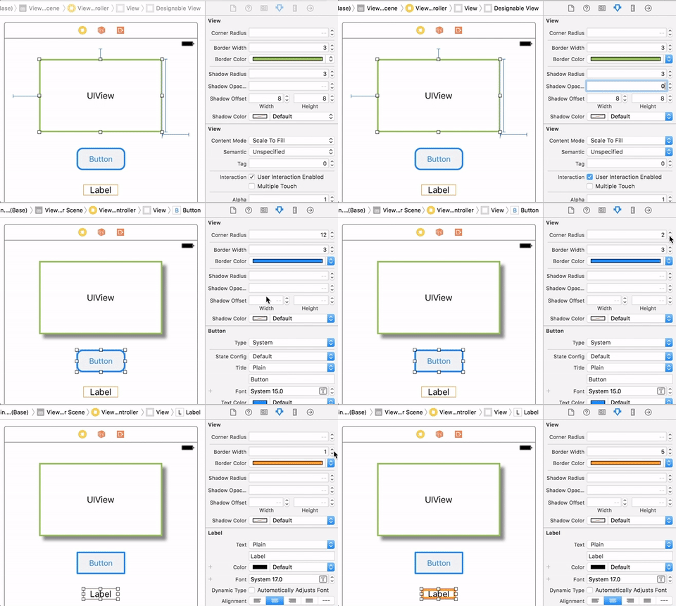
Now we can see changes take effect immediately in Interface Builder.


When I use @IBDesignable I get this annoying side effect of building the entire project every time I add a line of code. Do you know how to mitigate this?
This looks like it will be fixed in Xcode 9.2. This is in the release notes: Fixed a performance issue with rebuilding too frequently when editing IBDesignable views. (28360728)
Wow, this is amazing Mike! I never knew XCode could be modified like this.
I started learning iOS and Swift about 5 months ago, and this is the third really awesome blog post of yours I’ve stumbled upon. I can’t wait for the next one!
This is great! How might I add a border along only one side of a view or button?
Hi Caroline,
You can’t use a regular border for this, but you could add a 1 pixel wide UIView that has the background color for your border. Attaching this UIView/border to one of the sides of your view or button is pretty easy with auto layout.
Thanks very much!
I have just one problem I can’t figure out:
– button, gave it a custom class “GradientButton”
– added the extension to the AppDelegate
I can set shade, corner radius etc to a view etc.
when I do this for the button, I do get the gradient and I get a rounded borderline but the gradient is still squared behind the borderline.
What am I doing wrong or overlooking? I’m by no means I programmer but learning to become one.
Hi Patrick,
Try checking the box “Clip to Bounds” in the attributes inspector for your button.
Mike, thank you so much! Literally spent 2 hours googling about this. Didn’t know the right terminology apparently. So simple, just one box to check and it works like a charm. A valuable lesson learn’t, again thank you so much.
Setting clips to bounds seems to cancel out the shadow effect. I’m trying to get rounded corners and shadows, but so far it will only let me do one or the other.
I seem to have the same problem you’re having. I have a custom uiView class that makes a card with a number of text fields and images in it, and no matter what method I try, I am unable to have BOTH a shadow and rounded corner on my uiView. Have you figured out how to solve this?
Unfortunately, I never figured out how to do this. I ended up settling for just having rounded corners without the shadows. It was easy to do on Android, BTW.
I’ve been able to do so by using a BezierPath with rounded corners.
https://swiftlemma.com/2017/08/20/better-shadow-performance-on-views/
Hi Mike, thank you so much!
This is really great and it’s saving me a lot of time, I didn’t even know it was possibile to add these controls to interface builder.
Nice, but I got this error and I cant see new buttons.
error: IB Designables: Failed to render and update auto layout status for ChooseMapSourceViewController (7iE-PW-yDJ): The agent crashed
Hi Mike,
How can we do it both for iPhone and iPad?
Thank you, very helpful for newbie like me <3
You’re great!
The shadow in UIView doesn’t seem to be working for me.
Here’s what worked for me in Swift 4.1 (credit iosapptemplates.com)
extension UIView {
func dropShadow(scale: Bool = true) {
layer.masksToBounds = false
layer.shadowColor = UIColor.black.cgColor
layer.shadowOpacity = 0.2
layer.shadowOffset = .zero
layer.shadowRadius = 1
layer.shouldRasterize = true
layer.rasterizationScale = scale ? UIScreen.main.scale : 1
}
fucking amazing ^_^
thank you so much
After wasting my whole day on the internet this worked for me…thanks mike..!
For buttons, Ive created DesignableButton on Github. It goes a step further and centralizes your button styles so you define them in one place for easier maintenance.
https://github.com/IdleHandsApps/DesignableButton
Regards
Thanks for the awesome, short tutorial !! 👍
Thanks Hussein!
This is the best tip I’ve seen in 3 years of iOS development, and I did not even think it was possible, thank you
Thanks Daniel!
Shadow is not working