It’s time to begin the development phase of a project. The needs have been identified, and the workflow design is complete. Now it’s time to create the initial set of stories for your backlog.
Where do you start? How do you write individual stories? How do you even decide what those stories should be? I’ll address these questions in this series of posts:
- Breaking a UI into a Set of Features/Stories
- Making Stories that Are Small & Meaningful
- Setting Good Story Goals
- Decision-Making Guidelines
Let’s start with the hardest part—making the damn list.
First off: a caveat. There are many ways to create a list of stories. I am sure everyone has their own particular method, and I am sure each has its tradeoffs. This is an approach that has worked well for me overall.
1. Gather Supplies
My approach works best when you have the following supplies on hand:
- Low- to medium-fidelity user workflow wireframes†
- Plenty of clear desk space
- A red pen
- Multicolored sticky dots (if you’re feeling exotic)
Print the workflows across however many sheets of paper you need. I like printing on tabloid-sized paper, which has a good balance of density and readability.
I generally end up with anywhere between one to three dozen printouts, depending on the complexity of the workflows.

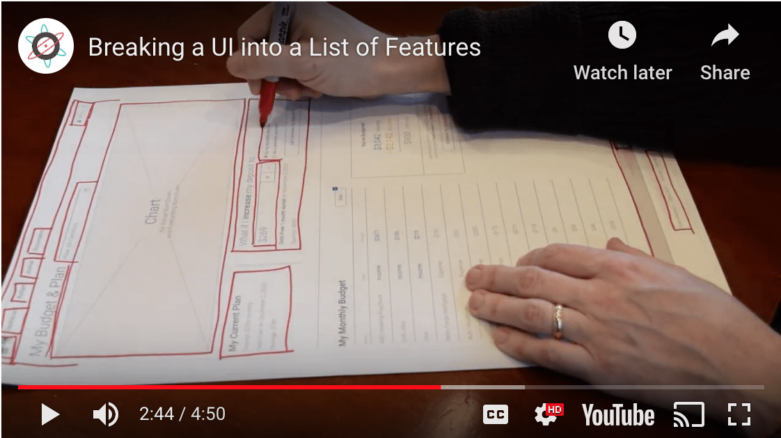
2. Mark User Features
Bring your printouts, pen, and dots to your nice, open desk space.
Select a single printout to begin. Then:
- Look for distinct, interactive components where a user might interact. Each of these likely represents a feature.
- Use your red pen to outline the component.
- Look for any components nested within the component you just outlined. Consider whether these need their own feature and should also be outlined.
- Continue the above process until you’ve exhausted components on the page.
Each printout usually results in as few as three components and as many as a dozen. More complicated workflows generally span multiple printouts.
I will sometimes write a short description (two to five words) next to a component if its purpose is not immediately clear.
I like to use a red pen, as my printouts are usually greyscale, and red stands out nicely. Use your judgment as to which color best fits the job.
Sometimes, I also add colored sticky dots to further call out certain components.‡
A Few Guidelines
Identifying features (and thereby stories) in this manner is clearly an art and not a science. My experience building GUIs with nested components within nested components goes a long way. That said, here are a couple of guidelines.
1. Favor small over large.
I prefer to identify small, atomic components over larger components. I don’t concern myself with batching or efficiencies at this point.
For example, consider the above wireframe. It includes a footer component with buttons for “FAQs,” “Email Us,” and “Chat Now.” I’d mark up each of them as components that will become stories.
By contrast, I could identify the footer and all of its components as a story. That could work, but it makes too many assumptions about those components, leading to my next suggestion.
2. Avoid assuming how a feature will work and what it will cost.
This guideline is a close cousin of the one above. Continuing the example from the wireframe above, it could be that the “FAQs” button opens a link—a trivial cost. Or it could be that it links to a separate help CMS and authenticates SSO. That’s far from a trivial cost.
Same for the “Email Us” button. It might pop up the user’s email client—a trivial cost. Or it might pop up an in-app dialog with validated email form inputs. Far from a trivial cost.
Even when I am quite confident that I know how something will work, I still default toward small over large. The last thing I want to do is to make invalid assumptions and bias the team while estimating these stories. After estimation, we’ll be in a better position to batch small stories if it will be helpful.
What Might Get Missed?
My approach above develops the story list from a UI-centric perspective. This means that deeper back-end calculations and side effects may get overlooked.
For example, the chart in the wireframe above may be too costly to regenerate on the fly. It’d be more appropriate for the chart to be regenerated in an overnight job instead. This could be easy to overlook when only reviewing UI components. My next post will address this concern.
What Next? Authoring an Individual Story
Now that we’ve got an initial story list put together, it’s time to start fleshing out the individual stories. My next post will describe my thinking and approach to this challenge.
- Breaking a UI into a Set of Features/Stories
- Making Stories that Are Small & Meaningful
- Setting Good Story Goals
- Decision-Making Guidelines
† High fidelity is great, but low-to-medium fidelity should be sufficient to start.
‡ My colleagues often get excited about the colored dots: What do they mean? Which are more significant than the others? The reality is that they mean nothing. I simply need an easier way to spot the features!