Article summary
While working on a design system for a client, a colleague and I were building out our components in Sketch. It was important to utilize symbols for nearly everything so we could maintain consistency throughout our designs. It was also important that we could make global changes quickly when needed.
We came across a challenge when developing our breadcrumb component, and we implemented an interesting solution that is both dynamic and scalable.
Our Breadcrumb
There were a few elements to our breadcrumb that made it a bit more complex to “symbolify.”
- There was a “home” icon (in which the icon artwork was subject to change).
- The number of levels needed to be anywhere from 1-6.
- The “current page” needed to be styled differently.
- The color palette was subject to change.
- The forward slash separator was also subject to change.
![]() Ultimately, we were working toward the image above.
Ultimately, we were working toward the image above.
Creating the Symbol
To create the final symbol, we used a combination of nested symbols and text styles.
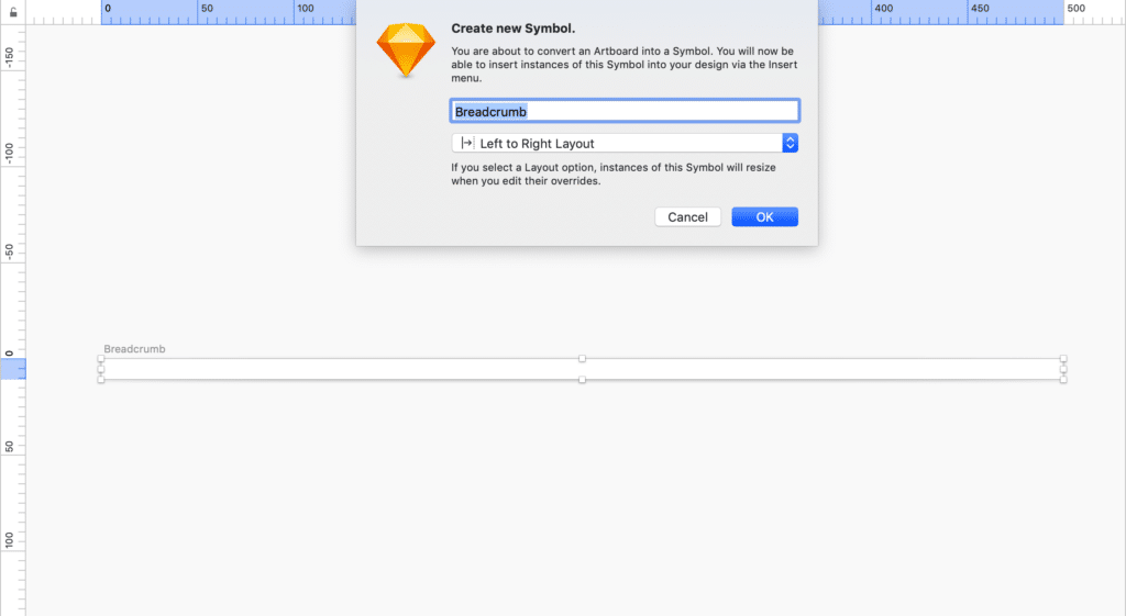
Step 1: Create the symbol artboard
Create a new symbol artboard, make it the appropriate width and height, and set it to the “Left to Right” layout.
Step 2: Icon
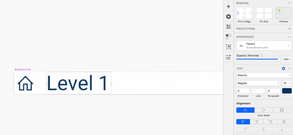
Place an instance of your home icon symbol directly in the bread crumb symbol. I like to pin it to the left edge and set a fixed height and width. This prevents it from moving around.

Step 3: The first level
Create a text box and type in “Level 1.” Make sure the text box is set to auto-width, left-aligned, and pinned to the left edge.
Once the text is set and styled as you like (for now, anyway), create a new text style for it under the “appear” section.
Step 4: The divider
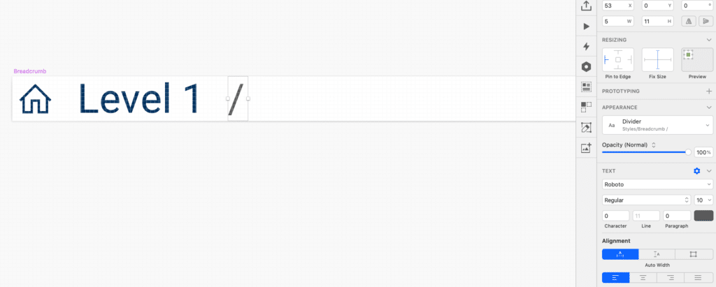
Similar to the “first level,” create a text box for your divider. Set the width to auto, left-aligned, and pinned to the left edge. Create a text style for this, as well.
If you want, you can also use a nested symbol for your dividers.
Step 5: Create additional levels
Next, copy and paste both the level and divider text boxes to as many levels as your breadcrumb will need.
There are a few extremely important things to remember here:
- There can be no more than 19px between two elements.
- All layers should be ordered and named appropriately.

Step 6: Change the last level style
In our app, we needed to indicate that the last level in the crumb was the user’s current page, so we needed to have a different text style.
Select the last level, change the appearance, and create a new text style in the “appear” section.
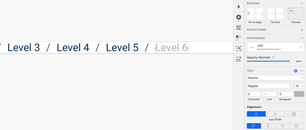
And voila–we have successfully created the symbol, and we can start using it!
Using the Symbol
Insert the symbol into your design document. With the symbol selected, we can see all of our overrides in the right-hand panel. The order in which they appear is based on our layer ordering within the symbol element, so make sure that it is cleaned up first.
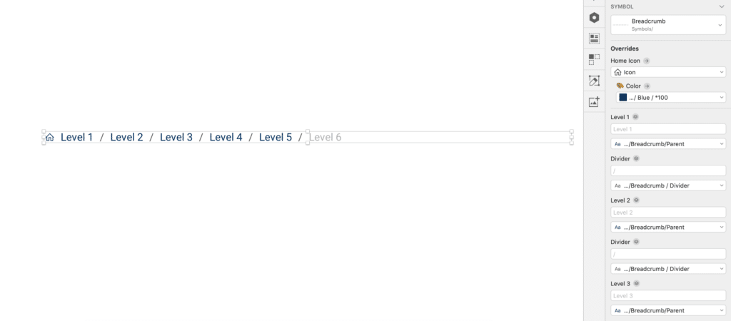
Using our Levels 1-6 in the overrides, we can start to assign our breadcrumb pages.
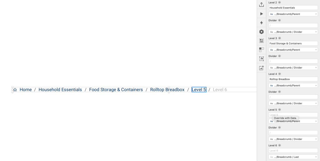
In this instance, however, we only need to go four levels deep. Typing a [space] into remaining levels and dividers will make them disappear.

Next, select the last level in your breadcrumb, and change its text style in the overrides.

And, just like that, we have built and used a dynamic and scalable breadcrumb symbol component in Sketch!
Editing the Symbol
Remember, one of our reasons for creating the component as a symbol was to make global changes quickly.
Within a matter of seconds, we can change the text styles, and even the divider, and have those changes propagate throughout all of our designs.

![]()
Let me know if you have any questions about our method to create a breadcrumb element, or if there are any techniques you’ve found to be useful, as well!

