Businesses that interact with their customers via the internet face increasing pressure to provide a quality user interface. As a customer of many online services, I expect websites to have a beautiful design, function intuitively, and work at a reasonable pace.
A lot of web applications go far beyond this, providing a user experience that’s enjoyable and keeps customers coming back. For those that don’t, there are plenty of standalone applications that act only as a layer of simple interfacing with other websites or tools. Banking applications and personal finance tools fall on both sides of this interface spectrum.
I’d like to provide a case study of how a well-integrated interface can wildly increase customer experience and satisfaction.
When a Bank Isn’t Enough
People often choose a bank for reasons of proximity, interest rates, fees, etc. My dad worked in finance while I was growing up, and he encouraged me to keep a savings account from a young age. Until I started keeping better track of my finances in college, I rarely interacted with the account.
My account was held at a local bank, and when I started using their portal, I found it very confusing. I could hardly find my bank statements, and there weren’t many workflows other than viewing balances and transactions. I started supplementing my bank’s website with budgeting and saving tools like Mint and Personal Capital But I was frustrated that the local bank’s website, where my money was actually moving, didn’t give me a comprehensive picture.
After some research and talking to friends, I decided to get an account with Simple in 2016. Over the last three years, Simple has wildly changed my financial habits. Although I still use Personal Capital for some tracking of external accounts, I house my checking and savings accounts in Simple.
Here are a few ways I’ve made Simple’s interface my main budgeting tool.
Navigating the Simple Interface
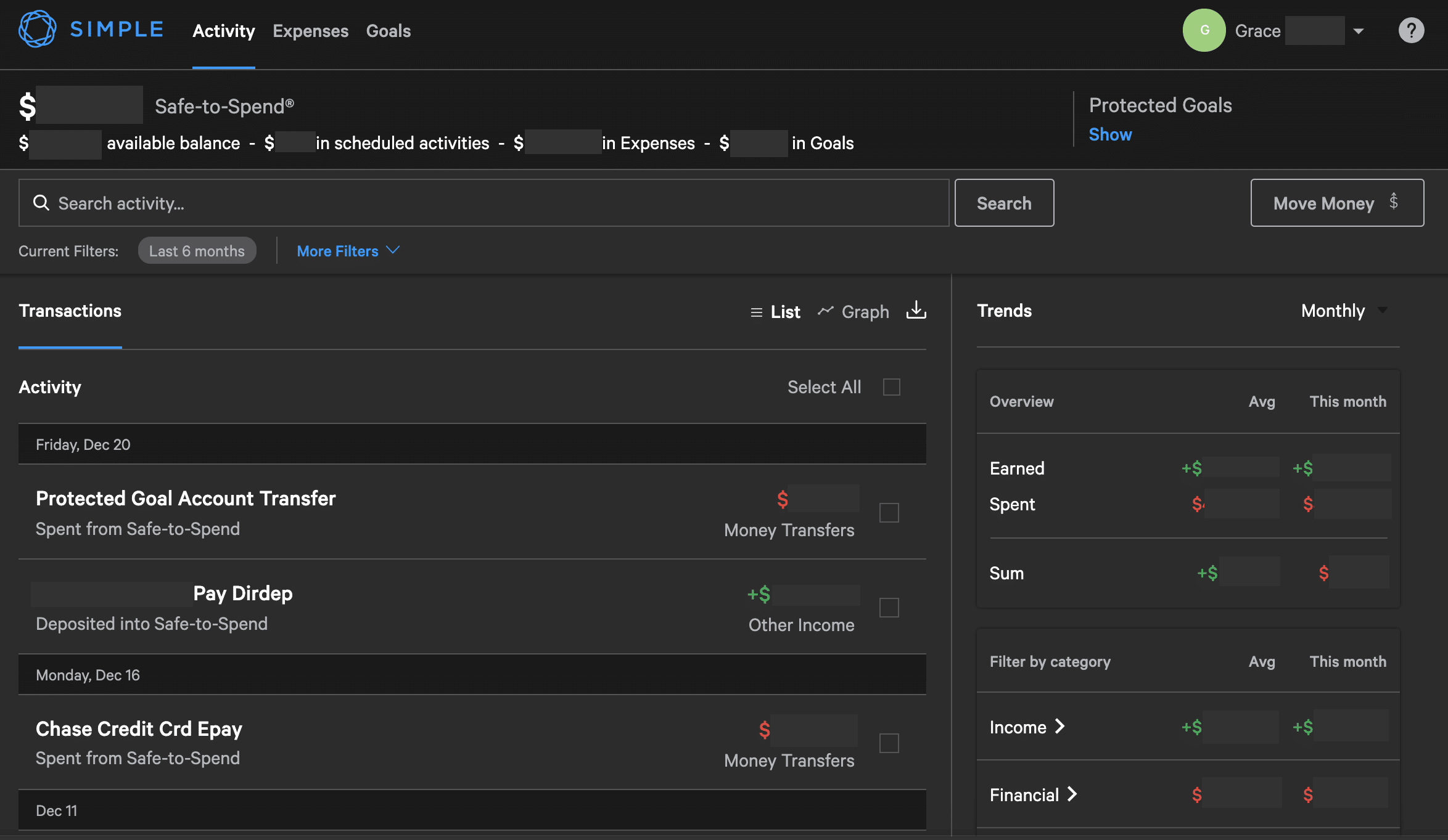
This is the Simple dashboard where I can view my transactions, some helpful information about my spending habits, and my Safe-to-Spend amount.
The search filters and the reporting on the right side of this page are tools I use regularly. Under the search bar, there’s a “more filters” button where I can choose to filter my transactions by date or by category. There are loads of spending categories to choose from, and I find that Simple sorts my transactions quite well on its own. If not, I can always change a transaction’s category manually and add notes (or even hashtags) to its description for easier finding later. I love that I can quickly locate either a single or group of transactions very quickly.
On the right side of the screen, I get a monthly income and spending report, plus how it compares to my average. This is how I do a fast checkup on budgeting. I find it helpful to see the money coming in and out categorized directly below (lots on gifts in December). There’s also a toggle to view the dashboard in a graph layout that breaks things down based more on cash flow.
These two tools are quite similar to personal budgeting software. What I don’t find mirrored in those applications is the Safe-to-Spend amount shown at the top of the dashboard. This amount is the money I have to spend that I haven’t allocated to something else. The equation for this will make more sense as we look at Simple’s other feature, but I find this especially helpful for giving me a good indication of how much I can save.
Tracking Expenses

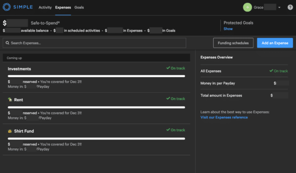
The next tab in Simple is expenses. This page shows all the things that I periodically collect a specific amount of money for. I found some of the wording here confusing at first (like the money being labeled “ready” or “coming-up”), but these have made paying recurring bills effortless.
Basically, I set up an expense by giving it a funding schedule (how often I want to set money aside for it) and a recurring date that I need to have it set aside by. This can be anything periodic, weekly, monthly, etc. My Simple will then subtract from my Safe-to-Spend the amount of money needed to reach the target.
For example, I have expenses set up for rent and my personal investment account with a funding schedule that corresponds to the days that I get paid. This way, I don’t ever see the money saved for these in my Safe-to-Spend, which protects me from unexpectedly spending it. The automation of this tool is fantastic; it allows me to only think about budgeting for expenses when I set them up the first time.
Setting Goals

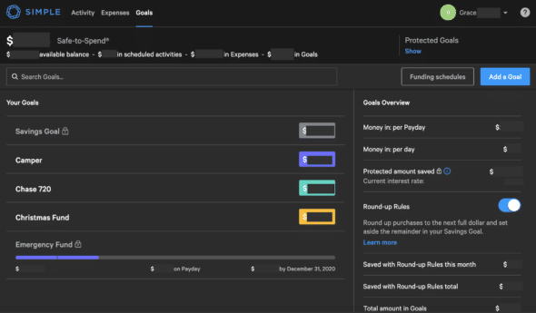
The last tab on Simple is the goals page. This was the reason I initially chose to use Simple, and I still cherish this feature. Goals are similar to expenses in that you can assign a funding schedule and set a target date, but they can also be a set sum of money.
For example, I have a goal for funds to remodel my camper. This was a chunk of money I had on hand that I set aside months ago to use for repairs. The amount has gone down as I do more work on the camper, but this way, I can move money from this goal to my Safe-to-Spend to cover renovation costs.
An additional thing I set aside goals for is credit card payments. I do this manually once a week or so; I check the amount due on my credit cards, then I move enough money to their respective goals to match the bills. This keeps my Safe-to-Spend amount accurate and also makes paying my credit card bills much easier.
Credit card spending is the reason I still use Personal Capital. Simple isn’t aware of my credit card transactions, so it can’t categorize money spent on them. However, I’ve found keeping goals for credit balances due is the easiest way to keep my Simple budgeting up to date.
Another highlight of Simple’s goals are the protected goals. These differ from normal goals in a Simple account in that they’re stored in a separate checking account that earns a higher rate of interest. Protected goals, like the savings goal and emergency fund pictured, are meant to be savings. By housing these under a separate account, Simple ensures that these funds are completely protected from accidental spending.
I have a repeating contribution to my emergency fund to meet a certain goal, but I contribute sporadically to my savings goal when I feel I have money to move there. I also use Simple’s round-up rules to contribute small, consistent amounts to my savings goal. All of these tools combined have led to a great strategy for me to save money in multiple ways.
Simple’s features and continued commitment to providing a fantastic user experience have made me a satisfied customer of nearly four years. I find that Simple continually listens to customer feedback and releases new and useful tools frequently as a result of this.
The benefits of using Simple’s integrated personal finance interface has far outweighed any cons of using an online bank for me. Simple’s user interface is at the core of their business. I believe having a great interface like this is imperative for companies that succeed in the e-commerce market.

