If your team is like many of the teams we work with, you’ve implemented a component library, but you’re finding that things aren’t working as smoothly expected.
Component libraries alone can do the job for a small, highly-skilled implementation team. But communication seems to break down when you add in less-than-top-rated developers or designers or those who just are not up to speed on your design system.
Here are three principles to help identify potential issues and ways to improve the process.
1. Design and development tooling should remain in sync.
It’s a great source of pain when design and development tooling used for component libraries start in different places. Recently, I’ve seen development teams pulling in material.ui or material.angular.ui while the design teams are using the default material sketch UI symbols.
While all of these tools are based on Google’s Material UI guidelines, they have fundamentally different patterns (and, likely, different naming conventions).
Design and development need to agree on a shared language for components and variants of components to be used in their component library. The team’s tooling should then adopt this language, so everyone is on the same page when referring to a component.
This can be done in Sketch by renaming the component or the titles of the fields to align with the derived language. Or development can name their components to match the agreed-upon terminology.
Adding layers of tooling is an option for some teams. Here are a few options to look into:
- react-sketch-app – Generates symbols directly from react code. This keeps the Sketch symbol and component code in sync.
- Zeplin Connected Components – Gives developers visibility to symbols created in Sketch, instead of only the CSS.
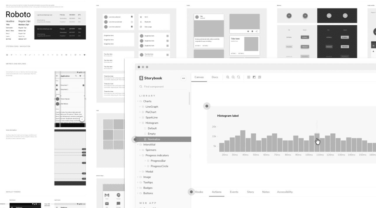
- Storybook – Gives designers visibility into the production components.
- Bit – Deploys, shares, and packages components.
The right tool or set of tools will depend on your individual team needs. Setting tooling up may seem like a ton of work, but fleshing out these details will make the movement of design concepts to production-ready code much more smooth. The alternative is a lot of technical and design debt and a slew of meetings to unravel the mess.
2. Stick to the component library, patterns, and only break when necessary.
Everyone involved in building software should be on the same page about the two-fold value a component library brings:
- Consistency – When each type of element looks and acts the same on every page, it builds trust with the user. It also decreases the pain of maintaining the code and updating the styling for the life of the product.
- Efficiency – Once the component library has been designed and implemented, designers and developers both save a lot of time. Designers have a finite number of elements to use to build the interfaces, and developers only need to copy/paste the component and hook it up to get it working instead of doing it all by hand every time.
There’s often a lot of leeway for designers to come up with very different layouts, given the same instructions. The benefit of a component library is in creating repeatable UI elements. Creating common patters of how those elements should be used together will help drive consistency across the application.
Another way to help is by making more examples available. This is very important when you have a larger design team, one which with less experience, or one that’s more distributed across areas of a product. Collecting and sharing how components are used and how they may be used together will help drive towards establishing stronger patterns.
As a product continues to grow, its complexity and UI needs will continue to grow with it. Keeping tight control over the elements and patterns will help control the madness. Therefore the whole team should value the component library, allowing designers and developers to break from the patterns when necessary.
3. Design and development should find a common language to communicate the intent and use of components.
The actual handoff of designs is where things often fall apart. This is nothing new and not a result of the introduction of component libraries. At its core, it’s a communication problem and one that’s unique to your team and their capabilities. There are a number of ways to address this fundamental issue of trying to implement UI designs.
Here are a few options:
- Design and development work together to layout the components on the page.
- Development layouts the page and design reviews the work.
- Designers get in the code and layout the components, then hand off to development.
- Developers spend more time getting to know the component library, so they can identify what likely components to use.
- Designers annotate designs and pass them to developers to translate and implement.
I would advocate for the minimal necessary approach to getting the designs implemented as best as possible. There are significant tradeoffs, which usually take meetings and can slow releases. Also, keep in mind a process that is working today may not work tomorrow. Your team is growing, learning, and maybe getting bigger. Communication is something to keep a close eye on.
At the end of the day, it’s the whole team’s responsibility to bring a product to life. Improving the design-to-implementation transition will help the whole process go smoother.