Article summary
Delivering new software is a complex process. Doing so at the height of a global pandemic only adds complexity. I thought I’d share my thoughts on an example done well, the How We Feel app.
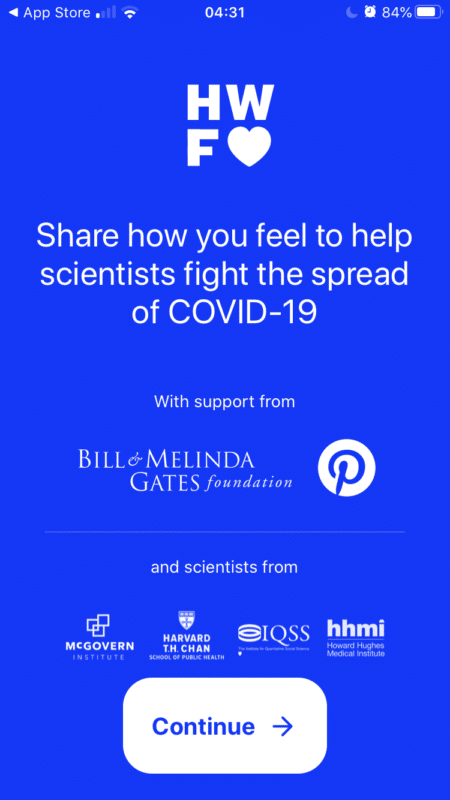
How We Feel is a mobile app that fills the gap between virus testing limitations and having no data at all. Each day, you can share how you’re feeling physically and emotionally and quantify how many people you may have been in contact with. The data you choose to share enables scientists and doctors to:
- Identify new outbreaks
- Understand how the coronavirus is spreading
- Discover new populations that may be at risk
- Evaluate how interventions are working to slow the spread of the disease
Six things stand out about this app from a user experience perspective.
1. Focus
So many apps try to be or do many things. How We Feel is clearly laser-focused on the mission to stop the spread of the COVID-19. The team knew what features to prioritize because they understood how the app would be used. I believe this focus was paramount to this app launching when most states were just starting their stay-home orders.
Having a clear mission and focused understanding of the end goal are among the biggest drivers to successful product delivery.
2. Privacy
It’s increasingly important to understand how one’s data is used; the idea of traceability or tracking one’s movements is often faced with skepticism. How We Feel is anonymous — it doesn’t ask for your name, phone number, or email address. Personal questions about sex and ethnicity are not required.
The app does ask about your location, but it also explains how this information will be used:
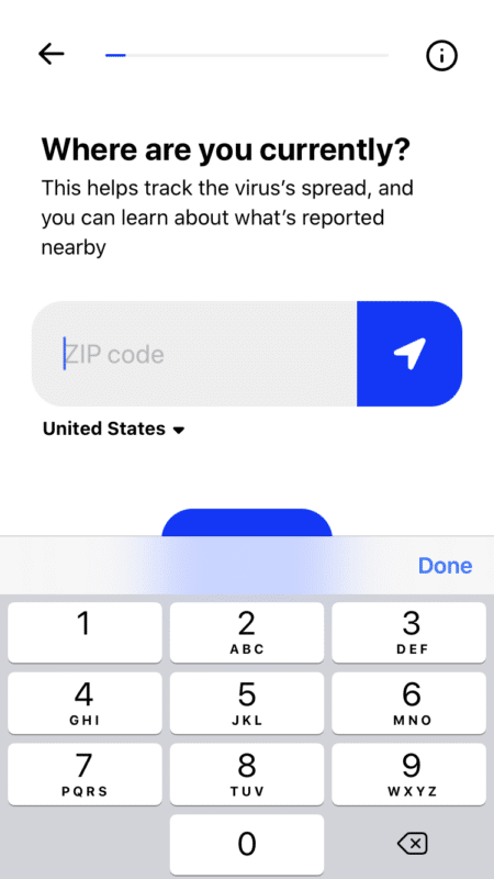
Empowering users to know how their data will be used and sharing only what is necessary builds trust.
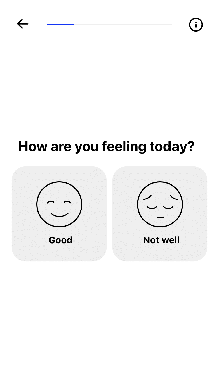
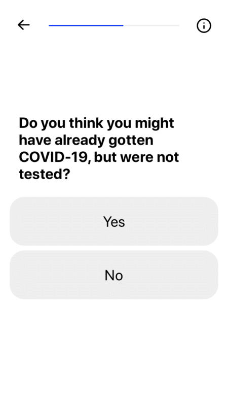
3. Accessibility
The daily check-in is a thirty-second survey facilitated by large icons and buttons that are highly accessible. The minimal branding also works in favor of usability. High-contrast colors (like the app’s blue, white, black, and gray) make the interface accessible to those with diminished vision, color deficiencies, or blindness.
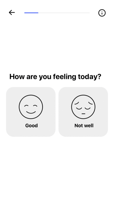
Focusing on accessibility increases the audience and improves the odds of accurate data.
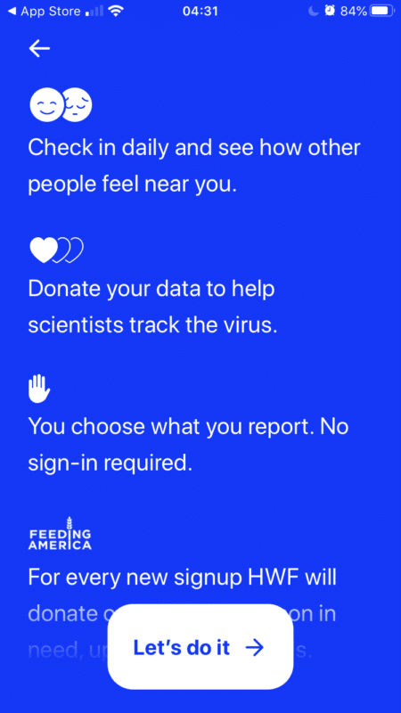
4. Social Good
Every time a new person submits their data for the first time, the organization donates a meal to people in need through Feeding America.
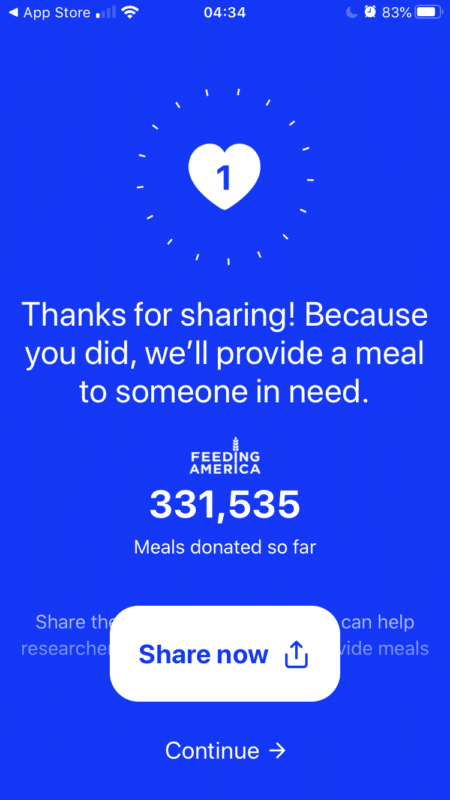
Participating in something that pays it forward makes everyone involved feel better about the time and energy they invest.
5. Retention
How We Feel has continued to tweak the daily check-in, asking slightly different questions every time. This keeps it interesting and ensures people are fully engaged with each check-in, instead of just going through the motions.
Their use of push notifications was interesting too. This can often be a cringe-worthy request from an app; we all fear the clingy feeling of too many notifications. How We Feel does it like this:
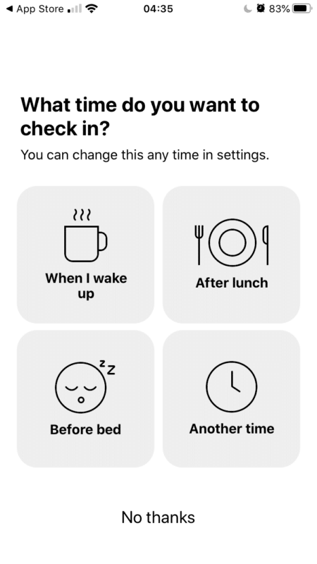
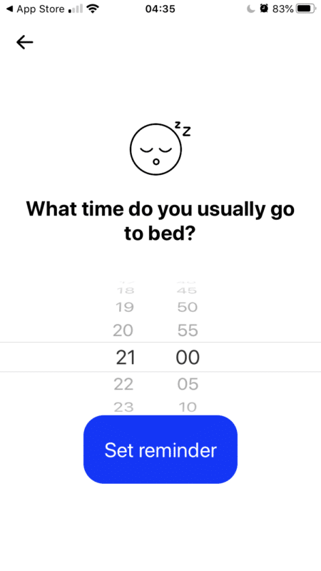
Make it easy (with multiple options) and desirable (on the user’s time) for people to continue to engage.
6. Context
Many survey tools now show you some results after you submit your response. Showing the results of health information, however, requires extra caution. Since How We Feel is anonymous, it’s easier to share summarized data.
How We Feel does a great job of providing context once people are done filling in the daily check-in questions.
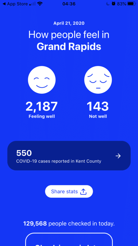
Show context of the bigger picture to keep users informed and address their curiosity.
While your app likely differs from How We Feel, focus, privacy, accessibility, social good, retention, and context are still relevant. These factors are worth addressing as a team when designing the purpose and experience of your application.