I recently worked with a client to design a standalone Apple Watch application to accompany an exiting iOS app. When starting, I was surprised at the lack of design resources for the Apple Watch, specifically for designing standalone watch apps. Here are my top six tips and resources for designing for the Apple Watch.
1. Wear a Watch
First and foremost, actually wear an Apple Watch and interact with it throughout the day. I made sure to download any apps that my client or peers described as “enjoyable to use” and tested them out. I also tried to make a point of trying out the watch in different settings (e.g., at home, walking the dog, while away from my phone) to really get a feel for the experience of using an Apple Watch.
This is important because there are a number of interactions on the watch that are unique (e.g., digital crown). These aren’t available on the iPhone or other wearable devices, and you can’t replicate them in the available prototyping tools.
2. Design for Augmented Reality
Peter Lewis at InVision does a great job of summing up the difference between designing for a wearable device and a phone:
“iPhone is alternate reality, and Apple Watch is augmented reality.”
When we design an app for a phone, we tend to focus on questions such as, “How do we keep users in the app?” and “How do we keep users coming back to the app?” However, when designing for a watch, we should instead ask ourselves, “How do we provide the minimal experience to give users what they need without interrupting their day?” and “How do we minimize interactions that a user has to complete within the watch application?”
We also have to think about what our users might be doing outside of the watch application. Are they carrying in their groceries? Are they in a meeting? At dinner? These kinds of considerations are vital to creating a non-intrusive app that gives users the information that they need at a glance.
3. Apply Classic App Design Principles
This may go without saying, but when designing for an Apple Watch, app design principles still apply! I suggest reading Vamsi Batchu, who categorized each of the classic design principles through the lens of the Apple Watch. Some of my favorite principles that he called out were the importance of hierarchy (we’ll get into this more later!) and navigation.
4. Consider Alternatives to Touch Input
It’s also important to consider the physical constraints of an Apple Watch. As the Nielsen Norman Group points out, the Watch’s tap area is much smaller than the recommended tap area for touch devices. For example, the app screen icons are 2 millimeters wide, while the recommended tap area is 10 millimeters. How do they recommend getting around this? It’s simple — don’t tap anything at all! Instead, leverage voice and gestures.
For the standalone app I was designing, we originally had a Bluetooth pairing screen that required users to enter their device’s serial number. This workflow was a perfect parallel to the one in the phone app, but on the Apple Watch it was difficult to know if you were clicking the correct numbers since the number entry screen on the watch has such small buttons.
The final solution ended up coming from the developers. Rather than require users to enter a serial number, they found a way to search for nearby Bluetooth devices and let users choose their device’s serial number from a list. This allowed us to use the easier up/down swipe gesture or let users scroll using the digital crown instead of using an on-screen keyboard.
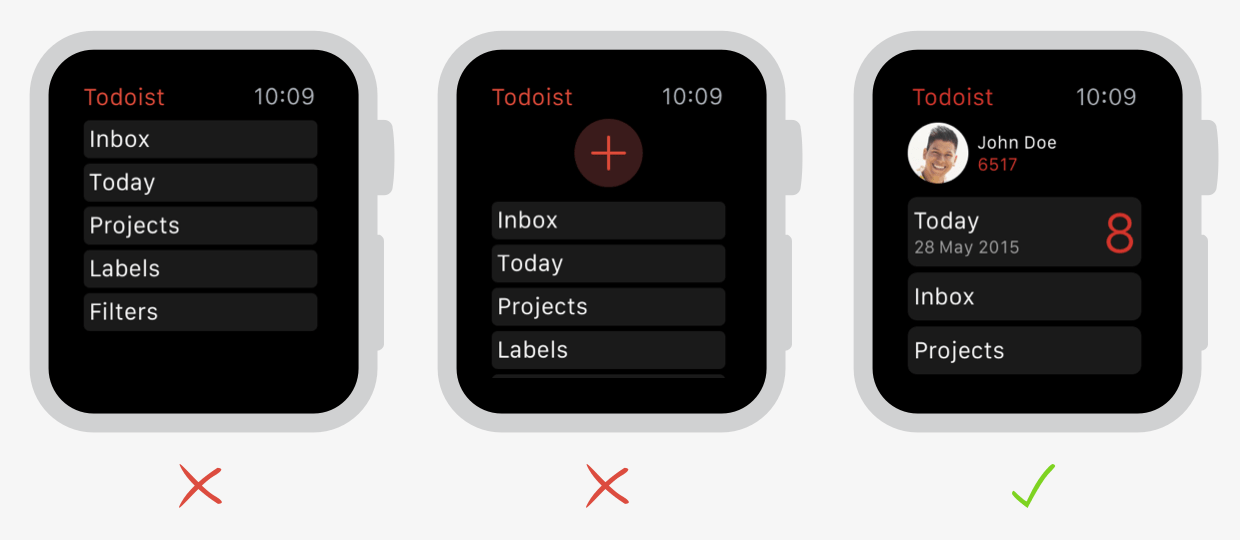
5. Prioritize Content
While Doist was designing and user testing their Apple Watch app, they repeatedly found that they had to prioritize and reprioritize content. They did this in a few ways:
- They put the most important piece information at the top and made it the largest item on the screen.
- They iterated, prioritizing key interactions (e.g., checking items off a list) over providing long text descriptions for known to-do items.
- They applied the same rule to their complications and at-a-glance notifications, making sure the most important content was the easiest to understand in less than a second.
6. Redesign the App Icon
Last, but not least, it’s important to consider all aspects of your brand on the Apple Watch. This includes sizing down your logo and app store icon for small-screen viewing. Artiom Dashinsky recommends leveraging a glyph or graphic (over text) and simplifying the graphics for a smaller size.

For my client, I thickened the strokes of their logo and increased the thickness of forms to ensure that it was easily recognizable on the app screen, as well as in complications and notifications.
Have you designed for the Apple Watch? If so, what did you learn from the experience?