In my current web app development project, my team has been using Material UI to develop UI components. Material UI proved to be an extremely useful library for React projects. It provides thoughtfully designed ready-to-use components for common use cases. For many months, the library provided exactly what we were looking for. But, eventually, I found myself adjusting and readjusting an MUI component with little success. Even though the pre-made structure of MUI provided immediate convenience, I needed to do a more extensive investigation to learn how to customize the details of a component to my needs.
Getting to the Root of the Problem
As a baseline for working with Material UI components, our team used the classic makeStyles hook. This hook defines styles under variable names and passes them to a component using the className={classes.root} pattern. For example:
export const useStyles = makeStyles(() =>
    createStyles({
        codeTitle: {
            marginTop: '12px',
            marginLeft: '20px',
        },
}));
import { useStyles } from './styles';
export const CodeBlock: React.FC = (props) => {
    const classes = useStyles();
    return (
        <Typography className={classes.codeTitle} variant="body2">
            {props.title}
        </Typography>
    )
}
Eventually, I came across an MUI component that did not fit the style that I needed. As much as I adjusted the styles within the makeStyles hook, I couldn’t get the component to reflect what I was looking for.
The specific component I was attempting to implement was a set of tabs; bolded text indicated a selection, but the project designs called for a colored indicator as well.

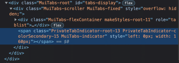
Upon inspection of the element, the DOM revealed that an indicator line did exist at the bottom of the selected tab. I tried changing the property on the component:
<Tabs
    id="tabs-display"
    value={props.selectedTab}
    onChange={handleChange}
    indicatorColor="secondary"
>
    {props.labels.map((value, index) => (
        <Tab role="tab" label={value} key={index} id={`tab-${_.lowerCase(value)}`} />
    ))}
</Tabs>

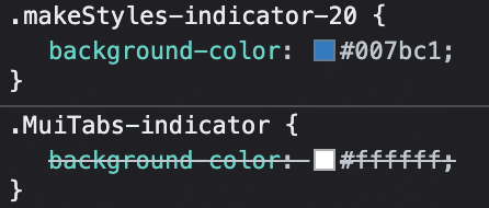
Even then, the color was being overridden by something that seemed out of my control.

The Solution: Keeping it Classy
The reason adjusting styles we applied through the className model did not work is because className affects the component only at the root level. Referencing the DOM, we can see that the indicator is an internal element, separate from the root.
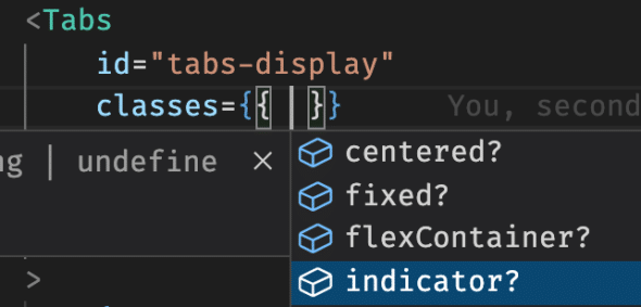
Switching from using the classNames prop to classes allows for direct access to all the inner elements that are not so obviously customizable. Here you can clearly see a list of the inner element options. This includes the indicator that appeared to be overriding the background color selection in the DOM inspection.

Now, adding some styles directly to the indicator, as well as including styles to the root component, is easy:
export const useStyles = makeStyles(() =>
    createStyles({
        indicator: {
            backgroundColor: Colors.blue[500],
        },
        flex: {
            marginTop: '14px',
            marginBottom: '14px',
        },
    })
);
<Tabs
    id="tabs-display"
    value={props.selectedTab}
    onChange={handleChange}
    classes={{ indicator: classes.indicator, flexContainer: classes.flex }}
>
    {props.labels.map((value, index) => (
        <Tab role="tab" label={value} key={index} id={`tab-${_.lowerCase(value)}`} />
    ))}
</Tabs>
And just like that, custom styles appear!


Customizing Styles in an MUI Component
Material UI is great for out-of-the-box components, but that doesn’t mean that they can’t be customized to your needs. Both the className and classes props are useful for reaching into different levels of MUI components.


Can you post github link for example?