
This is part one of a series on using Angular CDK Overlay to build a custom, accessible select dropdown component. First, we’ll discuss the initial HTML layout and get an introduction to CDK Overlay.
Checkboxes, Radio Buttons and Selects
If you’re building forms, at some point you’ll have to provide a way for users to pick an option from a list of possibilities. There are a few standard ways of doing this, including radio buttons, checkboxes, and select menus. There are good guidelines for when to use different inputs, so I won’t go over that here. Instead, I’ll focus on using and building custom select dropdown menus.
The Standard HTML Select
The standard HTML select works well and is set up with many convenient shortcuts and accessibility features. For example: tabbing to a select element and then hitting a letter will quickly jump to the first option that starts with that letter. Unfortunately, the default select menu is not very customizable. Even the MDN spec says that it is “notoriously difficult to style productively with CSS.” If you want to do anything more than display a simple list of text options in the menu, you’ll need to create a custom component. This means (re)implementing quite a lot of functionality that many users expect (and some rely on) when dealing with a select menu.
Introducing Angular CDK Overlay
This is where the Angular CDK Overlay service comes in. This service is the exact opposite of using the HTML select element. Where the select is rigid and not extensible, the CDK Overlay is completely open-ended and customizable. All it really gives us is a way to display a container “above” the content on the page, positioned relative to another element. Making it function like a select element with all the accessibility features and behavior the user expects is completely up to us.
The official documentation for the CDK Overlay is fairly sparse and only shows one simple example. In this series, I’ll show how to construct a simple select component that is accessible. We’ll then extend that component for other uses, such as selecting multiple items and displaying arbitrary content. Our select will work with reactive and template-driven forms and so we can use it exactly the same way as a standard select element.
Using the select
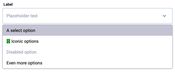
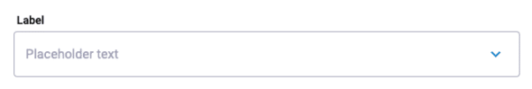
As with a standard select, there is one parent element with many child option elements you can select. Here is an example of the custom select with four options hooked up to an ngModel:
    <custom-select id="example"
            label="Label"
            placeholder="Placeholder text"
            [(ngModel)]="testModel">
        <custom-select-option [value]="{value:'select option', letter: 'a'}" >
            A select option
        </custom-select-option>
        <custom-select-option value="Iconic options">
            <i class="fas fa-building" style="color:green"></i>
            Iconic options
        </custom-select-option>
        <custom-select-option value="Disabled option" [disabled]="true">
            Disabled option
        </custom-select-option>
        <custom-select-option value="Even more">
            Even more options
        </custom-select-option>
    </custom-select>
The first option has an object as the value emitted when you select it. The second option has a green building icon in it that will also appear in the main select bar after being selected. The third option is disabled.
Building the Select Component HTML
Our select component will consist of three basic parts:
- The bar that shows either a placeholder value or the selected item that a user can click to display the list of options.
- The menu of possible options, each of which can be clicked to select that item.
- A simple service to easily allow communication from the list of items back to the parent component.
These will all be in one component directory laid out as follows:
custom-select/
    ├── custom-select-option.component.ts
    ├── custom-select-option.component.scss
    ├── custom-select.component.html
    ├── custom-select.component.scss
    ├── custom-select.component.spec.ts
    ├── custom-select.component.ts
    ├── custom-select.service.ts
    └── custom-select.module.ts
In this first part, we’ll just build the custom select HTML and custom select option HTML with the bare minimum TypeScript to get them working with the CDK overlay.
The select bar
All of this is in the select.component.html file.
<div class="select-wrapper">
  <label *ngIf="label.length > 0" [class.error]="error" class="label-text">{{label}}</label>
  <div #select
    tabindex="{{this.disabled ? -1 : 0}}"
    [ngClass]="mainSelectClasses()"
    (click)="showDropdown()"
    (keydown)="onKeyDown($event)"
    (blur)="onTouched()"
    [attr.id]="inputId"
    role="listbox"
    [attr.aria-label]="ariaLabel || null"
    [attr.aria-labelledby]="ariaLabelledby || null"
    [attr.aria-multiselectable]="false"
    [innerHTML]="displayText"></div>
  <span class="dropdown-arrow"
    (click)="onDropMenuIconClick($event)"></span>
</div>
Let’s go through this code line by line. The first line is a wrapper div that will contain everything else in our select menu and lets us style it. Line two is our label which we will set using the label input variable.
The next line is the main div which will make the options menu appear when a user clicks it. Inside this tag are all the handling and assistive tools that make this part function like a standard <select> element.
The select div has a template variable #select that we’ll use to position and size the options menu. We want the user to be able to hit the tab key to cycle through a page and select this element. So, we’re giving it a tabindex of 0 (except when it’s disabled, in which case we want it to be skipped so it gets a tabindex of -1). We’re using the function mainSelectClasses() to provide this div with all of the relevant CSS classes to set things like the disabled or error styles.
Then we have all of the handlers for different ways the user can interact with the element. That includes (click), (keydown), and (blur), which we will use to control what happens when the user clicks on the select bar, presses a key while it’s focused, or touched by the user in a form. We let the instance of the component set the id of this element with the inputId variable.
We’re giving this the listbox ARIA role. That will help people who use assistive devices such as screen readers identify that this is an element the user can select to display a menu of options. We’re also setting several other ARIA attributes so anyone can easily use this element.
Finally, we’re setting the [innerHTML]. This will allow us to update the displayed value when a user selects an option from the menu. Setting the innerHTML instead of just using interpolation lets us display content such as icons inside this select bar.
Next to the main select bar is a little down arrow overlaid at the end of the bar. This hints to users that this is a select menu they can interact with.
The options menu
Just after that arrow, inside the select-wrapper div is where we will place our CDK portal template:
  <ng-template cdk-portal class="dropdown">
    <div class="dropdown-menu">
      <div class="dropdown-options-container" (keydown)="onKeyDown($event)">
        <ng-content></ng-content>
      </div>
    </div>
  </ng-template>
This HTML tells the cdk-portal to appear here and lets us specify its contents. We have another (keydown) event binding to handle keyboard events when the user is focused in the menu. We’re using two nested divs inside the ng-template. That way, later we can go back and add more elements around the list of options when extending this component. This will let us easily add things like a search filter or an accept button. Inside everything is a ng-content element into which angular will project the options we specified when we used the custom select.
Using Angular CDK Overlay
To use the CDK Overlay, we must install it by running npm install @angular/cdk.
Also do not forget to add the line @import '@angular/cdk/overlay-prebuilt.css'; to your global stylesheet! If you skip this step or if the overlay CSS isn’t imported correctly, your overlay will appear after everything else on the page. You might feel very confused about why it isn’t in the correct spot.
The show dropdown function called by the (click)=showDropdown() handler is where we put all of the functionality that will display the list of options. For now, we’ll keep it to just displaying the overlay. But, in the future, we’ll make it highlight the selected option and scroll to it. This is where most of our CDK overlay wrangling happens.
This code is in the select.component.ts file:
private  overlayRef!: OverlayRef;
@ViewChild(CdkPortal) public  contentTemplate!: CdkPortal;
constructor(private overlay: Overlay) {}
...
private showDropdown(): void {
  this.overlayRef = this.overlay.create(this.getOverlayConfig());
  this.overlayRef.attach(this.contentTemplate);
  this.syncWidth();
  this.overlayRef.backdropClick().subscribe(() => this.hide());
  this.showing = true;
}
Again, going line by line, we can see that this creates a new CDK Overlay using our overlay config (more on that below). We’re attaching the list of options to the overlay we’ve defined in our HTML and can reference it with the contentTemplate variable. By default, the overlay is as wide as the content inside it, so the syncWidth() function adjusts it to the size of the main select bar. We also set the overlay to close when the user clicks outside of it and store the state of the overlay in our showing variable for later use.
The overlay config lets us define where the overlay will appear and how it will behave as the user scrolls the page. This is what ours looks like:
@ViewChild('select') public  select!: ElementRef;
...
private getOverlayConfig(): OverlayConfig {
  const positionStrategy = this.overlay
    .position()
    .flexibleConnectedTo(this.select.nativeElement)
    .withPush(true)
    .withPositions([
      {
        originX: 'start',
        originY: 'bottom',
        overlayX: 'start',
        overlayY: 'top',
        offsetY: 4,
      },
      {
        originX: 'start',
        originY: 'top',
        overlayX: 'start',
        overlayY: 'bottom',
        offsetY: -4,
      },
    ]);

    const scrollStrategy = this.overlay.scrollStrategies.reposition();
    return new OverlayConfig({
      positionStrategy: positionStrategy,
      scrollStrategy: scrollStrategy,
      hasBackdrop: true,
      backdropClass: 'cdk-overlay-transparent-backdrop',
  });
}
This sets the overlay to appear next to our main select div element. The withPush makes sure it remains in the viewport even if that overrides our positioning below. We’ve given it a couple of preferred positions. We’ve defined which corner of our main select div will correspond to the corner of the overlay and added a slight offset of 4 pixels to give it a little gap. The second position is not required, but it will be used if the first is outside of the viewport. With these positions, the overlay will appear below the input bar if possible and above it as a backup. The scroll strategy moves the overlay up and down as the user scrolls the page.
Here is our syncWidth() function which resizes the overlay to be the same size as the main select bar:
private syncWidth(): void {
  if (!this.overlayRef) {
    return;
  }
  const refRectWidth = this.select.nativeElement.getBoundingClientRect().width;
  this.overlayRef.updateSize({ width: refRectWidth });
}
We should also call this when the user resizes the page to ensure that the overlay and the input bar stay the same size:
@HostListener('window:resize')
public onWinResize(): void {
  this.syncWidth();
}
We need to hide the dropdown menu when the user clicks outside of it in the hide() function:
private  hide(): void {
  this.overlayRef.detach();
  this.showing = false;
}
Now we can click on our main select bar to display a list of options and click outside the list to hide it. We just need an option component.
Building the Option Component Skeleton
For now, we’re going to build out the most simple version just to display the options in the menu.
The option component
Here is the complete bare-bones select option component file custom-select-option.component.ts that will allow you to display the options shown in the example at the top of this post:
@Component({
  selector:  'custom-select-option',
  template:  `<ng-content></ng-content>`,
  styleUrls: ['./custom-select-option.component.scss'],
  host: {
    'role':  'listbox',
    '[attr.aria-label]':  'value'
  }
})
export  class  CustomSelectOptionComponent {

@Input()
public  value!: any;

@HostBinding('class.disabled') @Input()
  public  disabled = false;
}
Note that you’ll need to create a stylesheet for the option and the overall select component.
With all this in place, you should be able to show the list of options by clicking on the main select bar and then hide it by clicking anywhere else on the screen.
In part two of this series, we will implement the ability to select options both by clicking on them in the menu and using the keyboard. A demo of this component is available on stackblitz.