This is the third part in a series of post covering software jargon. As I mentioned in my previous posts, I’m writing this series to create a glossary of terms around specific areas of custom software development (technical, process, and design). I hope these posts will make it easier for non-technical people to ramp into their first custom software project. I mean for these definitions to provide enough context to follow a conversation without going too deep. Additionally, you should know that there are nuances in many of these terms that I will not cover here.
Quality software requires more than an elegant coding solution. It needs to provide real value, be easy to use, and be visually appealing. Good product design is critical to the success of any product. If a racing team built a world-class engine but designed a cube on wheels to place it in, they wouldn’t have much success.
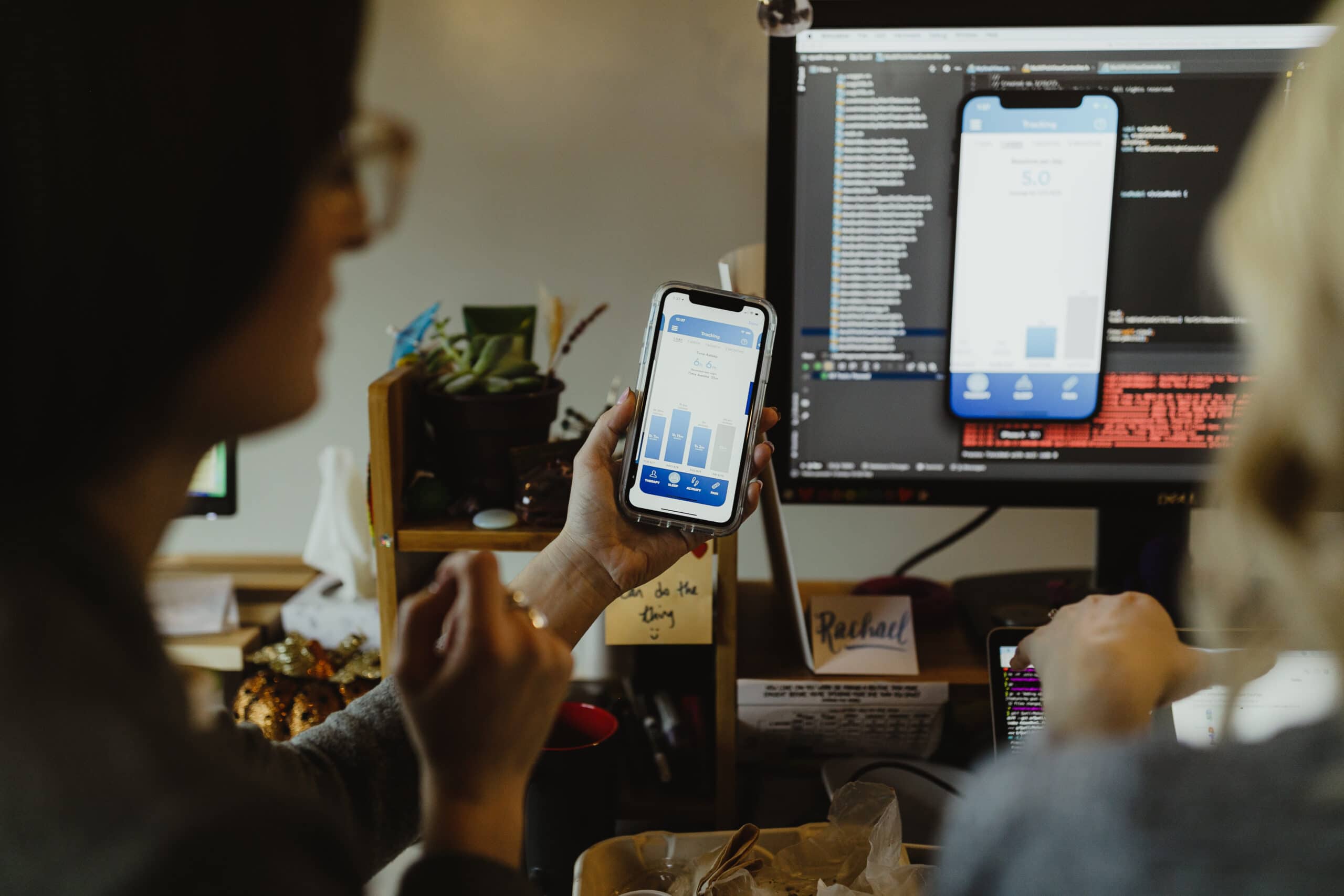
User Interface (UI)
Definition: The visible component of software that users interact with.
User interfaces can be complex, like a slick credit card entry form that does data validation on the fly. Or, it can be simple, like a text adventure game.
Human Centered Design (HCD)
Definition: A philosophy of design that emphasizes real users as the driving force behind designing a product.
Many of the concepts below are activities or terms that are used within HCD.
User eXperience (UX)
Definition: The emotions and thoughts a person has while using software.
A user’s experience includes several key considerations, such as:
- Does the software do what I expect?
- Is it pleasant to interact with?
- Is it easy to accomplish my tasks using the software?
User Research
Definition: Gathering data from real or prospective users of a system.
User research is an important tool in the HCD toolkit. It’s used to advise the future direction of a new application, and it enables feedback gathering on what is and isn’t working well with a current application.
There are several means for gathering data from users. These could include sending surveys, one-on-one conversations, and observing users complete tasks with the product.
Personas
Definition: A representation of the people that will interact with the system.
Each persona includes information about goals, motivations, frustrations, jobs they need to do, etc. for a specific type of person using a product.
For example, a food delivery service might have a persona of Hungry Todd, a 20-something college student whose main goal is to devour a Taco Bell Party Pack as quickly as possible. He’s frustrated when he doesn’t know when his food will arrive.
Personas are the guiding light for UI/UX designs. This avoids a common pitfall of stakeholders designing a system that suits them, not the real end user.
Journey Map
Definition: Documents steps people take to have a complete experience or journey.
This is another HCD tool that helps product teams understand how using software fits into the bigger picture of a person accomplishing a goal. An application likely has several journey maps for each persona using it.
For example, a college student looking for extra cash to buy booze for the weekend decides to look into a food delivery service their friends have been raving about. They visit your website and read about how easy it is to make a quick buck and they sign up. They enter information to validate they’re legit, and then they hop in their car and fire up the app. Next, they see a list of orders and select one. Then they copy the restaurant address over to Google Maps and they’re off.
A complete journey map would include all the steps after that, such as picking the food up, knowing the name on the order, knowing the address for delivery, getting paid, etc.
Responsive Design
Definition: Design that responds to different screen sizes to create a good user experience.
The most common types of responsive design are desktop, tablet, and mobile. Because real estate is different on these three devices, an application may need to re-organize content to keep a delightful user experience (i.e. no side-scrolling, etc.).
You can test whether a web application has an element of responsive design by resizing the browser window. Does the navigation turn into a side drawer at a certain size? Does content in a grid automatically push down to a new line?
Style Tiles
Definition: Incomplete representations of potential product design direction.
Style tiles provide several options for the look and feel of a product before one is chosen. They are intentionally incomplete to reduce effort and cost to build them, but they provide enough visual elements to create a vision for the rest of the system.
Style Guide
Definition: An artifact that documents standards for the look and feel of a product, brand, etc.
A style guide includes stuff like a color palette, typography information (fonts and font sizes), icons, logos, etc. Style guides are a key component in creating a consistent experience for users across an application.
Design System
Definition: A living document that details common elements and components the team will use throughout the system.
A design system uses elements in a style guide, such as color palette and typography, to build the components of a system.
For example, a design system should include documentation about buttons. For a button, the design system lays out what the button looks like enabled, disabled, when it’s pressed, etc.
A design system enables a team to move faster by reusing components across the system. Reused components are also great because it becomes easy to tweak elements of them quickly and have that percolate through the entire product.
Wireframes
Definition: Low-fidelity visualizations for UI and workflows.
Typically, wireframes are black-and-white depictions that use little or no real words or data. Wireframes are one of the cheapest ways to visualize and validate a system before investing more time into details and implementation.
Hi-Fidelity Designs
Definition: Detailed visualizations for UI and workflows.
Hi-fidelity designs give the best representation of how the product will look and function for end users. Hi-fi designs are still significantly cheaper to create than building the actual user interface in code.
Clickable Prototype
Definition: A tool that allows users to simulate interactions with static content as if it were real software.
Clickable prototypes are used to gather feedback on workflows and UI designs.
They allow teams to iterate on a design before investing additional capital to build the real experience. Most modern design tools, such as Figma, support creating clickable prototypes using existing high-fidelity designs.
As I’ve mentioned throughout this series, these glossaries are meant to build context so newcomers aren’t completely lost having conversations about custom software. There are probably an infinite set of words and terms that haven’t been covered in this series. If you feel that a term is missing, please comment and add your entry to this living glossary!