Design requires attention to both aesthetics and usability. Or to put it another way, design is where form meets function. This concept is nothing new and is something most of us can relate to.
For example, think about shopping for chairs. When I shop for furniture, it’s a constant dilemma. I sit on a puffy recliner and say, “This is so comfortable, but what an eyesore!” Then I find a chair with a style I like, but when I give it a try, “It looks nice, but I wish it felt nicer to sit on!”
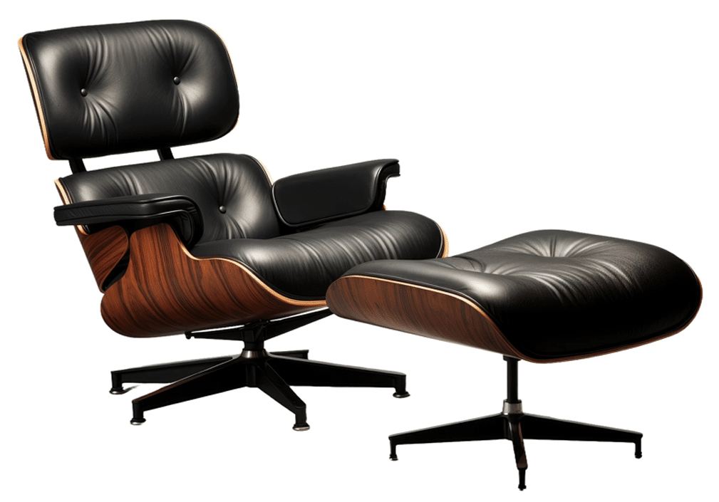
A well-designed chair has both comfort and style; tt is attractive and it feels great to use. Think of the iconic Eames chair – a modern, stylish chair designed to fit like a warn-in baseball mitt. (If you’ve watched Frasier, you might remember Frasier’s Eames chair and his disdain for his dad’s cozy recliner.)
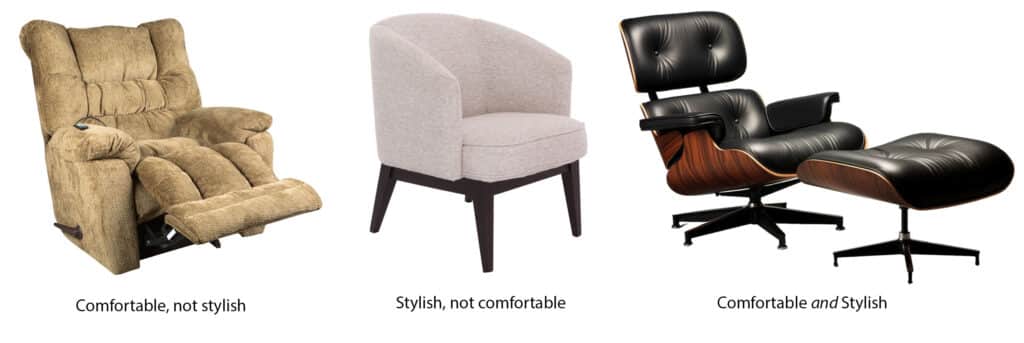
This concept of balancing form and function in good design applies to many parts of our daily lives. We want our homes to function well with layouts and features that make life easier, and we want them to have strong aesthetics with finishes and décor that make us feel good living in them. Clothes, cars, phones, appliances – the list goes on and on. We want our things to be well designed; we want them to have the right balance of aesthetics and usability.
This idea is very relatable and easy to understand, and yet in software design, people often forget what design is really for. Designers find ourselves in situations where we don’t have the time, resources, or information needed to create a solution. We try to express the issue, and often find that clients and team members don’t understand. What’s going on here?
Design Gets Confused with Decoration
I often hear that designers will take a piece of software and “make it pretty.” This phrase is the perfect example of the problematic confusion between design and decoration. “Making something pretty” is a process of decoration. Designers can certainly help spruce up a page with a better look and feel, but at its core, design is about solving problems, not about making things pretty.
So why do these concepts get confused? Why do so many people expect UX designers to just decorate the UI?
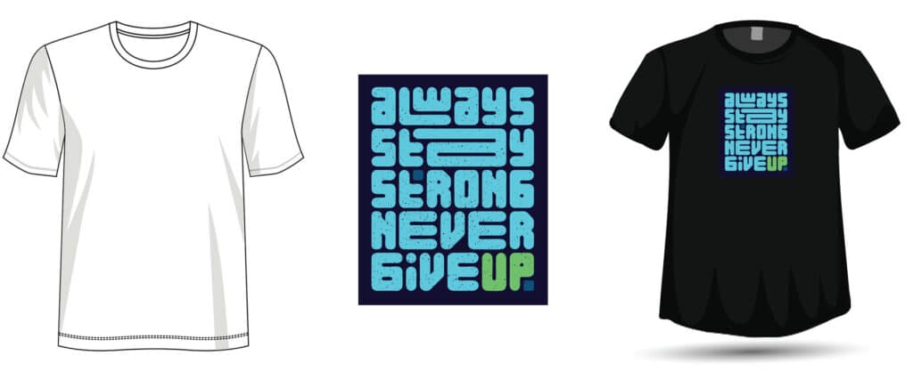
Taking a step back, it’s easy to understand. Design is a relatable concept, and yet in our everyday lives, we often use the term “design” when referring to decorating. For example, what does it mean when someone says they designed a T-shirt? Often, this means taking a pre-made t-shirt, picking a color, and applying a graphic to it. We might call this T-shirt design, but it is not actually design. It is decoration.
The Difference Between Design and Decoration
Design happens from the ground up. A clothing designer must craft a specific shape for each shirt – the neck, the sleeves, the drape. The designer must also select the right type of fabric with the right warmth, breathability, look, and feel. The designer must combine all of these details along with colors and patterns to form a cohesive piece that is functional and attractive for a specific type of customer. Will the shirt be for layering? What type of weather? Is it for active use? What demographic is it for? All of this must be considered. The nice graphic on the cool graphic tee is only a small part of it.
Consider the following.
Scenario 1: Fashion Design
(Disclaimer: I am not a fashion designer, just a viewer of many seasons of Project Runway!)
T-shirt Tammy started a line of shirts with the goal of producing trendy, sophisticated clothing that would look good on curvy figures, petite and tall. She decided to start simple, with cotton tees. She ordered hundreds of t-shirts and started applying different colors and patterns. After trying many combinations, she realized the shirts didn’t look very flattering, and lacked the sophistication she was after.
She hired a designer, hoping they could find the right combination of color and pattern to make these shirts work.
When Designer Dana got started, she helped Tammy understand that there was a limit to what she could fix. A crewneck t-shirt wasn’t the right cut for curvy women; a V-neck would be much more flattering. The clingy ribbed fabric hugged in all the wrong ways. The boxy sleeves did not speak sophistication; different shoulder seams and lengths would be much more flattering. The lengths of the shirts were for average height; they needed to be different for the target market of short and tall women.
Dana gave some advice on colors and patterns for different body types, but color and pattern alone would not be enough to turn these t-shirts into the sophisticated shirts for the short, tall, and curvy customers that Tammy was after.
Tammy hired a designer hoping they could decorate the t-shirts and fix the design. The problem was that most of the decisions a designer would normally make were already made by Tammy, and all that was left for Dana was decoration. Dana’s expertise in decoration was useful in trying to salvage the effort, but without being able to truly design the shirts, it was next to impossible to reach Tammy’s original objective.
The same type of scenario plays out in software design all the time. Designers often aren’t able to do our full job. We are brought in after many decisions have already been made. We can help make the software aesthetically pleasing, but applying colors and styles is not enough to make a product usable.
Here’s another situation to consider.
Scenario 2: Software Design
Client Carl wanted to create a ToDo app. He wanted the app to be clean and simple, but also flexible and full-featured. Two features that would make this app stand out from all of the others were a calendar and sharing options. Carl thought about hiring a designer, but his budget was limited, so he decided to put together some sketches and requirements and hired Developer Dee to focus on functionality with his first round of funds.
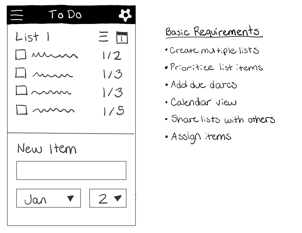
As the project progressed, Carl and Dee uncovered all sorts of details they didn’t think about and scenarios they didn’t think through. What they ended up with was an unruly app that was powerful but very difficult to use.
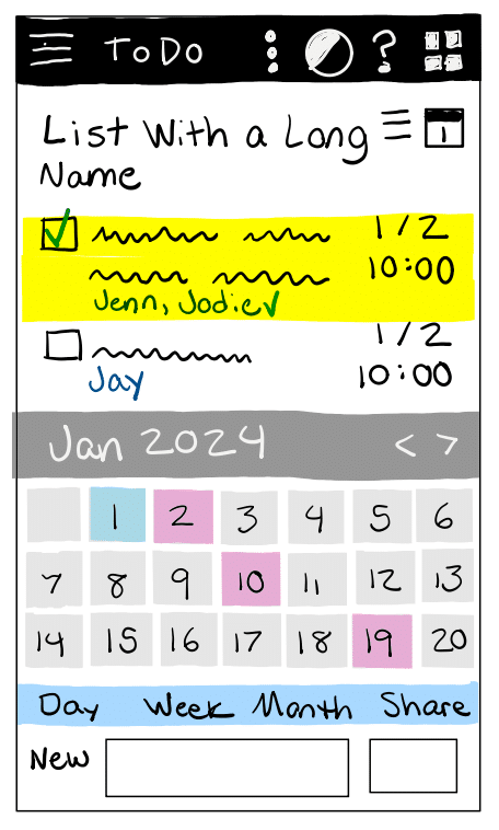
Carl realized that he needed a designer after all. The aesthetics were harder than he expected, but a designer would be able to make it right, right?
When designer Daria came on board, she quickly realized that the app wouldn’t support the type of workflow needed for an intuitive ToDo app. For quick reminders, the screen was far too busy. For tracking complex tasks, it was too confusing. The needs of different personas were all jumbled together on one screen that wouldn’t work well for any of them.
The deadline was quick approaching and there was no time for user research or for major re-work. Given the constraints, Daria could not design solutions for all of the problems in the app, but she was able to put together mockups to improve what was there.
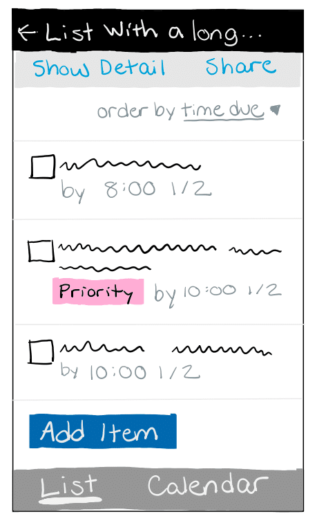
The new layout was definitely an improvement. Daria managed to maintain a clean and simple feel like the original sketches from the client while including the features that had turned it into such a mess before. But without time for a major overhaul, the calendar and sharing features were still ineffective and unlikely to be used. These features were what made the app unique, so if they weren’t good, it was hard to imagine the app succeeding.
Just like with the clothing example, bringing in a designer too late prevented the designer from effectively doing their job. Daria’s expertise in user experience and her skills with UI design certainly helped to improve the project and salvage the work, but Daria couldn’t fix the design by just rearranging and decorating the UI. She needed to be involved from the beginning to help with the foundational decisions that impacted the final result.
What Now?
I hope that the examples I’ve shared help build an understanding of how design is different from decoration, and why UX designers must be involved early on in a project. Decisions that are made at the beginning of a project have a large impact on the user experience. If the UX designer isn’t included until after a lot of decisions have already been made, then they are left only decorating the UI, and not able to truly do their job and solve problems for users or design effective products.
Having said all of that, when time and budget are limited (and they always are!) tough compromises need to be made. Design can’t always be front and center. When kicking off a project or finding yourself in the middle of a messy one, here are some things to consider:
Clients
- Know your priorities, and understand the risks of involving design too little, too late. If a good user experience is a high priority, then excluding UX designers at any stage is a very high risk decision.
- Involve designers early and often, even if just on a consultative basis. Even if the risk seems relatively low, I encourage regular check-ins with UX designers to identify red flags. What seems like a small risk at the start often turns into a critical usability issue later on that could have been resolved if a designer was included in the conversation early on.
Designers
- Help prevent misalignment and clarify misconceptions. If clients expect you to fix a design with decoration, help them understand the difference. The faster everyone gets on the same page, the better everyone can work together to find a solution.
- Teach and learn. This isn’t a one-way street. Yes, it is our responsibility to educate others about the role of design in a project. But first we must understand perspectives and priorities aside from our own.
- Make the best of each situation. We won’t always be included in decisions as much as we would like. But no matter what phase of a project we’re brought in on, we can still contribute and improve outcomes. With positive teamwork and good communication, we can increase the chance of being included earlier on in the future.

