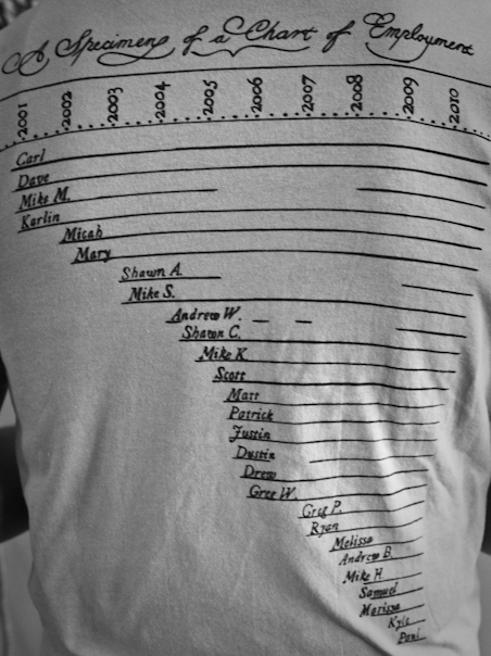
When the time came to create our newest company t-shirt, one atom thought it would be cool to include some fun and/or telling statistics about our company, such as the number of bikes owned while working here (41), index cards used (11,294), and cups of popcorn popped (lots). I immediately thought of an interesting info-graphic I had seen during my college days.
When I was a philosophy student at Calvin College, I remember seeing a chart that displayed all the philosophers who taught in the department over the years. It was an efficient and visually compelling (and thus memorable) representation of what would otherwise be a series of boring range dates. In an instant, this chart showed periods of department expansion, faculty members with particularly lengthy or short tenures, and snapshots of entire departments within a given year.
In a moment of serendipity, that very weekend Karlin came across a certain “Chart of Biography,” created by Joseph Priestley, a British polymath who lived in the latter eighteenth century. The chart, which dates to 1765, contains the names of 2000 figures of history on an ambitious 3,000 year timeline (1200 BCE to 1800 CE). Below is the redacted version.

We decided to use this as an inspiration for our t-shirt back. We wanted to include the names of atoms anyway, and it fit perfectly with the shirt’s statistical bent. I’m not sure what it means to have a “specimen of a chart” of anything, but we decided to stick with the original language; after all, the language, script and style evoke a sort of Enlightenment charm that resonates with our company name. The gaps indicate that an employee left and then came back, or had three or four internships before finally joining the molecule.


Since you’re omitting employees who are no longer there, the graphic cannot be used to infer about the growth of the company.
Seems to me like it graphically illustrates growth, Troll.
By the way, the front of the t-shirt has this stat: 32% CAGR since 2002 (first full year of operation).
Carl