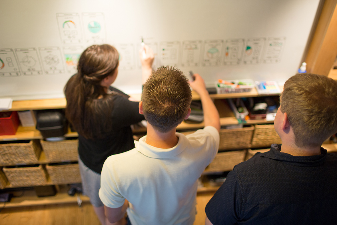
It’s the moment that every designer both loves and dreads: the design review with your customer or stakeholder.
Whether you realized it or not when you set out to become a designer (I’m guessing “not”—I’ll admit that I didn’t), effective communication and presentation are core parts of a designer’s job—and these skills set the excellent designers apart from the rest.
If you’ve developed a visually compelling, thoroughly researched, paradigm-shifting concept, but you can’t communicate its intent well enough to convince your stakeholders, that concept is worthless. This is true whether you’re part of an internal team and you need to gain consensus from your co-workers or boss, or you’re a consultant like me and you need to share your work and generate buy-in from external clients.
A design review can be won or lost in the first five minutes: it all comes down to how you, the designer, set the context and prepare people to approach the the work you’ve done.
If you’re not used to presenting in front of clients, it can be awkward to get started and tempting to jump right into the work. However, design presentations are much more successful when you give your audience some context for what they are looking at and how to respond. Here’s how I typically open a presentation:
“Right now, we’re going to look at concepts for Feature X. First, I want to give you a peek at the competitive and user research I’ve done and some observations that resulted, and then I’ll share how those ideas manifested in several design concepts. As we go along, I invite you to stop me with any questions or clarifications—this may get a little complex, and I want to make sure we develop a shared understanding of these ideas. Please hold your ideas and feedback until the end of the presentation. The thinking here is a bit of a journey, and I want to make sure you have the full picture before you react.”
Let’s unpack that a little.
When I start a presentation, I tell my audience:
- What we’re going to look at (Feature X, background info, several concepts)
- That it’s OK to ask questions
- That there will be time for feedback at the end
Breaking my introduction down in this way has the following effects:
People feel more at ease (hopefully) because they know where things are going. If my audience thinks we’re going to be looking at design mockups, and instead I start showing user research and screenshots of other apps, it could be confusing. Giving them an outline of the presentation lets them know that the work is still coming, but first we’re going to set the context, and that it’s important for them to pay attention to this information.
People feel free to ask questions. Acknowledging the complexity of what we’re approaching puts people at ease, so they don’t feel dumb if I’m not communicating an idea well. Hopefully, this induces them to clarify their understanding if necessary.
People approach the work with a more open mind. Design is a journey of understanding a problem, and my goal during a presentation is to bring my stakeholder along for that journey. To that end, I don’t just show my favorite concepts; I often include some of the less successful ones. I liken this to “showing your work” in math class—if you have the correct answer but cannot demonstrate why it’s correct, you don’t get the credit.
Similarly, the best solution to a design problem isn’t always the most obvious one, and it can take many iterations to discover the sweet spot between desirability, feasibility, and viability. Sharing the clunker ideas and speaking honestly about their pros and cons helps my stakeholders gain the confidence that my team and I have considered their problem from many possible angles.
However, this presentational approach of sharing some clunkers along with the winning solution doesn’t work well if the audience is constantly jumping in to provide feedback about what they do or don’t like about each concept. Letting the audience know that we’re going on a bit of a journey and that the feedback should be reserved for the end of the discussion—and gently reminding them if necessary—helps them think objectively about the pros and cons of the solution, instead of immediately trying to pass judgement and make a decision about how a feature should look or work.
By taking a deep breath and giving my audience some context about the presentation and the design solution, I’m able to generate consensus and get buy-in faster and with a happier audience.
What are some techniques you use for great design reviews?

