
The fifth item in my Swift Tool Belt is a class derived from UIButton that will draw your button with a gradient background. It will also expose the colors of your gradient in the attributes inspector of Xcode and render the gradient button directly in your storyboard.
Drawing the Gradient
Drawing a gradient on a button is pretty easy. Once you create a CAGradientLayer class, you can add it as a sublayer to the button’s CALayer. It does all of the hard work. All we need to do is provide it with the information it needs.
A gradient consists of an array of colors and locations for the placement of each color. Locations are specified in percentages, so an x position of 0 is all the way to the left, and the middle of the button is 0.5.
A simple gradient for a button consists of two colors that go from the top of the button to the bottom. This is the default location for a CAGradientLayer, so we do not have to specify the location in most situations.
let gradientLayer = CAGradientLayer()
gradientLayer.frame = yourButton.bounds
gradientLayer.colors = [topGradientColor.cgColor, bottomGradientColor.cgColor]
yourButton.layer.insertSublayer(gradientLayer, at: 0)
If you don’t specify a location, this is what is used as a default.
gradientLayer.startPoint = CGPoint(x: 0.5, y: 0.0)
gradientLayer.endPoint = CGPoint(x: 0.5, y: 1.0)
gradientLayer.locations = [0.0, 1.0]
Viewing our Gradient Button in Interface Builder
Now that we know how to draw a button, I want to be able to create a button with a gradient within an Xcode storyboard. If you are new to @IBDesignable and @IBInspectable, please see my blog post on Adding a Border, Corner Radius, and Shadow to a UIView with Interface Builder. In this post, I will be using my UIView+extensions file to create a rounded gradient button.
Remember a CAGradientLayer requires an array of colors and locations. If the default location is good enough for your gradient button, then all we need to do is specify the colors. I will add two inspectable properties to our button with a top and bottom color. When both colors are set, I will add the gradient layer to the button. If either color is missing, then I can remove the gradient layer from the button, returning it to a normal button.
@IBDesignable
class GradientButton: UIButton {
    let gradientLayer = CAGradientLayer()

    @IBInspectable
    var topGradientColor: UIColor? {
        didSet {
            setGradient(topGradientColor: topGradientColor, bottomGradientColor: bottomGradientColor)
        }
    }

    @IBInspectable
    var bottomGradientColor: UIColor? {
        didSet {
            setGradient(topGradientColor: topGradientColor, bottomGradientColor: bottomGradientColor)
        }
    }

    private func setGradient(topGradientColor: UIColor?, bottomGradientColor: UIColor?) {
        if let topGradientColor = topGradientColor, let bottomGradientColor = bottomGradientColor {
            gradientLayer.frame = bounds
            gradientLayer.colors = [topGradientColor.cgColor, bottomGradientColor.cgColor]
            gradientLayer.borderColor = layer.borderColor
            gradientLayer.borderWidth = layer.borderWidth
            gradientLayer.cornerRadius = layer.cornerRadius
            layer.insertSublayer(gradientLayer, at: 0)
        } else {
            gradientLayer.removeFromSuperlayer()
        }
    }
}
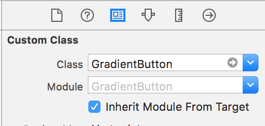
Once you add this code to your project, add a button to your storyboard scene and change the class name to GradientButton.
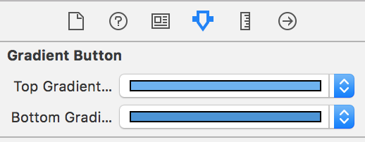
Next, you can see the two color properties that now appear in the attribute inspector for our button.
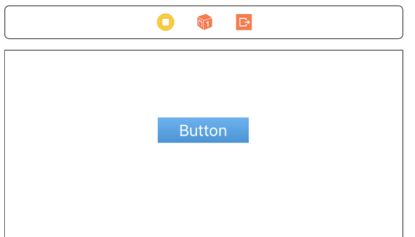
Once you change the colors, you should see your gradient button in the storyboard. Xcode can be finicky when showing any @IBDesignable object in Interface Builder, but it will display correctly at runtime.
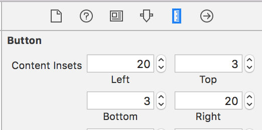
I have added a little padding around the text of the button by using a content inset. I added more padding to the left and right of the button than the top and bottom to make it look how I want it.
Rounded Gradient Button
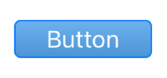
You may have noticed that the code above copies the main layer’s values for border color, width, and corner radius to our gradient layer. This will enable you to create a gradient button with rounded corners and a border.
As I mentioned, I am using my extension for UIView to add a border color, width, and corner radius. When I add those extensions, I see more properties for my button.
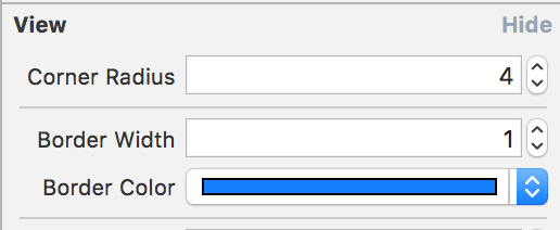
Since I copied the border and corner radius values from the button to the gradient layer, our button is now complete.
If you had a more complicated gradient, it would be easy to extend my class to take more colors and to specify locations with @IBInspectable properties. This is definitely a class that I bring with me on every project that needs a gradient button.


This is very helpful, thank you!
For me, the layer.cornerRadius in the UIView extension was not set before setGradient() was called from setting the gradient colors in GradientButton. So the gradient extended beyond the rounded edges. It worked for me to add a sharedInit() to call the getGradient() from init(frame:), init(coder:), prepareForInterfaceBuilder(), and awakeFromNib(). Setting the layer.masksToBounds = true is another option, but I found it left an almost unnoticeable sliver of the gradient outside the border.
This is great explain with easy to understand. it works perfectly in my project code. Thanks for sharing the good thought.