Article summary
We’ve already determined how our plans will be structured and what the most important value propositions are. Now for the fun part: how to design the layout of your models and values. The main goal here is conversions—convert as many users to become paying members as quickly as possible. There are many ways to express your models, but ideally you’ll choose the one that best fits your business.
Let’s examine a few examples of membership and pricing pages currently alive on the web.
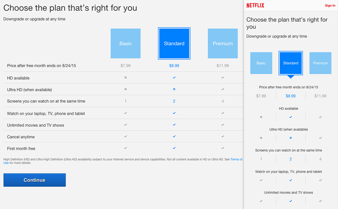
Netflix
Netflix decided to keep things simple with a clear layout and responsive grid. Though the mobile view gets a little funky with their tabbed membership content, tabs can be a good way to showcase multiple membership models on mobile while keeping things clean. However, you do lose some potential to easily compare and contrast features between each model.
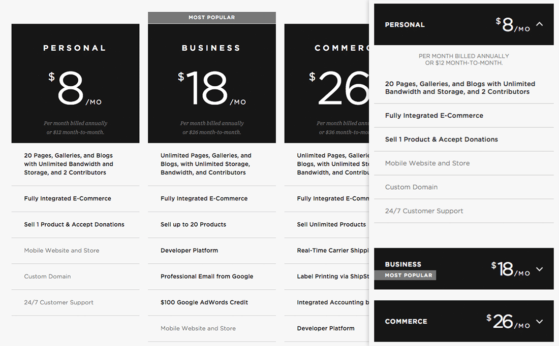
Squarespace
The star of the show here is the price. It hits you in the face with its largeness; features are almost listed as an afterthought. Though this model can be strong for certain businesses, I would challenge you to A/B test pages that showcase large pricing for one and large feature sells with another. Are pricing or features more important to your users?
The strength of this layout is the mobile view (still strongly focused on the pricing) that allows a user to access more feature information through a show/hide menu.
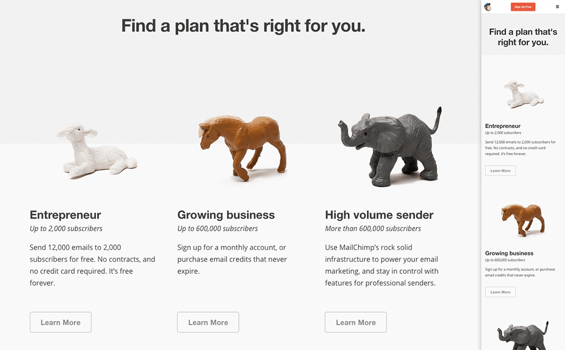
Mailchimp
Oh, whimsy! Mailchimp decided to keep things lighthearted and simple (a strength of their brand, in general) with some friendly animal characters. The layout is clean, and the value proposition is focused on the number of subscribers your business would have. Actual pricing of the plan could be a little easier to find, but Mailchimp is mainly trying to gain your email address. I see what you did there, Mailchimp. Smart.
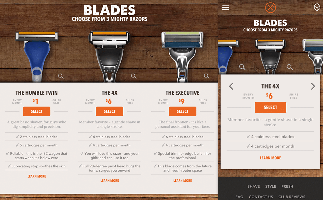
Dollar Shave Club
Because you know I’m all ‘bout that… blade. A very interesting model in that it showcases the value differences between physical products. They also incorporated checkout into the selection process, which keeps things fast and simple. The faster you can help a user to checkout the better—for them and for your business.
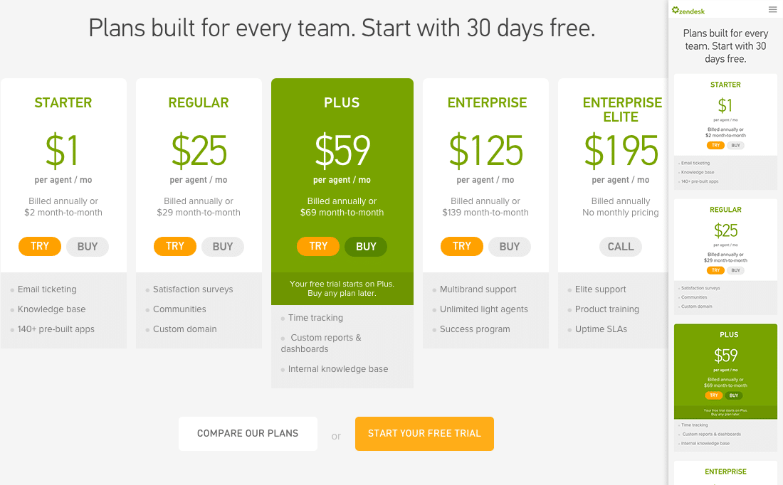
Zendesk
Potential members are given the opportunity to try or buy with Zendesk’s model. Offering users a chance to test-drive a product can help hook them faster. Show them that your app functions well and can really improve their lives, and they’ll be sure to keep coming back for more.
However, there is a (not-so-nice) opportunity to be sneaky here. Amazon Prime, for example, offers a free trial which you have to input credit card info for in order to activate and then conveniently “forgets” to remind you when your trial is up and charges your card. They snagged me once this way, but it didn’t feel too good, and I’m sure their digital karma has taken a significant hit because of such unsavory activities.
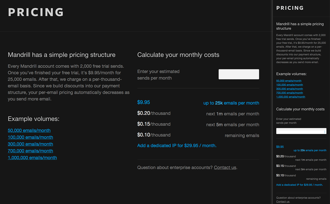
Mandrill
This is one of my all-time favorite models. It allows the user to estimate what their monthly fees will be, quickly and simply. Because the dollar estimate is accurate to the amount of sends you input, you can get a real sense for cost and enable you to compare against other products. I’ve seen this “instant quote” model done successfully many times across the web. CustomInk and Microsoft Azure are good examples that offer similar models with their “custom quote” sections.
Pattern Libraries
Aside from the examples above, and there are many, many more where that came from. Pattern libraries like the ZURB U Library are another great place to seek inspiration. ZURB U is like Pinterest for UX patterns, with a plethora of models to check out; just do a search for “pricing.” Like a brick and mortar library, you can get indefinitely lost in the stacks, and that’s a good thing.
Now Go!
Take your time to flesh out and test various options. Don’t forget as you build out your pricing and membership page to reference all the good work you’ve already done. Lay out the membership models in a simple way, let your strongest value propositions shine big and strong, and plan for responsiveness for friendly and optimized viewing on all devices.
Now go forth and create, good citizen designers, and if you’ve recently built pricing and membership model pages, please drop us a line and share your insights.
This is three of a three-part series providing insights for product owners, UX designers, and business strategists on how to frame models, explore value propositions and build responsive layouts for membership and pricing of digital products.

